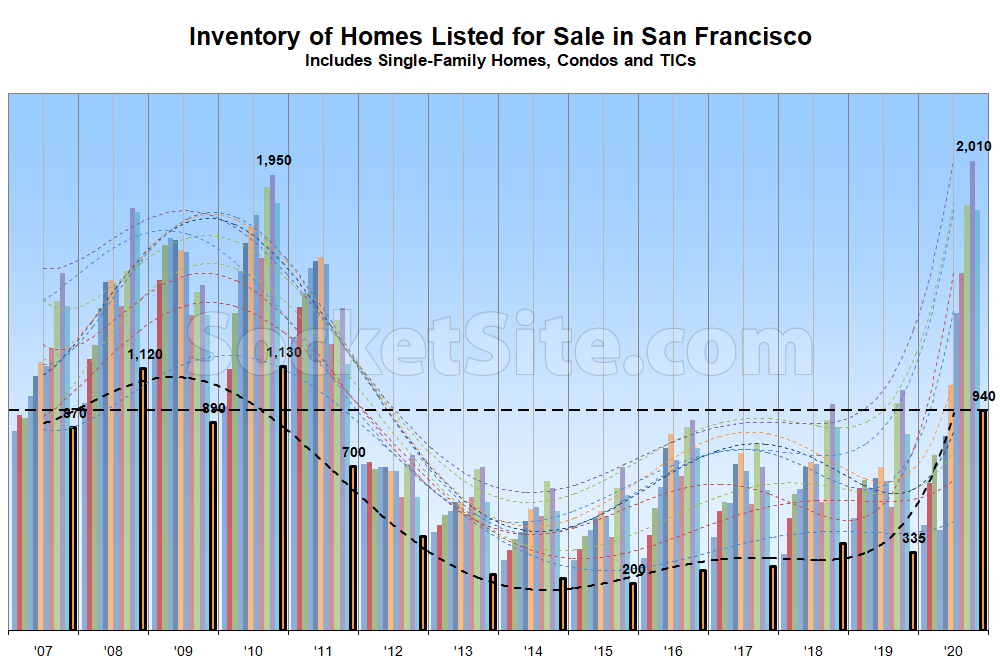
While the net number of homes listed for sale dropped around 45 percent over the past month in San Francisco, as was to be expected with a seasonal culling of unsold listings underway, inventory levels are still up nearly 3x on a year-over-year basis, with 200 percent more condos on the market, 115 percent more single-family homes and nearly 5x the total number of homes on the market at the end of 2015.
Expect inventory levels to jump in the first quarter of 2021 and then steadily climb through the middle of the year.
And while the list prices for 33 percent of the homes on the market have been reduced at least once, which is six percentage points higher than at the same time last year, the “expectation gap” between the average asking price per square foot of the homes which are in contract and those which are not is back over 10 percent.

What do the various bar colors represent? Could you add a color key to these as well?
It’s just months of the year
@AstrosFan — there are 12 vertical bars per year, each representing a month of the year. The black bordered month is the immediately past month (i.e., Dec 2020). Corresponding color dashed lines along X-axis are trendlines.
The horizontal black dashed line is a visual aid for comparing the immediately past month data against previous years.
In terms of relative trends, last month with an inventory level of 940 is nearly 3x (2.80x rounded) that of Dec of 2019.
If past is a good indication, the data (and trend) suggests that inventory levels may climb in the months ahead.
Hope that helps!
Dweller’s comment should be reprinted every time this chart is shown.