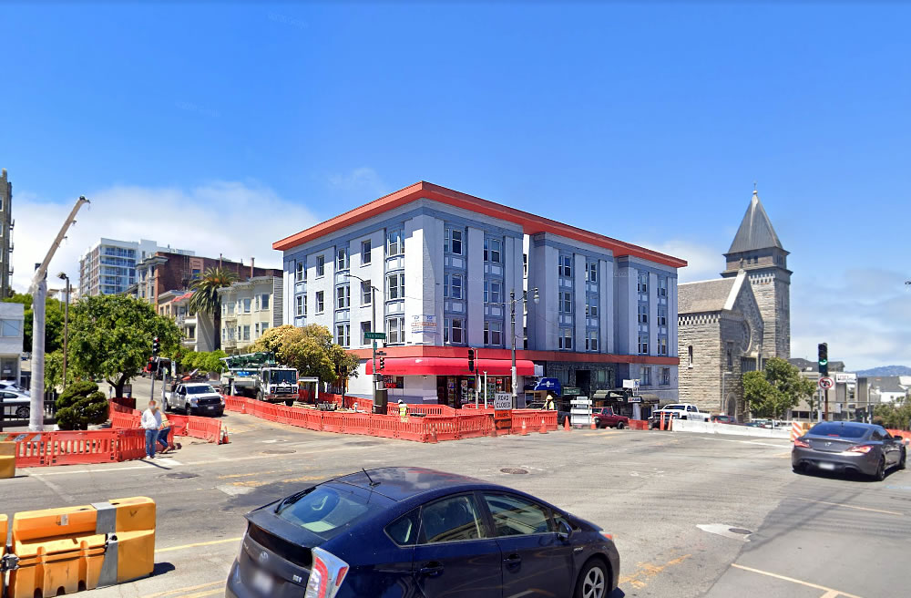
Purchased for $8.41 million in January of 2014, plans to redevelop the 5-story building on the northwest corner of Van Ness and Pacific Avenues (2101-2107 Van Ness) have been drawn.
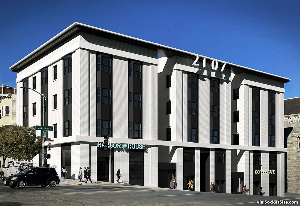
And as proposed, the building, which is currently configured with around 58 office suites over 2,500 square feet of ground floor retail space, and “may have a history of non-permitted residential use within a portion of [its] upper floor office suites,” would be converted into 32 residential condos, with a mix of 5 studios, 16 one-bedrooms and 11 two-bedroom units over 4,250 square feet of ground floor restaurant (“Harbor House”) and café space and off-street parking for 32 bikes but no cars.
And yes, the corner parcel upon which the existing 70-foot-tall building sits is zoned for development up to 80 feet in height.
We’ll keep you posted and plugged-in.


Gosh, that’s an ugly rendering! It’s not just the street address at the top that makes it ugly, but that is certainly part of it. It’s too bad that none of the historic elements of the building have been retained.
I have noticed this building over the years because today it has that weird, modified cornice element. Wonder what the revised renderings will look like?
Which elements?? It looks like they haven’t done anything except slap a (remarkably lifeless) monochromatic paint scheme on it.
It looks like a lot of the 2ndary elements – moldings between the windows, for instance – have been removed.
Yeah, perhaps. OTOH, while it’s always wise to be pessimistic, it’s rash to draw many conclusions from renderings…which are many times – I suspect – just generated by software. [Insert my usual ‘renderings rant’ here].
What is historic about this building? Remember that “historic” is not a synonym for “old”.
This needs to be said more often.
While unlikely to be designated a Class A Historic Resource, the building was once home to the Center for Special Problems (which provided support services to HIV positive and transgender clients). And as such, the building has been identified for its association with LGBTQ history per the Citywide Historic Context Statement for LGBTQ History in San Francisco, which was completed in 2015.
Beyond that, the Van Ness corridor has a host of buildings of this era and style – even if any one of them individually is not “historic”, I think the corridor as a whole has a wonderful coherent feel that’s diminished every time one of these buildings is torn down or, as here, dumbed down.
So if a building fails to be worth embalming on its own merits, we shall now fall back to some generalized “but it looks like everything else” argument to preserve it in amber? What a convenient line of reasoning for not building anything anywhere ever!
Yes, you’re right, I said that the entire city should be frozen as-is and no more building should be allowed anywhere.
(And apparently you’ve never heard of historic districts, which are actually quite common.)
Also, I feel like all Van Ness development renderings should be required to show Van Ness bus lane construction materials in piles.
Hee! Hee! Too true.
A carbuncle. Should be rejected on grounds of repulsiveness.
Ah yes, let’s make sure that the city accepts or rejects any and all renovation and construction permits based on your subjective personal aesthetic tastes. What could possibly go wrong?
Gotta say, the front elevation looks like a bank.
Tear it down and build a 400 ft tall building full of homes.
Ridiculous that all this time & energy will go into refurbishing 5 story building on a rapid bus line in an affluent area of the city. All of Van Ness should be zoned for 400ft to allow SF to maximize the investment ($ and way too much time) made in BRT (which will be done next year).
agree 100%
agree. van ness should be upzone for 400 ft from 13th all the way down to union
That logo for Harbor House is an extremely fine inn up north. If connected, it would be a vast improvement over “Happy Donuts”
It’s one and the same as envisioned.
Hate it – hate the destruction of all the original design elements. Did we learn nothing from 1950s and 1960s “updating” of facades (many of which we’re now endeavoring to restore)…? Any architect contributing to this should have trouble sleeping at night…
No, they really shouldn’t. This is ancient Greek pottery. It’s not the Clay Army. It’s not even close the the only or best remaining example of this type of architecture.
Looks like someone has a well-thumbed copy of Revit for Dummies!
I can’t wait for the fad of whitewashed facades to pass. It was unoriginal when it first emerged, and will not age well, especially on a busy corridor like Van Ness that gets so much traffic from diesel trucks.
They had an opportunity to turn back the huge mistake of the ghastly, adjoined roof-piece hideous’ity. But, no.
100% agree, that current roof piece is unsuccessful. And the new one is not much better.
“NEO-FACHIST” Architecture! Trump should feel comfortable making a speech with this as his backdrop…!
Shout out to my boy Conifer!
That rendering has got a nice “Ho Chi Minh’s Mausoleum” vibe to it. Look it up if you think I’m lying. There’s definitely a waxed communist body in the lobby.
Carbuncle is right!
OR…
How about they restore this building to its original appearance? Wouldn’t take that much, honestly.
Since we actually know how it looked.
Lovely. Yep- I think they could do an updated version of this design, and fix the ghastly cornice mistake.
Note the pic is from before St Brigid’s being refaced; altho I don’t believe that was done for aesthetic reasons – it was street widening or structural, or some such – I shudder to think what it would end up looking like if done nowadays…Heaven help us !!
Fun fact: the interior air gap is so narrow because the original architect liked sparrows but not pigeons so it’s juuust wide enough.
Source: Van Ness Corridor Mid-Sized Office Space with Possible Unpermitted Residential Use Historical Society
Oh come on: condors or eagles I can believe, but pigeons ??
I like sparrows too. They are sweet little hoppy birds.
I have nothing against updating a facade, but this looks like comic book Albert Speer and I can’t imagine it looks like a place you’d want to buy a condo in.
UPDATE: While plans have been drawn, as outlined above, the corner parcel and building at 2101 Van Ness Avenue is now on the market with a $13 million price tag, prior to any entitlements being secured.