While it failed to sell in 2011, having been “lavishly remodeled” with Venetian plaster, Italian tile, exotic woods and a floor plan “inspired by a Feng Shui Master,” the 1,400-square-foot unit #1 in the former Smitty Knitting Factory building at 75 Lansing Street ended up trading for $1.18 million in late 2014.
This past June, the two-bedroom live/work loft returned to the market priced at $1.295 million, a sale at which would have represented total appreciation of 9.7 percent since the fourth quarter of 2014. And having been reduced to $1.198 million in September, the list price for 75 Lansing Street #1 has just been further reduced to a sub-2014 price of $1.145 million.
In addition, the listing copy has since been updated to note that the seller will now pre-pay one year worth of HOA dues (which currently run $496 per month) along with one year of parking fees (which currently run $300 per month) or grant a comparable credit toward closing costs as well. Let the bargaining begin.
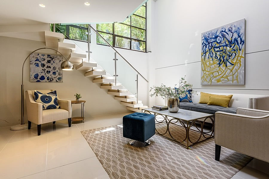





Not terrible, if you don’t mind living in an upscale version of a basement.
Perhaps that’s why it only fetched $1.18 million in the fourth quarter 2014 despite the quality of its finishes. Which brings us back to the market today.
With the exception of the first photograph this place seems to lack proper fenestration.
Looks like the building is a loft conversion, and it is not uncommon for lofts to have fewer windows that other types of residences.
The issue is not so much the lack of windows (though more windows would certainly be desirable), but the fact that most of the unit appears to be below ground level, so the the light from the few windows filters down from above, rather than shines through at eye level. It is a pretty unit, but it is still a basement unit, and so there is simply not going to be as much of demand for it as there would be for a unit above-ground.
Is the living room underground?
Feels like it’s all underground. Unappealing.
was it underground also back in 2014??
I like the location. Central but end of cul- de-sac. So probably quiet for being downtown. But the kitchen is ridiculous.
The microwave shelf looks like Giraffe Escher. No doors on any of the lower cabinets? Not even the sink? It’s Ikea gone wrong. First thing to change.
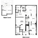
UPDATE: A floor plan, which hasn’t changed since 2014, has since been added to the gallery above.
Hate this floor plan. Not only are the only windows over the stair case (unless there’s something at the other end, which is cut off on the floor plan), but to get to the closest bathroom from the upstairs bedroom you have to go down the stairs, walk through the living room, then walk through the kitchen.
Actually, that’s the only bathroom; you have to go through the kitchen to get to the bathroom from the ‘master’ bedroom too.
There are windows on the other side of the unit, in the library and foyer, which are actually shown on the floor plan (and in the linked listing), as well. No comment on the location of the bathroom.
Is the “entry foyer” part of the unit or common space? Looks like the latter. If so, the only “window” in the master bedroom looks like the opaque glass door that leads to your neighbor’s acess stairway/hallway. This place has a dog of a floorplan.
and the most direct way to the kitchen from the entry is through the master bedroom. And that bathroom in the corner, accesible only through the kitchen. It is SUCH a dog of a plan.
If you buy a home meaningfully below market comps, then the home must be unappealing. This home failed to sell in 2011, then sold well below market in strong market in 2014, so expect it to fail to sell now. Especially with tons of condo and rental supply all around it.
I dunno, the finishes and build quality look first rate. For $1.1M I could quite happily live there.
The floor plan is not unlike some Paris apartments that have been chopped up from bigger ones. Rather funny, as long as you don’t have to live there.
UPDATE: Lavishly Remodeled Loft Fails to Fetch Its 2014 Price