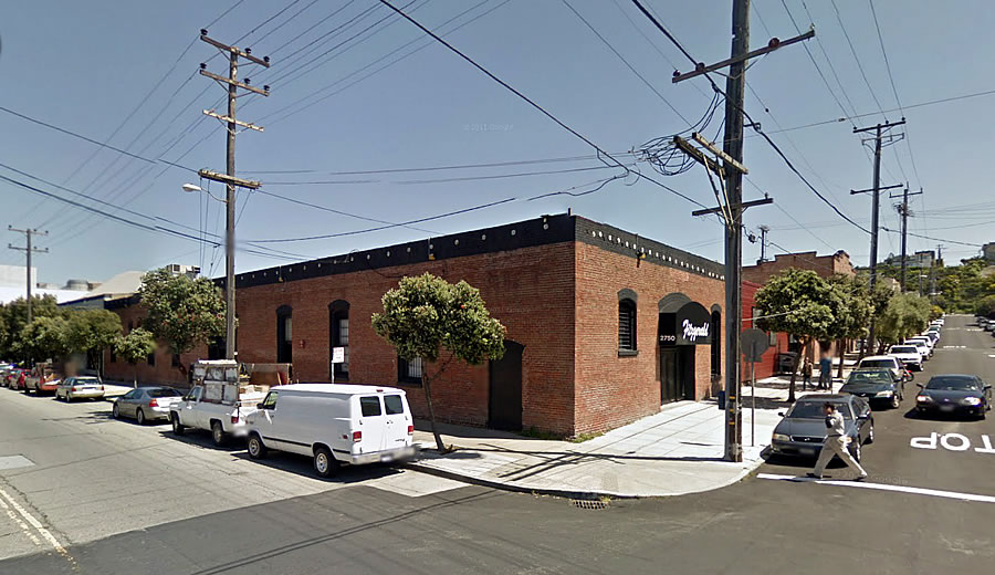
In the works since 2014, as we first reported at the time, plans to mostly demolish the brick and timber Fitzgerald Furniture Company building on the northeast corner of 19th and Bryant Streets and develop a contemporary six-story building on the Mission District site could be approved by San Francisco’s Planning Commission in two weeks time.
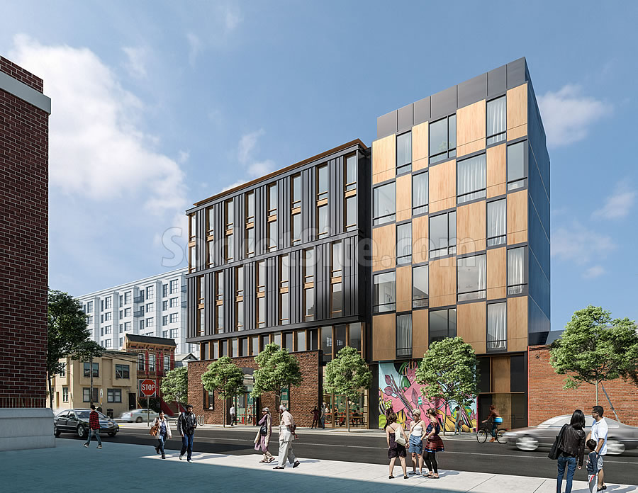
As designed by Perry Architects, the existing building’s brick façade would be saved and incorporated into the new development “as a gesture to preserve [the] existing neighborhood[‘s] architectural character” and behind which the new building would rise to a height of 68 feet and yield 60 modern condos over 7,400 square feet of new restaurant/retail space and a garage for 45 cars and 84 bikes.
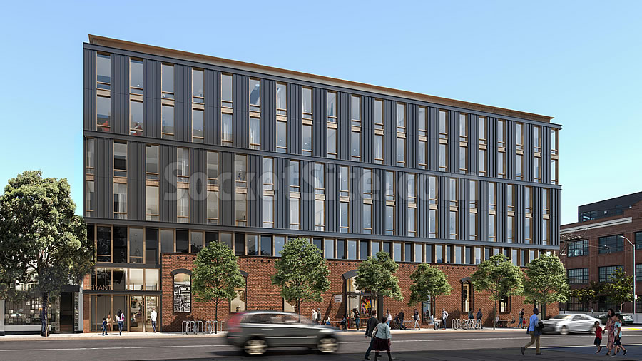
A 4,800-square-foot roof deck with raised planters would provide open space for the building’s residents and the development’s 19th Street façade features two distinct designs to break up its overall mass.
We’ll keep you posted and plugged-in.
I dig it. Tasteful and respectful to surrounding scale (as well as character). Also, bonus points for breaking up the massing on 19th st. Even the material choices seem solid. Nice work, Perry Architects.
Generally I prefer one building to look like one building. I do like how the verticality of the main facade gives a strong counterpoint to the wide & blocky mass. I wish they’d continued that style consistently around both sides.
Why does one building need to look like one building? It seems to me that breaking it up into two facades here makes it look less ponderous (IMHO) and it certainly makes fit to the scale of the neighborhood better.
ITA. The “two” buildings are complementary and make for a great juxtaposition.
Kilroy’s Exchange on 16th is one building broken into several non-commentary buildings. They look totally unrelated – but that works too. It’s a quite interesting looking “block” now. Far better than if Kilroy had built a 10 story, square, single façade office block.
Exchange is coming together wonderfully and it was announced today that Dropbox is taking the entire complex constituting the largest single lease in SF history.
I like the idea that a thing can look like what it is. There are many ways of articulating and varying a facade to reduce visual bulk. Like a big person wearing slimming stripes vs pretending to be 2 people by wearing a mask.
At least they look related, too many times the “multiple building” approach creates a design that looks like multiple architects designed a building without ever coordinating.
Ditto. Well done!
Have they paid off Calle 24 or MEDA yet?
Lol. I strongly dislike them.
Looks Design-District-y. Overall impression with the brown and blue is a little drab. I could go for more color, like the waylaid 16th and Florida proposal, which I greatly prefer. Not awful though. Glad to see housing move forward.
I hope that’s just a stand-in for 2070 Bryant in the background of the 2nd rendering. I believe that was the portion of the site given to the city for affordable housing.
This is quite nice. It is not great architecture, but it is solid and should be typical of most new SF projects rather than the exception.
Retaining the brick façade is spot on. It gives an earthy, intimate feel to the building. Breaking up the 19th Street side into “two” structures works. Picture it as a single structure and you’ll get how much more interesting what the architects have done is. The bronze with the dark gray and the brick is an engaging and interesting color scheme. The Bryant Street façade, though a “single” building, is tempered by the large expanse of brick at the ground floor. The roofline could be better, but at least there is a small effort at varying it which in itself is better than the straight edge flat, unarticulated rooflines which are the norm for new mid-size projects such as this.
Compare this to the 16th and Florida proposal. Well maybe not – it’s a bit visually jarring to go from one to the other and, if not that, it’s frustrating – as in why does SF get so few buildings akin to the former and so many like the latter.
Kudos to Perry Architects. Now let’s hope whomever purchases the Sixth Street housing block entitlements brings this firm in for a redo of those proposed structures.
That’s a cool building! We’re getting better!
Wow! That looks and sounds wonderful.
UPDATE: Waylaid Mission District Development Modified, Slated for Approval