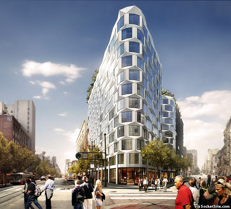
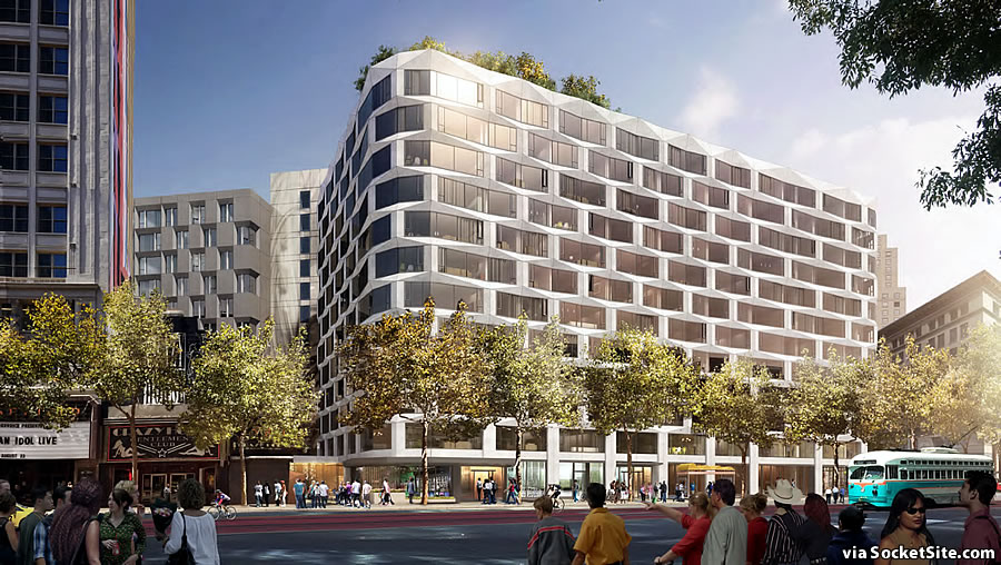
While the prow and Market Street facade of the proposed 12-story development to rise on half the Mid-Market block bound by Market, Turk and Taylor, have been slightly refined (primarily at the base), the 950 Market Street project’s Turk and Taylor Street look has been completely redesigned by Handel Architects as newly rendered below:
The project as proposed would wrap around The Warfield and Crazy Horse theaters and yield 242 condos, a 232-room hotel, 82 parking spaces and 16,100 square feet of retail space spread across the development’s ground floor.
But the development would raze the existing buildings across the 950-974 Market Street site, buildings which were recently identified as contextual resources for LGBTQ History in San Francisco, a move which is being challenged the co-author of the LGBTQ Historic Context Report. The development is being challenged by Sue Hestor’s ‘San Franciscans for Reasonable Growth’ movement as well.
In order to pave the way for the project and offer all 242 condos at market rates, the development team is now proposing to either deed the property at 180 Jones Street to the San Francisco Mayor’s Office of Housing and Community Development and pay $12.8 million into a 180 Jones Street Affordable Housing Fund or to build up to 70 affordable studio or efficiency apartments on the 180 Jones Street site and establish a $2 million 180 Jones Street Affordable Housing Fund as well.
If the redesigned 950 Market Street project survives its appeal next week and is approved by San Francisco’s Planning Commission, it will then take an estimated 27 months to build once it breaks ground.


Let’s start the official process of designating a nickname: I nominate “the bubblewrap building”
beehive
BIG beehive… I like it.
any way you gut it, that’s a really weird looking building but I keep forgetting that any sense of planning or foresight is forbidden in SF because the mean kids will shout you down if you dare suggest everything these folks do isn’t 1000% perfect.
Planning is forbidden in SF? lol, that’s a new one. Also, SF’s mayor is Willy Wonka.
San Francisco is famous for its simple, efficient, and relaxed planning and permitting process. At least the San Francisco that Bart lives in.
I love it
I do too!
Great building. Build it!
Totally agree, BUILD IT, along with 70 affordable on Jones.
Very cool! Let’s get this built!
Still cannot wrap my head around the LGBTQ Contextual Resource argument. If that has any weight with the City it will be a dark day for urban planning.
Every site listed requires a CEQA review now. As well it should. If you think it holds no weight, then you why freak out and worry about the findings?
Not impressed with the design. Kind of reminds me of the development up at Market and Octavia. Plus side, it cleans up and area and that is always good.
I like it, especially the prow part. It’s different and interesting. I hope that doesn’t get value-engineered away.
I like this design as well – different but not radically and should age well. let’s get it going before the market conditions abandon the investment for another 10 yrs.
Waffle House
How does it transition from the waffle (hat tip) design to the blocky one?
It looks like the blocky design is an alternative to the waffle design…? There’s another image that’s all waffle, no blocky.
I think all-waffle is the old version.
no they are connected, look down the street in the second rendering you can see that the waffle bubbles have a dent then end at the edge of the black one
Much prefer the original Bjarke Ingels Group design.
Absolutely.
Agreed.
I agree. But anything is better than another building made of rectangles with a few of them painted orange and blue.
I like the project (and the claim that the existing building should be kept because it once housed a gay bar is re-frickin’-diculous.) The facade design is really ugly — reminds me of “modern architecture” from the 60s — and it will look even worse after six months when it’s already dingy and dirty. But, as the Pope says, who am I to judge?
Wait Hestor’s not dead yet. Christ it’s as if we’re going to stuck with her and Pesky for an eternity. Good thing they were so effective in staving off the housing crises.
Was just in Mexico City, which blows us away with its architecture and green spaces. Mexico City, people — San Francisco is by comparison ‘peyton4play place.’ Its utterly criminal.
Dear God, this is an UGLY building! Please don’t stick us with this eyesore for decades to come!
You mean you prefer the slum buildings that are there now. Look, it may not be your cup of tea, and I personally am not that enamored, but it is far superior to what currently exists and it will provide a crisp, clean and modern development to a crappy block.
Save the beauty concerns for an area of town that might actually be negatively impacted by new development.
Nice design! j Stay on the forefront of design SF. Buildings that will last over time.
This looks identical what every Art Academy kid (and every other art school for that matter) is doing in their design classes. Not even architecture programs, just art school, where they sit and plan for future societies and make models of parks in hallways and closets and rooftops.
Everything looks like a beehive or wrapped in textural design elements.
I love it – this gay contextual blockade is baloney. Who cares what happened in some crappy building 40 years ago…. I’m gay and I can tell you, the gays don’t care either.
As for Sue Hestor, uugh, please go away. What a horrible annoying gadfly
The gays don’t call themselves the gays, but either way, it’s gays establishing their history. You might just not be one for history.
Love it. Build it.
I don’t get it – looks like everybody is praising the beehive design, but SS has posted that as original design (in 3 pictures) and the bland looking building as the redesign. Is that correct?
I much prefer the beehive look, but it is probably more costly to construct and maintain.