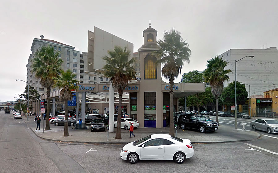
The public hearing for Trumark Urban’s proposed redevelopment of the Tower Car Wash and gas station site at 1601 Mission Street and South Van Ness Avenue has been scheduled for April 7.
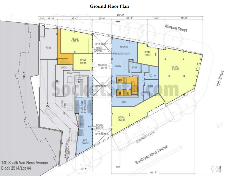
If approved, a 12-story building designed by Handel Architects, with 220 condos over 7,300 square feet of retail space and an underground garage for 97 cars, would rise up to 120 feet in height across the trapezoidal-shaped site.
The building’s garage would be accessed from South Van Ness Avenue. The retail space could be divided into three, four or five units. And a mid-block alley through the development would provide access to the development’s lobby and bike “lounge,” and provide passage between Mission and South Van Ness.
Plans to construct a high-rise residential building on the corner date back over 25 years, when a proposal to develop a 500-unit building across the 1601 Mission Street site and its adjacent parcels was floated. Instead, the Firestone tire shop on the corner was converted into the car wash and 140 South (Van Ness) was constructed on the parcel next door, with 212 condos over a lesser amount of retail.
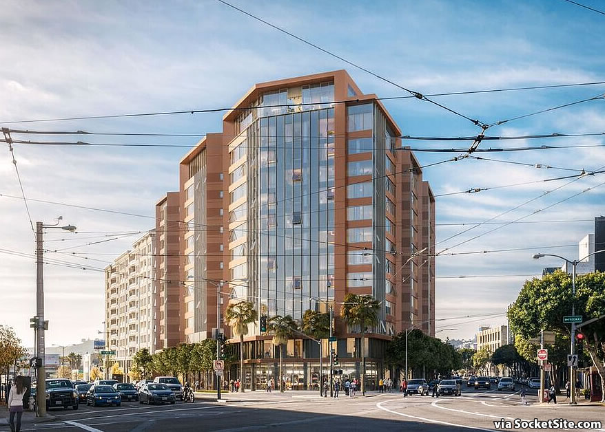
Digging the ’80s vibe in this sunset rendering. 🙂
I like it, great use of the land, but wish zoning height was at least 100ft higher (than only 120ft limit) in return for higher % of affordable homes.
Looks great. Built it.
who would rent the ground floor retail there? That area has no foot traffic or neighborhood cluster.
Long term plan is that there will be a few 400 ft towers in that 2-3 block radius. It will introduce a lot of foot traffic from residents and office workers.
Foot traffic? Not necessarily. You see a lot of high rises going up in SOMA but is there really an increase in foot traffic?
No. No increase in foot traffic. Because virtually all the towers you see rising are under construction. Meaning nobody lives there yet.
If you want a perfect example of the increase in foot traffic, compare 10th and Market (NEMA/Twitter) to neighboring 9th and Market or 8th and Market. Night and day difference in streetscape. 1,000 residents in that block has really made a significant difference in the feel of that section, and in a way that even extends to that block of Market.
…because it’s a CD car wash and gas station. Put 500 more residents on the block and there will be foot traffic.
And even if there isn’t foot traffic, so what? There are businesses that don’t depend on foot traffic– for examples, just look at what else exists around there. A dental office, a store for specialty plastic materials, a nonprofit. They’re not glamorous, but they need space too.
Right and this is an easy walk to Muni metro and major bus lines stop right in front
Tap, tap plastics, the fantastic plastic place!
Maybe a bar or fancy restaurant where all the fixers and cronies can entertain the planning department employees.
Isn’t that where the old Mels used to be? maybe they should get first crack at the retail space…
Mel’s was next door where the newish housing block now stands: 140 S Van Ness
Why would anyone want to go visit retail in a location that will never be anything other than just a car wash?
The answer, of course, is that there WILL BE foot traffic there in that location once the building is constructed and there are 400 people living directly upstairs.
Some people’s lack of perception about the difference between the future and the present is really astounding. These are the same people who say that there’s no need to expand infrastructure in anticipation of population growth, because it works fine now, and that there’s no need to plan for earthquakes because there haven’t been any big earthquakes in a while.
Make it taller! A lot of high-rises are going up within a close distance, at least make it 200ft!
Having that weird covering on the top floor doesn’t make sense to me, it would definitely block out a lot of natural light coming from the south.
windshielding, same for the tabs along the sides.
The old Hub neighborhood lost much of it’s foot traffic pedestrian friendliness when it was carved up by Gough in the 1930s, by South Van Ness in the 1940s, and then the coup de graceless of the Central Fwy in the 1950s. History and photos at namelink.
Undo those (or at least the last two) and it could recover as a neighborhood. Otherwise, it is more like a multi-way intersection spreadout over ~4 city blocks than a neighborhood. Is there anywhere else of comparable size in SF with a greater ratio of surface street to buildable land?
Jake, what is this namelink that you mentioned?
Namelink means the link is on the name in “Posted by name”. Hover your mouse over “Jake” and you will see the url for a site has histories of some sf neighborhoods.
While the top floor canopy remains, it has been reduced as newly rendered above.
Looks better than the building behind it, and better than the planning department and SFDBI building…
Keep the neon/lighting elements (goes with the morphosis federal building) though not nearly as cool, it has a slight mod snicker. now again ask the question BRT Van Ness will it deal with the population growth?
BRT is a joke. It won’t be able to handle the current load, much less hundreds of additional riders, assuming these developments will encourage people to ride public transit instead of driving.
Looks like an Arquitectonica reject. This is a very high profile corner; why so ugly? Just say no.
Is the mid-block alley going to be open to the public, or residents only? If public, I hope the “Bicycle Lounge” has security worthy of Fort Knox.
considering DBI offices are right by there, i’m guessing the retail spaces will be some diverse lunch spots, a dry cleaning place and a starbucks.
they should build 10 floors of underground parking there too.
DBI will be moving to the goodwill site
Building Department has revised its requirements, interpreting the building code to require that ground floor retail space be leased specifically to a Quizno’s and/or a Krsipy Kream.
Ugly. Too tall. Keep the Tower.
Wow, soon no more gas stations and car washes in SF….
That’s a bit of an exaggeration. I see no problem replacing gas stations within dense urban environments and along major streets. So what if you have to drive a few more miles to fill up. Small price, big gain.
Better than what’s there now but I agree it should be taller. The design already looks dated but then it’s only one weird rendering.
UPDATE: The most recent rendering and design iteration for the development, which will be presented to the City’s Planning Commission in three weeks time, has been added to our image gallery above.
But where will I get my Tesla washed?
The new rendering should be a lesson for those saying that the proposal at Market and Sanchez should have “warmer” colors: be careful what you wish for!
This is a definite improvement over the garish design in the iteration initially published.
Definitely too short for this corner lot
good bye sweet San Francisco. Build those high rises — build those high rises higher and wider! Welcome to Houston. Enjoy the unique SF before it is completely gone. tear falls
Seriously?
Young people can afford to buy homes in Houston.
But who would ever want to live there?
Why would you imply that for San Francisco to build high-rises makes it more like Houston?
San Francisco has always had more high-rises than Houston.
When Houston builds high-rises, it becomes more like San Francisco.
San Francisco has been a densely populated urban center for its entire history.
If San Francisco starts demolishing high-rises and replacing them with suburban tracts of single-family ranch homes, then you can feel free to claim it’s becoming more like Houston.
A funny comment from the historical survey of the Tower Car Wash in 1976: “Another tower in a wasteland autoscape.”
Could this possibly be uglier? We are reaping what we sow – bland, suburban boxes that we’ll have to live with forever. For shame, Planning Department.
220 condos and 97 parking spaces. Does that mean that over 100 of those condos will be sold at below market prices for those who can’t afford or don’t have cars?
Most likely parking will be unbundled from the living units. Buyers who want parking will purchase tproperties: their home and their parking spot. It may work the opposite way: Parking spots might sell out before the living units if they are underpriced.
“Below market prices”? No. It means that they’ll sell for the market price of a unit that doesn’t have parking.
I thought parking in all these new developments can’t be sold. They are all leased to the residents.
“Below market” mean that it will be physically located below the market that will be leasing the ground-floor retail space.
The parking will be located below the market.
And the location is about one block below Market (St.) – so, in a sense, all of the units will be below market, which should make everyone happy.
I like that the rendering artist included the overhead wires in that view from across the street.
Doesn’t stand out architecturally!
Not creative, not interesting, but it is housing. Is that all we can expect in one of the wealthiest cities in the US… build whatever because we just need housing units?
Integrate the old tower structure into retail or a private public space… and add another 20 floors to the new structure.
UPDATE: The rendering for 1601 Mission’s pedestrian alley and bike lounge.
the developer is only including the alley because it is a planning code requirement. However, I thought alleys were to be open to the sky, not 1 or 2 stories. This is joke.
What does this project do to 140 South Van Ness? It looks like it butts right up to that building. If I bought into one of those condos, I would be upset.
Be upset.
What an ugly building!! Both versions try to do outdo themselves with their Las Vegas, Miami, Houston ugliness. Whatever happened to classic apartment buildings with balconies providing some human scale?