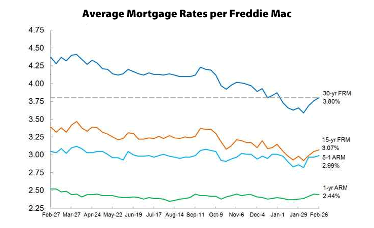
Mortgage rates have ticked up for the third week in a row and the average rate for a conforming 30-year mortgage is currently averaging 3.8 percent, up from 3.59 percent at the beginning of the month.
The 30-year rate was 4.37 percent at this time last year.
Averaging 6.7 percent over the past twenty years, the 30-year rate hit all-time low of 3.31 percent in November 2012 and a three-year high of 4.58 percent in August 2013.

That chart over such a short period of time is misleading.
How is it misleading? The ed. talks about rate trends over the last year and includes a chart that shows exactly that. He also noted the 20 year average and the 3-year trend. Just because a single graph does not include every metric one could imagine does not make anything misleading. Rates have indeed ticked up over the last few weeks.
It’s misleading (to me) because the time band makes it look like there is a big spike and we’re headed up to higher peaks. A longer view shows that these fluctuations in the 5-3.5% band have been the norm for a while. And while I agree the 30year is the best marker for a measure of likely impact on home prices; I think many people are looking still at the alternative non-30 year mortgages.
Pretty huge spike in interest rates today — on the good jobs report, so this is based on a good trend, not bad news. I suspect the next time this chart is updated, the uptick will be more prominent.