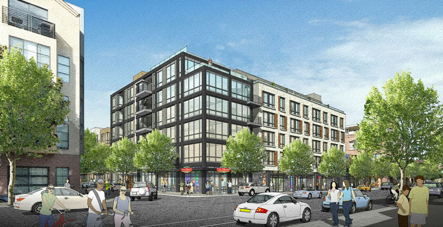
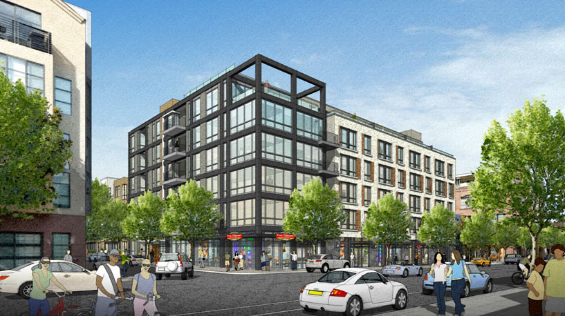
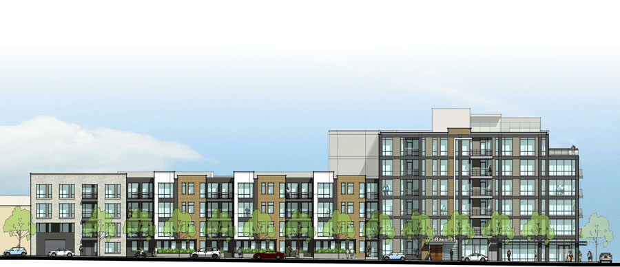
The cement plaster lattice which was originally intended to frame a phantom sixth floor on the corner of the proposed building to rise at Folsom and Rausch has been removed from the project’s final design, but otherwise the architecture for the development dubbed 99 Rausch remains fundamentally the same and is slated to be approved by San Francisco’s Planning Commission this week.
As the project was originally designed by BAR Architects:
Once again, the 112-unit project will rise to a height of 65 feet, stepping down to 40-feet along Rausch and 54-feet along Folsom, replacing the former Bay Lighting & Design building at 1140 Folsom, with 5,600 square feet of ground floor retail space (divided into two) and a garage for 84 cars and 104 bikes with its entrance on Rausch.


Why did they get rid of the framing? It was the one kind of interesting design feature of the project.
The building seems unnaturally cropped without the frame. The frame gave the building a finished, yet creative, look.
Under building. West soma plan is worst bs planning ever done in SF. Out of date before plan signed off on
But it’s the law. Did you attend community planning meetings to voice your concerns? I did.
You repeat this every single time. The one point you make is that people should participate in community meetings rather than complaint on SocketSite. So let’s all start going to the SOMA meetings and demand change to this plan. Nothing is set in stone, many cities including SF have done countless upzones. SOMA is the low hanging fruit for upzones in SF.
Futurist does this every single time when it comes to zoning, but trot out city regulations for the number of parking spots a developer must adhere to, and he sings a completely different tune.
But isn’t the way to affect change in a community by attending public meetings and making your voice heard? Same as the voter who never votes but complains about who won.
As for parking regulations, yes, I don’t agree with the reduced ratios for new construction. But I have voiced my concerns in letters and emails to the Planning Dept.
Can someone explain what ‘under building’ even means?
Agreed. I recently drove on Market Street especially past the Twitter building and I still see the old decayed buildings, lack of any storefronts, and the general mismatched architecture. The foliage of loiterers added to the misery.
What I find amusing is that the introduction of this new building will somehow greatly increase the width of the sidewalk on the other side of Folsom.
Live Smart: Mid-market is still transitioning rapidly after nearly 40 years of political folly. I work in the area and it is changing very rapidly, and those decayed buildings are either getting refreshed or flattened with new structures. Don’t you read this site?!
yet one more “design” change requested by the planning commission. this would suggest that some “architects” in the planning commission know better than architects who submitted original design…i think not!
really bland design. Needs more empty framework, not less. Must be up against NIMBY neighbors
I live on Rausch, I’ve attended numerous meetings with neighbors, with the developer, and now even with planning department about this building. I personally thought it looked better with the open frame at the top. I don’t believe they removed it in response to neighbors, I think it was in response to planning. I could be wrong about that but it’s the impression I have at this time. I have definitely heard mixed feedback from neighbors. Some liked it, some didn’t. Some people voice an opinion against the heavy dark color of the frame as being too dark. At the planning commission meeting this past thursday one of the commissioners voiced a request for more “whimsy” and a dislike for the repetition in the design facing Folsom. I would also love to see it look more creative, maybe more abstract/irregular instead of a simple repeating pattern. Why not make it look really cool instead of trying to blend in and disappear? Of course the more unusual it is, the more you’ll have people both strongly in favor and strongly against.