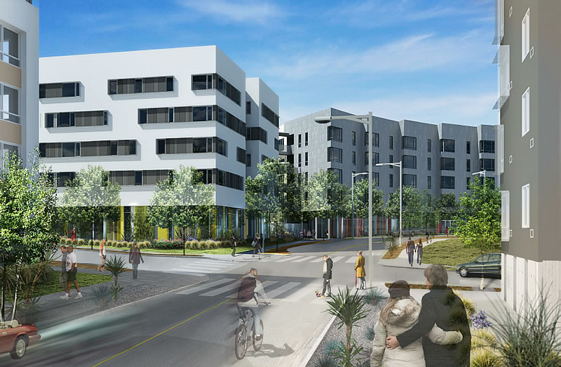
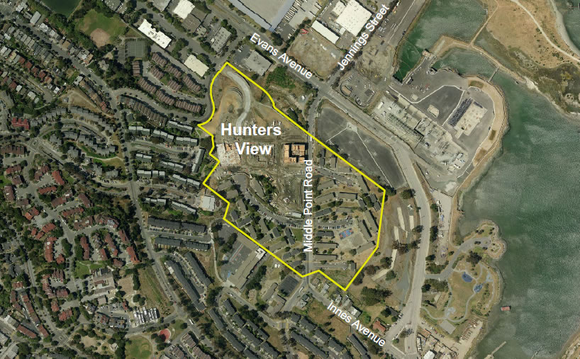
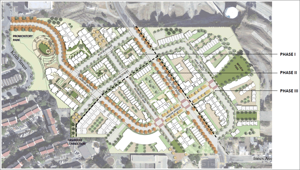
The rebuilding of San Francisco’s 22-acre Hunters View public housing development into a mixed-income neighborhood will triple the number of dwelling units to 800 – half of which will be market rate – and create three new neighborhood parks, a new community center, and neighborhood-serving commercial space.
The heart of the new neighborhood will be Block 10, a five-story building to rise on Fairfax Avenue at the southwest corner of Hunters View.
Block 10 is envisioned as the primary civic and commercial hub for the community, and ground floor uses will contain a community center, childcare facility, leasing office, and retail space. The ground floor will also include a one-story at-grade parking garage accessed on Fairfax Avenue that will hold 18 parking spaces. The upper four floors will contain 72 dwelling units (40 one-bedroom and 32 three-bedroom units).
With the entire ground floor devoted to community uses, Block 10 will be the “heart” of the neighborhood and create spaces for Hunters View residents to engage with each other and the broader community. Block 10 will also include a mixed-income daycare facility on the ground floor directly adjacent to Ironwood Park.
Designed by David Baker + Partners and Paulett Taggart Architects, Block 10 is part of the second phase of redevelopment, the infrastructure work for which is underway and will include the construction on Blocks 7 and 11 which is anticipated to begin this October.
Phase Three of the redevelopment will include up to 400 market rate units and a new Bayview Park.


What a beautiful suburban office park.
Wait, what…?
What’s up with the ugly buildings being proposed. Another ugly design coming out of David Baker Assoc….
Why is his office getting a lot of these low income/ market rate housing commissions? Is it because he designs stuff that looks like below market rate or because he comes up with cheap designs or is it because his office wines and dines the right people?
Just saying, his designs look like low end Heller/Manus and that’s saying a lot!
whether you think their work is ugly or not it sure gets published a lot so….
i think they’re a great firm and they are able to pack a lot more design into an affordable building than some firms are able to in a market rate building.
The new buildings might be ugly but they look much better that the existing buildings that were built to house US navy personnel during WW2.
don’t see much “heart” here. but then Fillmore Center was supposed to become the “heart” of the Fillmore too. funny how that worked out.
maybe at least a few signs of some kind might help?
The Fillmore Center blocks are actually pretty lively. The high density helps the ‘hood. The gym helps. It would be worse without them. The problem is that there isn’t MORE.
And a hat-tip to the complex’s maintenance staff who do an EXCELLENT job.
Gotta love that Urban Renewal.
I don’t love it. But it’s way, way better than low-rise.
you miss the point. there is no sense of ‘place’ in Fillmore Center or near it, despite all the people.
in this Hunters View perspective, besides all the cheap landscaping do you see any useable outdoor spaces connected to the retail? do you see any local gathering spots? do you see any colorful store signs? heck, do you even see a stop sign for safety? do you see any neighborhood personality at all?
Part of the lack of a sense of place in the lower Fillmore is the surrounding neighborhood (where I live). It’s a generally low-income area and that puts the businesses in the area in a tight spot. Also, in regard to outdoor areas, the weather doesn’t help, what with the fog blasting in most afternoons.
I’m in complete agreement on the horrible design of the Hunters View area. Utter failure.
BobN, you do know what the Fillmore was before urban renewal, right?
Yes, I do know what it was. I’m not glad they bulldozed the Fillmore.
I’m just saying that the Fillmore Center is far, far preferable to low-rise housing.
Looks like old East Berlin. In the worst kind of way. And what’s with the name “Hunter’s View”. vurp
Heart? More like a hollow core.
Someday we’ll find it… the Cashmere Connection…
Yeah, design is kinda meh. But it should be a significant improvement over…what is/is not there now. So I’ll take it, and hope the market rate component is successful.
This looks just like the housing estates thrown up in the 50s, 60s and 70s all over the UK. Drab, monolithic buildings set back a few feet from the street and surrounded by little plazas that no one sits in.
In other words, it looks like all the rest of SF’s public housing.
What a wasted opportunity.
Why in the world is this not at LEAST 5x as dense? This is a travesty.
Public housing density has had a history of not working out very well for most involved. (cf. Geneva Towers.) It’s really not the worst thing that they’re treading lightly here.
Um, who in the world said anything about public housing? I’m saying make it 5x as dense, with all of the additional density added being market rate. The point is that we need to dilute the new public housing being built by as much as we possibly can.
I can’t believe all these comments! Do you have any idea what this is REPLACING?? This is a huge improvement!
I’m really not convinced that it is. It’s just a newer version of the same crap. This area needs significant density more than just about anywhere else if it hopes to turn the corner, bring in some new folks, and become a nice area.