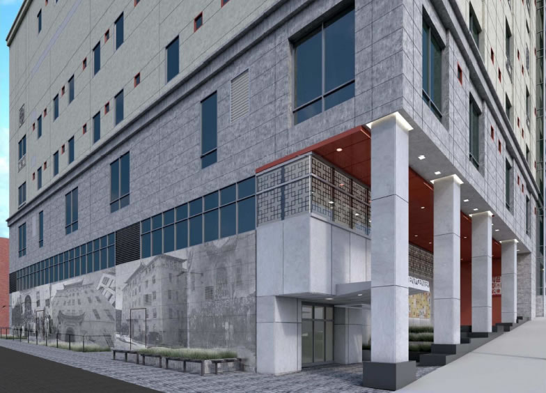
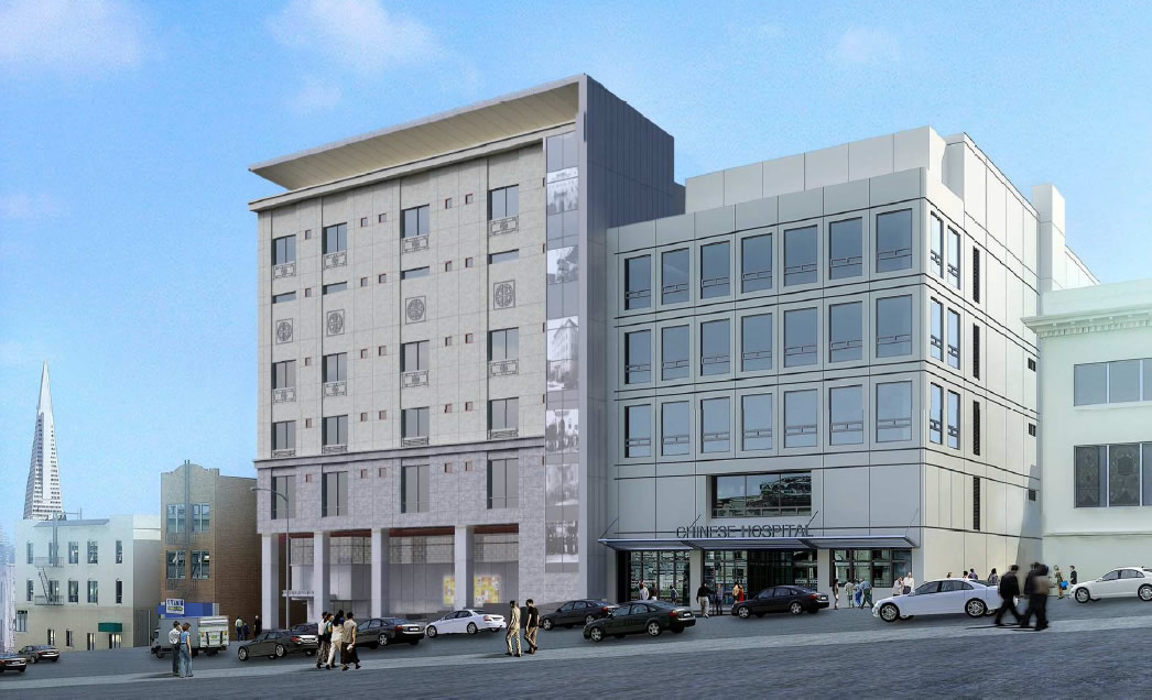
With the birthplace of Bruce Lee having been demolished and construction of the new Chinese Hospital at 835 Jackson Street underway, the designs for the new hospital’s façade and alleyway have been “enhanced” to be a bit more hospitable.
The north elevation includes revisions to the terraces to add more planters, remove stairs, and add natural stone pavers. Low-relief medallions designed with Chinese iconography have been added at the 3rd, 4th, 5th, and 6th floors. The stair glazing on the north elevation has been revised to incorporate silkscreen historic images of the old hospital.

James Alley has been enhanced to include pavement matching the terrace pavers, planters along the alley, bicycle rails and seating. Additional lighting has been incorporated to allow use of the alley in the evening. Along the east elevation, an art mural has been incorporated covering the entire length of the wall. The mural will cover and mask all doors and louvers.
The new Chinese Hospital is now slated to open in 2017, at which point the current hospital at 845 Jackson Street will be remodeled into a Medical Office Building and Outpatient Center.

I don’t see much improvement in the new design. Boring.
Bruce would probably give it a quick kick.
It looks too bland.
while i think historical preservation is really important i think it’s a bit much to decorate a building with images of the building you just tore down. maybe a display inside the hospital showing its history would be more appropriate.
in 50 years when they rebuild will they clad the new hospital with images of the old hospital clad with images of the old hospital?
It’s not a “bit much”. what matters is that those changes made now relate and reflect the needs of that community NOW. that’s what is important. 50 years from now or 100 years from now, why does it matter to you what they do now? You’re simply thinking very small.
The “display” as you call it could also change in 50 years with an interior renovation.
i’m just curious as to when they’re going to let go. covering a new building with images of the old building that used to be there sends a message that architecturally the new one can’t stand on it’s own and that it’ll always be in the shadow of the historic building. it’s a conflicting message.
No, that’s not a conflicting message at all. It’s a message about the historical aspect of that site and the original building. Those images mean something to the local residents.
It has nothing to do with whether the new building “can stand on it’s own”. these minor decorative elements are hardly changing the architecture of the structure.
They are merely respecting the history of that site and paying respect to the residents.
Considering what you’re referring to as “minor decorative elements” cover panels that are some 16’x100′ on one side and an entire six story panel on the other, I’d argue that these are not “minor” at all. To be blunt, they are more like a cheaper and tackier version of facadism. A continuation or further expression of the ornate details like the medallions would have been a more appropriate expression of the historical notions of the site.
Murals are always inauthentic and sad. Better to forget the old structure altogether now you can’t erase the mistake of demolishing it
Rediscovering the past to understand the present is an ancient tenet of Chinese philosophy. The Confucian version is something like ‘warming up the old in order to know the new’.
It is especially important in a building that holds the passages of lives at the center of a community.
Being on the face of a multistory stairway conveys confidence in both future and past.
I wonder if they are translucent so they can be seen at night.
Thanks Jake for the thoughtful and intelligent comments. Much appreciated. You have added more meaning to what I have been suggesting.
Its like Rose Pak and Calvin Welch must have gotten together with the folks over in Colma to come up with this gawdawful mausoleum.
There are better ways to use a photographic record to reference history. What is done here reflects the ease and cheapness of “panel printing” rather than honoring the old building. It is crass and already outdated. Try again and the solution needn’t be visible from the satellite view.
The rest of the changes to the building do improve over the previous design though.
from awful to mediocre – that’s progress!
Obviously they are (or should be) embarrassed about destroying a fine building with the “token”
reference to it in the mural . . .
The fine building you are referring to out of date and functionally obsolete: architecturally, technically, structurally and inefficient in terms of health care way finding and best use of spaces. Upgrading it, which yes, could have been done would have cost almost as much as a new building, but still left with a deficient building of low floor to floor heights and many other major negative issues.
Adding the murals and other symbolic elements of the old building does NOT embarrass anyone. They simply pay respect and offer a visual connection for the community.
I am appalled at the mis-informed negative comments here, when in reality, the changes are very small and the Chinese community is gaining a much needed completely new facility.
I understand the desire to reference the old building but the way it is implemented with photo murals made of mediocre images and assembled in a pinterest-ish collage is a poor choice. It is reminiscent of those booths found in 1980s shopping malls where any crummy photo could be made into a T-shirt. It was novel at first, now just banal. The project sponsors think that they found a cheap way to appease those who will miss the old building.
They should try harder and get someone with artistic talent involved. There might still be a few left in SF.
Honestly MOD, I am trying hard to hear what you’re saying, but your point of view represents so much of what is wrong with the SF “process”. Every single change to our environment (in any form) is criticized with the opinion that “something must be better than this”. Of course you have no idea what could be better, except that something else would be.
The opinion you express is echoed by many others. Nothing as presented is good enough. There is an air of arrogance that surely YOU know something else is better, more artistic, more this, more than. And it comes across, not with any unique or special knowledge (except to compare the murals to a crummy photo booth in a shopping mall.) Nice. You have no knowledge as to the sponsors found a “cheap way” to appease the community.
My focus here as always been to take time to UNDERSTAND the process of how a project got to where it is today; understand the changes that were made, understand the complexities of that process (which I do), and support that achievement.
Don’t take my word for it. Ask around.
Well said, Futurist.
I live in a cardboard box by the side of a road in Marin. Some of you will say it’s too big and ostentatious (heck, it says Amazon and it’s 8’ x 8’ x 4’ – and that must surely be over the top for you), and some of you will say how shocking that I’m forced to live in such a structure (bless you). Some of you will tell me I’m a snob for being in Marin and that I should move it to Daley City or maybe some new FEMA tsunami zone designation, and others will say I should be located on Union Square above some nice heat vent (bless you). Some of you will bemoan the sharpness of the box’s corners, and wonder why some ill-educated architect couldn’t make them more pleasantly rounded (crown molding you say: hey, remember, this IS a cardboard box), and others will offer to pay for me to study under Calatrava so I can landmark my cardboard box (bless you). I’m wondering how you’ll feel if I grab someone’s leftover carpet remnants to line the floor, or if I should remain in my life’s station by using old rags. I’m contemplating cutting little window holes in the box, but I’m afraid some of you will insult the dimensions and the locations of the holes (where did this idiot get his ideas from – some god-hating, left-leaning, uber-university?).
Hope all of you have fun with this. I look forward to the helpful positive and negative insights into many of these articles, but the rest of you folks shouldn’t be allowed out in decent society.
(borrowed from a NYC blog. Only the geographic names have been changed to protect the guilty.)