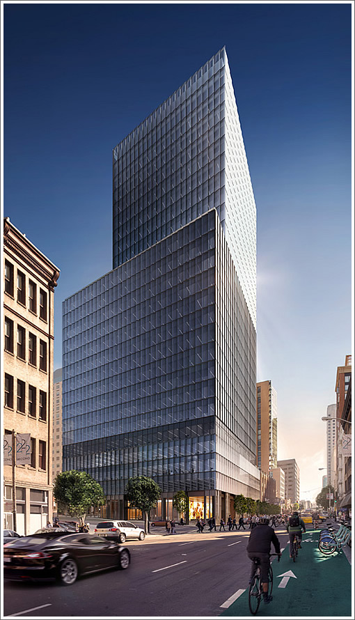
With work on Tishman’s 350-foot office tower to rise on the southwest corner of Second and Howard well underway, a project which was first approved for development in 2010, a new website for 222 Second is now online. A peek inside and around the building:
Wow! This building site is in the center of the SF universe. Who knew that Howard/2nd was still considered the FiDi. Oh wait. It’s not. It’s called SOMA for a reason.
Reminds me of a lot of the forgettable architecture in Midtown Manhattan, like the building I worked in.
no more views for one hawthorne.
I just don’t see why the building has to be that short and squat looking
speaking of no more views – the absence of the Transbay Tower and other buildings (already under construction) is a bit glaring… the characterization of this as a “midtown Manhattan” building is spot-on; I’m glad to see the height and density here, but the video’s a little over the top given what’s happening to the NE, E and SE of this site…
The little computer tour cannot conceal that this thing is a copy of what has plagued NYC for decades: ROI spreadsheets re-interpreted as high-rises. All have the qualities of a cinder block: sturdy, cheap, and no imagination. We can only hope that superior structures will eventually shroud 222’s anemia from the SF skyline.
Great example of pure modern, international style.
Not every high rise has to be a wacked out Frank Gehry or Zaha Hadid.
“We can only hope that superior structures will eventually shroud 222’s anemia from the SF skyline.” -John Hudson.
It’s short enough that it won’t show up or will be partially hidden from most angles anyways.
Also, I think it looks ok in the renderings. Yeah it’s a simple glass box that’s a little stubby-looking, but not everything needs to be an architectural masterpiece.
Sam, was your comment in jest? At 350 feet (26 floors) it’s hardly short and squat. For comparison, the taller of the two infinity towers is also 350 feet while the Hawthorne is 290 feet.
Sam was probably comparing the structure to the others being built within 4 blocks of it.
The only way this building would be interesting is if a couple having you-know-what had their parts plastered against the inside of the glass a-la the NY Standard Hotel at the High Line.
The glass facade is a modern tradition, and this tower has it in spades. Too bad it wasn’t a Zaha Hadid, like futurist suggested, SF needs some of her, but anyway this is a lot better than the Foundry Sq complex. Its been a surface parking lot for as long as I have known it.
There may be a place for Hadid in our future here in SF, or even a Frank Gehry. that’s fine.
But people need to understand that there is also a place for serene, calm, modern, elegant, refined architecture too.
I wish more people here would take time to understand the history and growth of modern architecture in America, instead of just (instantly) wanting a circus at every corner.
++++ futurist,
“a circus at every corner” describes Shanghai. As commenters have noted earlier, this looks like something out of Midtown Manhattan. I’ll take Midtown Manhattan over Shanghai every time.
I feel a little part of the mini-rendered-people’s lives slipping away when they walk in…
Can you smell the institutional carpet and the quiet whisk of the elevator doors? Blonde maple tables and room temperature bottles of water. “Please help yourself to a (Keurig) cup of coffee.”
Good looking building.
BTW, I still dislike that SFMOMA extension – the vid intro underscores why, it’s so oddly shoehorned / hidden behind other buildings, and Botta’s own great (if very much period-specific) original SFMOMA building.
Looks nice. I do think what they are doing in London is pretty interesting and a good model for integrating modern / interesting structures among older / traditional buildings. Would be nice to see some more of that here. My personal opinion is that these structures will be here a 1000 years so there should be some pressure or incentive to build something timeless. Still lots of land and time and for now, there is a demand for it. So let’s get it built already.
I enjoy the large headline at the site: “Endless Views. Limitless Possibilites” – is that something similar to “Possibilities”?
“Elegant and refined?” Uhmmmm, sure.
UPDATE: LinkedIn Snags An Entire San Francisco Tower To Call Their Own.
“I wish more people here would take time to understand the history and growth of modern architecture in America, instead of just (instantly) wanting a circus at every corner.”
The truth must finally be revealed – everyone posting here actually has a PhD in Architectural History from Yale. We all just play various plebian characters to entertain ourselves by driving other posters slowly insane, sort of like Sartre’s No Exit, but with stucco and bay windows.