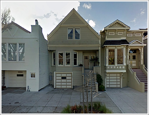
Purchased for $1,263,000 in November of 2012, the Noe Valley home at 1632 Dolores Street has just returned to the market listed for $2,875,000 having been rebuilt and expanded “with the latest in designer colors and quality finishes throughout.”
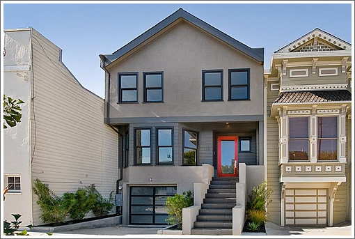
The kitchen within 1632 Dolores Street before and after:
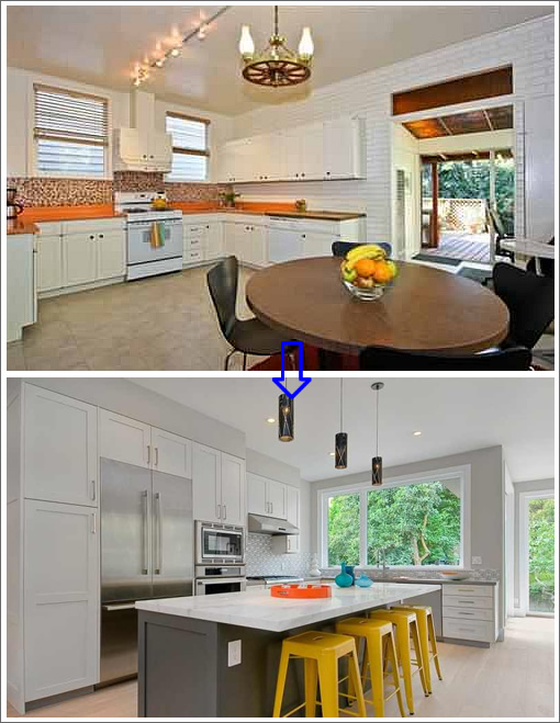
The open living area into which the kitchen now opens (which had been a separate living room, dinning room, and media room before):
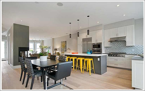
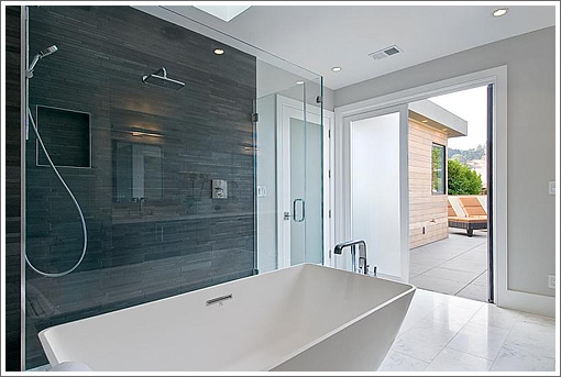
And the new bath above, there’s a new one below as well:
∙ Listing: 1632 Dolores Street (4/3.5) – $2,875,000 [1632dolores.com]
I’m not sure someone didn’t get the before and after facades switched. Ech.
Nice job of modifying the roofline to create more upper floor space. For some reason that facade looks a little off though. That heavy handed stainless hardware on the stairway also looks out of place.
I will admit that I was not a fan of the previous bathroom (purple!) and kitchen, but man I am NOT A FAN of the renovation. Usually I don’t mind when these older buildings are “modernized” but this place really lacks soul. I hate the new flooring and can’t believe they ruined the staircase. 🙁
There are two other $2MM+ places right near this place on Dolores.
1685 Dolores for almost $3MM and 1688 Dolores for $2.3MM and i think they were all purchased and rebuilt..
I find it hard to believe this 2-3 block section on Dolores @ 29th & 30th could support these type of prices…
I thought facade and street-facing roofline modifications were verboten on pre-1950s homes in San Francisco. Does anyone know how the developer pulled this off (and in a pretty short time frame, no less)?
I have to hand it to them that they definitely improved the interior, even though I still fail to see why every SFH has to live like a loft on the inside.
They should have made the listing copy read “…with the latest in designer colors and quality finishes throughout the interior.”
These Dwellification flippers are ruining the aesthetic fabric of San Francisco neighborhoods. Why would you leave/restore the texture of the siding around the bay windows when you went out of your way to remove every other feature on the facade?
But I realize I’m in a distinct minority, and with so many arrivistes bringing their preferences here along with their equity and wealth, I’m sure it’ll sell at asking or higher and the flipper(s) involved will chuckle to themselves all the way home from the bank.
Which will motivate the next flipper to ruin the next traditional home. Lather, rinse, repeat.
Original permit was approved back in 2008, before the Planning Department cared so much about boring old buildings.
While it’s nice they increased usable space inside, now the top floor looks too visually heavy for the rest of the house below it. The proportions are all off.
So has there really been a dramatic change over the last five years in how the Planning Department enforces historic preservation norms?
Also not a fan of the remodel. Why they chose to remove all Victorian aspects of the facade escapes me. I would think a Victorian exterior would have far more curb appeal, especially given that the building next door is Victorian as well.
This facade will look dated in 10 years, but a Victorian facade is classic….
Looks like a tornado dropped a double-wide on top of this place.
In 30 years there’s going to be a bunch of gut rehabs that create separate rooms for the living room, kitchen, and dining room.
If you ever cook, you know you want to be able to close off the kitchen from guests so you can enjoy dinner without looking at the mess. If you do only take out, doesn’t matter. But then you can make the kitchen really tiny.
Although the facade has taken a bunch of lumps already, they are well deserved. Facade, here is another LUMP!!! Horrible. Don’t architects learn about proportion and scale and artistry – or do they just assume their clients know nothing about these?
Red. Door. Stupid.
3words
Terribly incompetent exterior design:
-top floor is heavy handed in proportion, barge board trim is devoid of any character and too heavy.
-windows lack vertical proportion, and trimmed out very cheaply.
-poor handling of the exterior side wall gutters at the roof; there are other ways to do this. Exposing the downspout to the storm system this way is visually ugly, but cheap.
-not a fan of the open interiors, as I have said before here, but that seems to be selling.
How do obvious code violations like mounting an outlet underneath an overhang at the island get passed through final? Inside is nice but outside is a shame.
Feelings about the facade and finishes aside. This is a massively high trafficked few blocks in the morning and evening commute. Seems like a ridiculous amount to spend to have trouble pulling in and out of your driveway if you ever plan to use your car. Also, it surprises me that block would support this price.
Hideous yet bland.
The best outcome would be the market refusing to pay for this rubbish. If the flipper ends up losing money, this kind of cheap work will stop.
One does not have to be old to think this price for this poorly redone house in this marginal street is unreal.
Little details that are a little off. The backsplash on the bar not matching up with the cabinets above it. Backsplash in the kitchen also just ends with white space above it, visually a little off. The hardware in the staircase is just weird. Is that glass tile on the floor of the shower where it is likely to crack with temperature differences?
But it’ll sell. The tech buyer/equity-rich population is not typical. It doesn’t matter about commute hours – they might work from home or have flexible hours. Open kitchen? In this foodie world, they likely go out to eat a lot (location is key) but still want to have a beautiful, occasionally used kitchen where having a clever dinner party with wine drinking around the chef as they discuss macaron making or something. Facade not beautiful but at least “new” looking. 4 bedrooms? One is definitely going to be an office and the other two allows room for maybe a kid or two, and then also an exercise room or au pair/nanny.
Not perfect, rather bland, but no real big dealbreakers in terms of floor plan.
Yes, an open kitchen sells as “I’m an awesome chef” but reads as “I never cook beyond reheating leftovers.”
The kitchens of tract homes built in the 1950s through 80s weren’t flashy but were generally very good places to cook. Now we’re entering the era of Potemkin kitchens purposed with propping up egos rather over being great workspaces.
We don’t get good architecture, we get what sells.
kicthen and baths seem nicely done. the photo of the rear (38/79) makes it look fantastic, but:
-why are the family room outlets so high on the wall? (photos 31 and 36)
-why do you need 32 photos of the neighborhood, especially with so many of 24th st?
-why is the front so ugly?
The top floor of this remuddled house is a monstrous carbuncle on the visage of an old friend.
Oh yeah, regarding the heaviness/awkwardness of the top floor: part of this is due to how it was photographed and processed. It looks like the editor swapped in a different oblique photo of the facade which isn’t quite as bad. But if you go to the listing website you’ll see the straight-on shot of the facade. The photographer had shot with a wide angle lens up close and needed to manipulate the photo to counteract the distortion and make it look straight again. In the process the top floor is made to look larger and more looming than it really is. Photography fail.
Still that doesn’t explain all of its homeliness. Maybe the contrast to the delicate detail of the neighbor to the right makes it look all the more brutal. Though the previous facade had less detail compared to the right neighbor, it was a lot more harmonious.
Don’t care either way about the interior, I’m more surprised (@chad n. freud says it) about this price for this location.
The new exterior looks bland, but then the original house was not a looker either–especially compared to its much prettier and ornamented neighbor. I suspect the renovated facade was a result of the developer making a half-hearted attempt at “blending in” (massing issues aside) and trying to offer the least offensive design. However, the facade would have been far more interesting if the developer had instead put up an ultra-modern exterior rather than the bland neo-traditional facade.
1688 Dolores is in contract after being listed for $2.33M.
31 Valley sold for $2.82M.
3 more at 27th and Dolores sold for $2.5M+ in the last six months.
1685 is sitting on the market at $2.995M. I am convinced that they are going to have to come down a bit.
The neighborhood can support this pricing but I think this is a bit over priced. I predict it will end up moving for $2.7M. Why put your house on the market this time of year? Wouldn’t you do better waiting for spring?
This renovation was done in less than a year. It’s no wonder it looks so bland; they were more concerned with flipping it than giving it any real character.
The facade looks like half the houses in the Excelsior, where second floors were clumsily added to single-floor cottages decades ago.
Backsplash in the kitchen also just ends with white space above it, visually a little off.
No, silly, that’s where your “Le Chat Noir” print goes!
The quantitative analysis carried out by real estate people seems centered on PPSF * total SF = Price
Change the roofline, widen the useful living space yields more total square footage (remember yesterday everyone hating the 1250sf 3bed 2.5 bath)? That’s how we wind up with that funny roofline.
Agree that the interior design choices inside are fairly aggressive. And I agree the red door is over the top. Quite a few colors already on the front.
I still think families appreciate having a kitchen open to a family room/living room. Anyone who has had kids underfoot in a tight kitchen can relate.
I’m old school, a dying breed, whatever, but this is nauseating to me as are the people who will buy this place.
Sort of a geeky, awkward, ‘trying to fit in’ kind of design aesthetic in this place. Its a perfect fit to its target audience.
Ugly is the right term to describe the exterior work.
That “now” pic in a serious city would be all it takes to fire the entire planning department staff.
That new facade is ridiculous.
10 points for comment from “around1905” which references the Prince of Wales comment regarding the proposed addition to the National Gallery in London. That comment got “His Royal Highness” (the quotes are because I am not a monarchist) in such trouble with British Architects that a one hour BBC program had to be created and broadcast so that he could explain what he meant by those words.
“No, silly, that’s where your “Le Chat Noir” print goes!”
LMAO
Ugly does not equal modern.
The facade appears to mush a Richmond special circa 1950’s box house on top of a Victorian. Special all right – in a bad, bad way.
Poor San Francisco!
Exterior FAIL
One more comment. The failure here is one frequently seen in SF remodels and it has to do with size.
Developers try to cram as much house as possible into the lot. Here they went up; it’s an attic cram. Sometimes they go into the yard. They evince a frantic square footage grab and it mirrors American gluttony: for food, gadgets, housewares.
Fight house obesity!
This house is too big! That house is too small!
Why on earth do developers take out the walls?
You walk right on in and the back you do see!
This style is not quite to my liking, not me.
I hope no one buys it, that will show them I bet.
If things could just stay the same it’d be the best yet!
I’d hide in my room and I’d have some nice soup.
Those nasty house builders, I’d give them the schtup!
Why plaster cement doesn’t cost many bucks,
But Ed, Ned, and Fred know for sure stucco sucks
Sand and paint those Victorians, keeping dining enclosed!
(Though I heard it’s lots of work to do one of those.)
Why two bedrooms’ one more than anyone needs
Bundle those chirrens together with thneeds
Now my dog’s gotten lose, what say you you haters?
If she drops the deuce, I _might_ clean it up later.
Nahhh probably not, that rich man will do it.
When he’s furious his well crafted heel has gone through it.
Why into his works I’ve sure thrown a spanner!
Like the mess of this city that’s made by these planners!
If only a _serious_city_ San Francisco could be
Until then, funny rhymes, and hyperbole.
(After Ted Geisel)
soccermom you rock!
^ noevalleyjim was correct..1685 Dolores went down 200K
I think they wanted the house to look like Halloween because that is when they put it on the market…ditto to all the comments above, particularly about destroying the Victorian exterior. The house is a horror. Love the poem however.
A lot of the hate thrown at the house seems to be directed at the people who might buy it, rather than the developers who flipped it.
Don’t mistake it, I hate the facade as well. But there are some merits; the backyard looks nice and the kitchen does not have as many shortcuts as taken by other flippers at this price point. The choice of flooring finish throughout I’m afraid will time stamp the reno down to the minute. Even with money, that is a PITA to update.
The listing price of 1685 Dolores was marked down $200K to $2.795MM..it still has to sell
NoeValleyJim said it would sell for $2.7MM, so his prediction looks better but someone still has to buy it..
I have no idea how they got around the resource evaluation and impact portion for the facade and roofline alteration, except that maybe in 2008 the current review process was not in place.
Poor, bastardized house. What a horrible shame.
If the current owners get the asking price then they are going to make out like bandits ,
that’s a gross profit of $1.6 Million before costs and just a period of 1 year !
the place is in contract
I saw this open house last weekend. I think the agent there is one of the owners.
The place has decent, new interior, but it didn’t make me want to spend $2.8m. Who am I kidding, I don’t even have $1.8m.
I am guessing the cost for remodeling is probably about $700k?
this sold for $2.75MM. NVjim was very close..