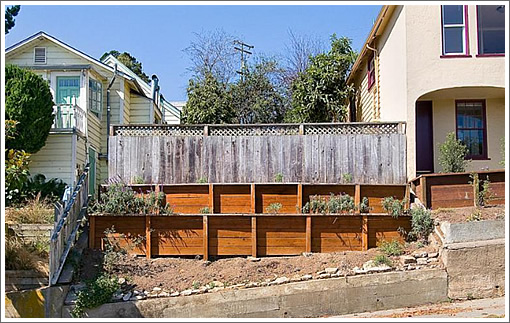
The undeveloped Glen Park lot at 30 Conrad was purchased for $310,000 in February of 2012 without any approvals to build, approvals which were judiciously secured.
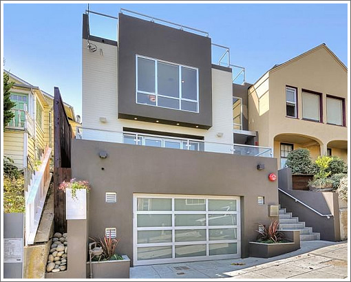
And upon the lot, a contemporary three-story over garage home has since been built.
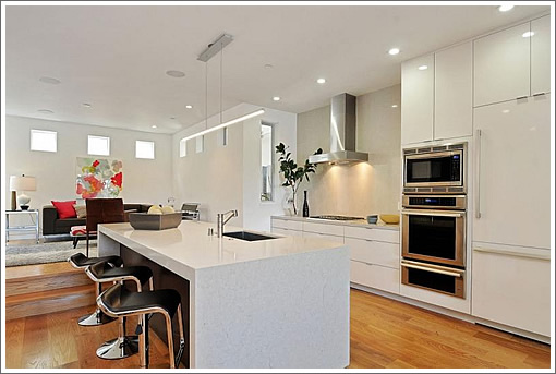
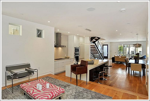
Designed by Felipe Rodriguez, a steel, glass and wood staircase connects the floors:
And while the Glen Park pad hasn’t yet been listed, it has been priced at $2,749,000 with room for two cars in the garage below, a roof top deck above, and four bedrooms in-between.
∙ Listing: 30 Conrad (4/3.5) – $2,749,000 | Floor Plans [30conrad.com]
ok, i’ll say it. that is the most hideous new building i’ve seen in a long time. With interriors to match. C’mon folks….an empty lot is a great opp to add a beautiful building and not just max out Sq footage for max resale. this looks like it could have been built in the 70s.
Not my favorite contemporary home in recent memory but certainly not the worst. The builder has taken the Noe Valley new construction formula and has applied it to Glen Park. Conrad is a nice street but there aren’t too many homes that have sold for this price in GP. I’m guessing it will sell slightly under asking. Either way the seller is going to make a bucket-load of money.
This is a nice addition to Glen Park:, clean, contemporary expression, with appropriate setbacks and massing.
Simple exterior materials and coloring; not over-designed.
Clean, open interiors (spelled with 2 r’s.
As older properties, like the yellow cottage next door become in disrepair, or lack space for new families, this is the evolution of lots and buildings in our neighborhoods.
@seth rogers, agree … although I think the sfh that has just been completed at 3020 Laguna and is on the market for $4.5m gives it a run for its atrociousness money.
Giant boxes on the hillside,
Giant boxes made of ticky tacky,
Giant boxes on the hillside,
Giant boxes all the same.
There’s a grey one and a beige one
And a dark grey one and another grey one,
And they all have open concept floorplans
And they all look just the same.
Good SF recycling! Clearly, the terrace boards on the empty lot were used for the house’s new floors.
Snout house.
Come on folks…love it, hate it, don’t care, not my style, etc. Your points are?
Building on Futurist’s point…as people need more space for whatever reason (surprise sextuplets, drooling old parents moving in, obsessive hoarding habit, etc.) I’d rather see a property completed gutted or torn down to the curb than a crappy addition that fits neither the existing house nor the neighborhood. In this case they were able to start from scratch and since it’s not a historic neighborhood the builders/owners were able to construct something to their liking. I live out in the Sunset and have seen some terrible remodels of those typical 2 bedroom stacked units (garage/entry on ground level with living space above). (Worse yet are the fugly “pop ups” afflicting Washington, DC rowhouses.)
Mark, our points are they are ugly and not a good fit with the surrounding buildings. And your point about drooling old parents is not appropriate.
Take that 50,000,000th quote of Pete
Seeger’s cover of that Malvina Reynolds song over to sfgate
where 15 other noncriticL thinkers who quote it in every post about new Sf construction will give it a thumbs up.
Mark is simply expanding on what I said, and that’s simply part of the process of this ever changing, growing city. and he’s very correct about some of the horrendous remodels and additions out in the Sunset.
This project hardly fits that description. and sure, we can debate endlessly the merits of “good” design, or “fitting in” with the surrounding context. But, the Planning Code clearly defines setbacks, massing, shape, form and other metrics.
Whether you like this project or not because it is modern and NOT like the adjacent properties is always up for debate.
I like it. It fits and it’s appropriate in scale, detail and materials.
You may or may not like the style, but it is fair to discuss merits of the execution of the floor plan and the finishes.
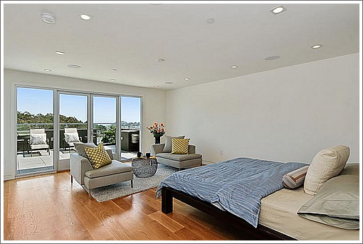
Maybe its due to the angle of the photos, but I find the ceilings to be very distracting. There are a ton of cans, speakers, alarms and other stuff on the ceilings. The “swiss cheese” ceilings are made all the more evident by the spare design of the walls, floor and architecture.
I find the main floor storage to be a bit inadequate. There is just a small coat closet on the main level and the kitchen (and storage) is relatively undersized for a four BR home.
@Anon:
I’m just bored. Bored of the same boring boxes with the same boring open floor plans and the same generic paint colors. It is a style thing really, not a complaint about new construction. I altered the lyrics to reflect my perspective. Just like noncritical defenses of any new construction project regardless of merit bores me.
I would agree with Gur on those points. The use of downlights randomly all over the ceilings is a terrible cliché, and a poor lighting solution for many rooms.
Lighting bedrooms with recessed downlights is just plain bad design.
The coat closet is a joke and very small.
The kitchen is woefully lacking more upper cabinets. I still dislike kitchens that are completely OPEN to the largest spaces in the house. There is no definition of space; any clutter and noise and smells in the kitchen, which are NORMAL are there for all to see. While I like some open interiors, there should be more thought into the kitchen placement, functional design and some walls to separate it from the main living area.
The “powder room” (I despise that name) location is in a terrible location, offering zero privacy from the dining and living areas, when one wants to use it. Again, poor design solution.
This isn’t even good contemporary.
Just addressing the exterior, I agree with seth rogers & Oceangoer that this building is butt ugly, even when taking the style, such as it is, into account but I’d be lying if I said I hadn’t seen uglier new construction homes recently. 2827 Greenwich Street in Cow Hollow was arguably worse as far as negative curb appeal. I’ve also seen much, much worse clashes with neighborhood context. Neither means this place is excusable, though.
Then what is “good contemporary” by your definition? Are there metrics you can point to, or is this really just about personal taste, and opinion?
And saying “butt ugly” just moves the conversation backwards. I believe you, or others have brought up the “clashes” issue before. But isn’t it a fair point to suggest that the existing little “stucco-ized” former Vic next door just as clashing?
Do you just want sameness, uniformity, standardization, similarity, conformity, or what?
I think it would be valuable any time someone on this site has a critique of a design to offer a link or picture of one they think would work better (words can only do so much). This would serve to both educate the audience about the poster’s positions as well as generate more valuable discussion, in my opinion. It would also serve to eliminate the waste of energy that is the cliche internet “meh.”
“the waste of energy that is the cliche internet “meh.””
Just because it’s cliched doesn’t make it untrue. Translate “meh” to average and it becomes unsurprising that a lot of design work is average. Average is an easy target to hit for builders and is at least inoffensive to a wide swath of the population which helps get multiple bidders for a house. But the rational for it doesn’t make it any less average.
It makes sense that McD’s makes the burgers they do for a mass market, but you’d be awfully disappointed with a big mac at the French Laundry.
Maybe $2.8M is the new dollar value meal in SF real estate, but especially if that’s true it’s very much worth commenting on.
I don’t find my comments or anyone’s here a “waste of energy”. that’s just being dismissive.
A lot of us like the dialogue back and forth. I personally don’t see any value in posting a link of a property to compare with the one I am talking about. All that would do is add more and new comments about the posted link, and probably divert the ideas of the subject property.
We all have tons of opinions, thoughts, comments and criticisms of projects built all over SF: I am no exception.
I just don’t like comments like “butt ugly”, “boring” or “fugly”.
Adds nothing and those types of words are, indeed, a waste of energy.
“Bored” is an interesting choice of wording. As if sfre
is supposed to entertain you. Cause it isn’t. People like open floorplans. Deal with it. And if entertainment is ao important, then be original yourself and leVe the tixky tacky song over at sfgate ….
Anyway, from the vocabulary a lot of you bashers use, “meh,” “butt ugly,” the ticky tacky song, etc? Y’all aren’t exactly flashing any knowledge of design, or architexture writing skills.
It’s like, nothing to say? Don’t like it? Fine then. Don’t buy it. but son’t bore me talking about how you’re bored.
Feh. Not bad, a bit dreary.
But I have a question about contemporary home style. Anything the least bit ‘cool’ has to completely forswear homey or cozy. Only in low brow suburban tracts do developers add tacky but homey features – an arch here, a nook there.
It’s just weird. Why are homes not allowed to be homey anymore?
Island sink – ugh. Especially in such an open space, is going to be so cluttered with drying pans, dishes etc. Would not buy.
“The kitchen is woefully lacking more upper cabinets. I still dislike kitchens that are completely OPEN to the largest spaces in the house. There is no definition of space; any clutter and noise and smells in the kitchen, which are NORMAL are there for all to see. While I like some open interiors, there should be more thought into the kitchen placement, functional design and some walls to separate it from the main living area.”
Very true. At some point there will be a change in trends and some of these open kitchens will be semi-closed creating separation again. Still… this is a really nice place. Not sure what all the complaints are about.
It’s striking that the land value here is just over 300k while the lot and building together is asking 2.8M. I was under the impression that the historical ratio of lot to building value was more like 3 or 4. This place, with a ratio of 8, is either way over improved for the neighborhood or makes the point that it is not land that is inordinately expensive in SF, it is building costs.
@ Adam: Bored of the same boring boxes with the same boring open floor plans
Because small, boxy rooms are sooo much sexier!
@around1905,
No, you’re equivocating across time and markets. The lot would fetch 700+ today. It was purchased in 2010.
You have to actually visit the house to appreciate it. It is a fine house.The house is well laid out.It is bright and new.The decks are fabulous with smashing views.The bathrooms are great and the back yard is lovely ,a perfect size for family lunch or any gathering.Well done to the team involved in this building!!
A wet bar in the master bedroom? The dorm room I always wanted…
Just had a great tour of this fine home yesterday. Love the whole thing! A fine home in a great sunny location. It has it all.
The spin is more believable or at least more entertaining if you can point out some minor flaw:
“The only thing I couldn’t figure out was how to use so much space!!”
“I’d better buy some more clothes for closets that spacious!”
“Seems like I will need to upgrade my pots and pans!”
Don’t worry about all the negative folks here. Looks like a great project and a smart 2010 buy. It will work out…
2012 buy I mean…
Wow! What a nice home! Went to the preview yesterday evening and I must say, the pictures on this blog don’t do the house near a justice as reality does. The evening views from the many decks are just magnificent, especially the roof! Prices these days in the city for modern luxurious homes like this one are all comparable and this one isn’t any exception. The spaciousness that hits the eye when you walk in the door and the lovely bathrooms are unlike anything I can find or see in new property in the city these days. I must say I love this house and I’m looking forward to bringing my realtor with me for open house Sunday.
Cozy. That is my one word. All these new homes lack cozy. For example, you open the front door and you are in the house…no hallway. It is all open and exposed. I can’t believe that people spending this kind of money at some point won’t wish they had a dining room. This continued “restaurantification” or W hotelization of the San Francisco housing stock is very unfortunate in the long run.
The other thing is the garage…it appears to be a one car garage. Like all these new and/or remodeled homes in Noe Valley they are only doing a one car garage. Hard to believe that a “family” with a four bedroom house is going to have only one car. I think we will see a backlash in one form or other against this, probably in the form of more restrictive parking or higher fees for parking permits in neighborhoods. But of course everyone will be getting rid of their cars, so maybe I am wrong…
self promo comments like these are highly entertaining:
“Wow! What a nice home! Went to the preview yesterday evening and I must say, the pictures on this blog don’t do the house near a justice as reality does. The evening views from the many decks are just magnificent, especially the roof! Prices these days in the city for modern luxurious homes like this one are all comparable and this one isn’t any exception. The spaciousness that hits the eye when you walk in the door and the lovely bathrooms are unlike anything I can find or see in new property in the city these days. I must say I love this house and I’m looking forward to bringing my realtor with me for open house Sunday.”
just a reminder folks…people interested in specific houses don’t spread that enthusiasm since they want to actually buy the house (hypothetically). I do appreciate the effort on the part of the owner to write these fake comments though.
Tearing out all of the walls and creating one large amorphous space is the probably the easiest form of space planning out there. Just stick a kitchen here, a dining room table there, and a couple of couches around the fireplace and voila! When you have seen countless variations on this theme you start to get picky. Do the kids hang out in the “media room” while the parents finish their dinner party in the dining zone? Can I watch my loud movie while you read a book in the living quadrant? Does that kitchen have enough storage for a serious cook? This home has nice finishes but when I look at that first floor those are the things that I notice. And for those who are being down on the criticism- It’s a house! Does it have feelings all of a sudden? Someone will snap this place up in the next month, regardless of what some random people think about it on the internet. Perhaps in the meantime the contractor/owner and the PR folks at the agency can grown thicker skins.
I don’t think saying that a newly-constructed home is “butt ugly” moves the conversation backwards as much as it expresses — yes — my personal taste and opinion about the architect’s design and the contractor’s execution/realization of it.
They produced a home that’s unappealing. That’s it.
I don’t think it’s at all productive to have a discussion about that kind of thing with those who have a highly-developer postmodern aesthetic sensibility that rejects even the concept of any modern object being “ugly”.
It’s fair to point out the ruined former Victorian next door. In fact, that’s why I said this wasn’t the worse case of clashing with the neighboring homes that I’ve seen recently.
Then I would encourage you and others to use words such as “unappealing” instead of butt-ugly.
But I don’t have a clue as to what you are trying to say in your paragraph about “highly developer….”
Clarify?
Hi FOLKS
Loved this house as I strolled thru it on Thursday evening . The space is just what one wants
The shill bus has pulled in.
Poor Futurist. It’s open house today
The house is quite appealing, actually, Brahma. It has 3 food size bedrooms 2 ba’s on one level, a lot of openness, aeveral outdoor spaces, views, lots of light, contemporary style, and a big garage. So yeah while it is valid to come here and critique execution, saying it is all together unappealing is a crock. But then again you pretty much never get anything correct when you post. And post. And post.
I went to the open house yesterday. It’s a very nice home. My biggest complaint is the placement of the kitchen island. It is flush against the step up living area which is somewhat awkward. Also, there are great views and I would have moved the living area up one level to take advantage of them.
Sez Anon: “Bored” is an interesting choice of wording. As if sfre is supposed to entertain you. Cause it isn’t. People like open floorplans. Deal with it.”
No — SOME people like open floor plans. Many don’t. I think most people buy homes not because they find exactly what they’re looking for, but because they find whatever they can afford that’s available. I think Nate’s got it right: open floor plans are easy to design. And cheap.
Having built both open designs and more traditional layouts in SF neither traditional or open is easier to design. These tradeoffs also really don’t have much of an effect on the overall costs. Right now trends are for more open designs. I personally like some visual and architectural separation of living spaces while still keeping an overall open feeling. I don’t like the kitchen to be in the living room either…
People, some people …. Tomato tomahto. Enough people.
And the trend goes hand in hand with other lifestyle trends such as people freaking out if their kids are out of their sight, or food trends and the way folks entertain around the kitchen nowadays.
Pending after 3 days
“Pending after 3 days”
Not surprising. A unique home that would probably be another 500K more in Noe Valley.
Rumor has it it’s pending north
Of 3m