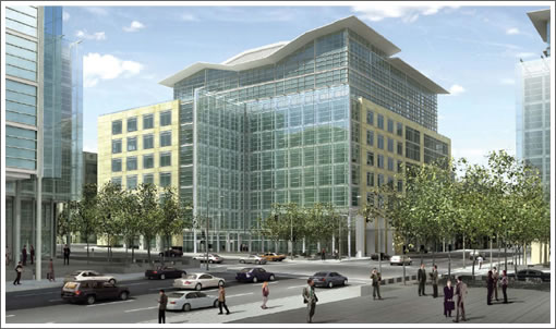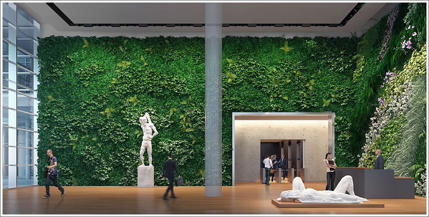
Under construction and nearing completion at the corner of First and Howard, the ten-story Foundry Square III will yield 275,000 square feet of “open collaborative” office space. A 100-foot long living wall will adorn the building’s lobby (click renderings to enlarge).

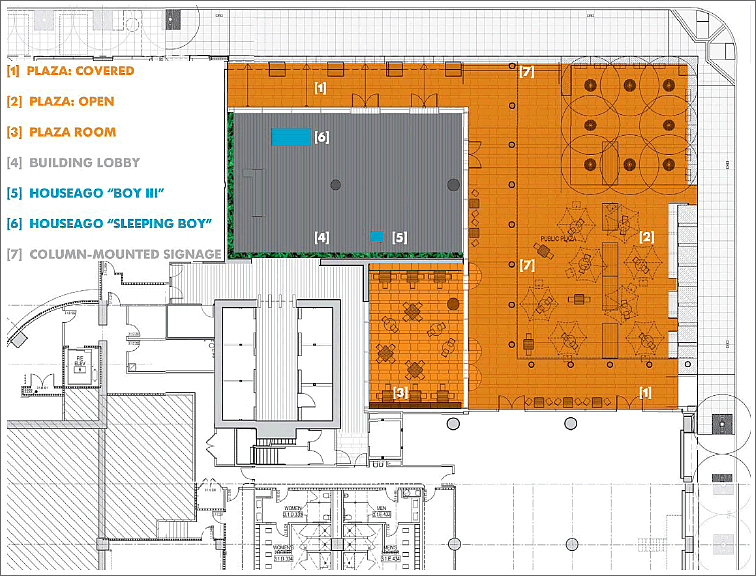
While the development also includes a new public plaza on the corner, it’s within the lobby of the building that Tishman Speyer proposes to place two sculptures by artist Thomas Houseago (“Boy III” and “Sleeping Boy”) in order to fulfill the City’s 1% for Art requirement.

And while the lobby of the building would only be accessible to the public during normal business hours (8:00am to 7:00pm), the sculptures would be placed so as to be visible from the public plaza when the lobby is closed.

I love the idea of the living wall.
Looks sharp! We need more of this outside…[stuff] to make people want to stop and take a closer look.
I do love the buildings, but what a waste of expensive real estate in this market climate. III could have been taller and in a completely different architectural style, but the plans must have been approved before the crash. As is, they come off as a suburban campus in the middle of freakin’ San Francisco!
On various other web sites people have expressed unhappiness that this building isn’t taller. I can recall when Foundry Square was undergoing the planning/permitting process and the city expressed gratitude to the developers because, even though the then-existing zoning (much less the current zoning which has had heights raised) would have permitted taller structures, they would have shaded the future roof-top TransBay Terminal park. As built, Foundry Square will not do that.
I am very happy to see it completed and I like the living wall as well as the simple placement of the 2 sculptures (though I’m not a huge fan of the artist).
I wanna be there when the aphids attack!
On various other web sites people have expressed unhappiness that this building isn’t taller. I can recall when Foundry Square was undergoing the planning/permitting process and the city expressed gratitude to the developers because, even though the then-existing zoning (much less the current zoning which has had heights raised) would have permitted taller structures, they would have shaded the future roof-top TransBay Terminal park. As built, Foundry Square will not do that.
I am very happy to see it completed and I like the living wall as well as the simple placement of the 2 sculptures (though I’m not a huge fan of the artist).
Some of these posts do get to be truly insane.
Seems some of Marten’s comments are confusing: you “love” the buildings but then in the next breath you call it a waste of real estate? huh?
Then you used the tired complaint of wanting the buildings taller. Huh? and in a completely different architectural style? Seriously?
Sure you can have an opinion, but to me, it is so off base that it’s not even credible.
The 4 Foundry Square buildings were designed and built over a 10 year period to be a cohesive urban complex creating open space at all 4 corners. The buildings have a wonderful scale, with detailing and art amenities. And yes, they were designed PURPOSELY at a lower scale so as not to shade the new Transbay Park, and ALSO lend some height modulation to a area with many high rises.
This obsession and constant whining about every new project MUST be taller is tiresome and without merit.
How is this project possibly a bad solution? And, really what do you mean by “freakin San Francisco”?
I don’t know where you guys got your idea that Foundry Square was designed to avoid shading the Transbay Center roof park. These buildings were designed and approved way before there was ever a concept for a park on the Transbay Center roof. I don’t know when Foundry Square was intially approved, but it was well before 2000 since the first building was built somewhere around then (2000). The park on the roof of the Transbay Terminal didn’t appear until 2005-6 at the earliest when the competition for the design was held. The only earlier, pre-2005 concept developed during the approval/EIR phase had a glass roof (designed – I think – by Richard Rogers).
Futurist is spot on. I really can’t understand why some people on this site think the answer for every building site is a skyscraper. I work for a company that has space in two of the Foundry Square buildings and the offices here are the envy of everyone who comes here. Large floor plates for collaborative work environments are what every company is looking for today. Slender highrises can’t accomodate these type of work environments — and you can’t fill SOMA exclusively with tall towers with large floor plates.
We should be striving for a mix of high quality low, mid and high rise buildings, including a balance of renovations and new construction. That’s what makes for great urban environments.
I did not call for a skyscraper, just something different. I don’t see the need for symmetry here, and I’m a logical symmetrist. Plus, the exterior differentiation comes off as hokey. Let’s see. Which building do I work in? The one with the brown accents. Please. They would look perfect in the suburbs or even Mission Bay, and there’s the rub about the buildings in Mission Bay too. A discussion for another day…..
Thankfully, the talented design team who produced Foundry Square does not have to listen to individual, personalized opinions.
Seriously, Marten, what do you like?
What a whiner.
I’m curious if anyone knows what the inspiration for the roof is? I’m taking an Design Principles class and have an assignment regarding SF architecture.