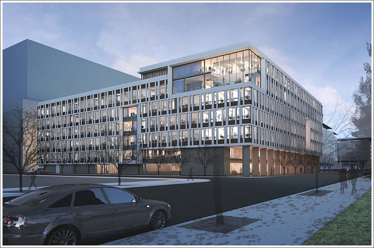
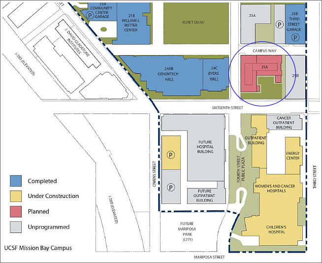
A plugged-in tipster delivers WRNS Studio’s renderings for UCSF’s proposed Academic Building to rise at Fourth and Sixteenth Streets on Mission Bay Block 25A, with a plaza on the corner and a garden courtyard along Sixteenth (click renderings to enlarge):
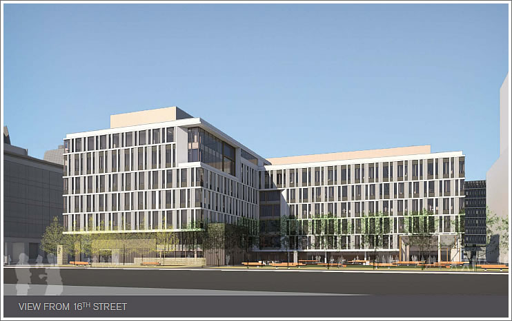
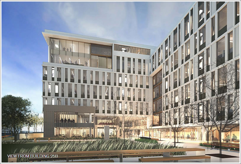
The design will be publicly presented to the Citizens Advisory Committee this Thursday, September 13 at the Mission Creek Senior Community Building (225 Berry Street) at 5pm.
∙ Mission Bay Neighborhood Block And Construction Watch [SocketSite]
1973 – Here we come!
It seems like every building in Mission Bay is trying to make some sort of architectural statement. There’s no continuity and it just feels industrial.
It’s also a complete failure as far as walk-ability is concerned. Sidewalks there are completely empty. Reminds me of Irvine. What a waste of space.
^Agreed, not all buildings need to be fancy. Prefer to see a few really big “statement” buildings, with the remainder just run of the mill normal buildings.
I would argue that the problem with Mission Bay architecture is that every building except the community center is bland box that looks as if it could be in a San Diego office park. Compare the design of lab buildings at UCSF with comparable new buildings at UC Berkeley. I wouldn’t judge the success of the neighborhood just yet- the current daytime workers are mostly poor grad students and post docs who aren’t about to be supporting a vibrant retail community and street life. Labs also require a lot of square footage per worker, so the density of persons is lower than it may seem. Once the hospital and the next round of housing opens, I think the Mission Bay development will start to look at lot more livable.
I agree with Luc… I look forward to Mission Bay flourishing a bit.
Give it some time for the shops and restaurants to fill the area… after a decent bar or two, that area will be perfect for all sorts of people afraid to hang out in “dodgier areas” like the Mission or the Tenderloin.
This is hardly a bland box. This is an excellent example of restrained, pure modernism: Elegant, articulated facade, interesting corner expressions. and refined.
There are no trendy tricks here, nothing to scream look at me, but at the same time making a quiet, clean statement. The UCSF campus does not have to be a carnival of craziness; and to be fair there is rich bold color with the bright orange student center.
WRNS Studio is an excellent firm, with strong, solid modernist values and a talented team of architects.
MY take on ucsf it is the direct result of an institutional, master planned cluster of very, very large parcels that yield, large stand alone institutional buildings.
No mystery. It was planned as a ‘campus’ and looks like one.
Subdividing some sections or ‘neighborhoods’ of the campus, from the beginning, into smaller parcels is the only thing that could have been done to ensure a finer scale of architecture. But then that goes against the institutional need for big floor plates.
I think it looks lovely, and 1000 x better than the pink and olive green circus that Salesforce had been planning across the street.
Regarding all of the Irvine and San Diego comments, those office parks have a lot more landscaping than Mission Bay, but overall I agree that this is becoming an underwhelming office park and nothing more, and no better than the Southern California sprawl so many dismiss.
It is hard to imagine that the original Mission Bay plans floated over 20 years ago with canals, transit/pedestrian streets, greenbelt vistas to the Bay, and participation by “world class” architects would slowly fall down to this final development lacking any of the features first proposed.
The usual suspects praise this building and “neighborhood” because at least it is new construction providing jobs and space, but anyone who has spent time living in Europe or even other great North American cities understands that we should have expected a LOT MORE from Mission Bay.
As someone who lived in a high rise unit in another American city and watched below the rapid development of another urban rail yard into a world famous park and district full of museums, offices, residential towers, award winning landscaping and public art and performance spaces, my question is why not in the “rich” Bay Area? I am always amazed at how such minimal effort of design creates such enthusiam by many of the posters here. Mission Bay and its pedestrian commercial architecture is worthy of no praise and has received little recognition from the world wide design community for good reason.
Quit complaining. San Francisco is not interested in innovative or interesting architecture. Deal with it.
Just plain ugly. I can’t believe the lack of imagination and greenery. What a waste of space and design effort. What has happened?
Does anyone know what’s happening with the nearby garage on 3rd Street? Are they ever going to replace the glass panels or will it stay in its unfinished state forever?