As we first reported with respect to Forest City’s proposed 88 unit development at 2175 Market Street, the Planning department issued a Preliminary Mitigated Negative Declaration with respect to the potential environmental effects of the proposed project last month, which is a good thing if you’re the developer and a step forward assuming the declaration was not (successfully) appealed within 20 days.
The Declaration was, of course, appealed.
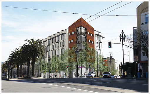
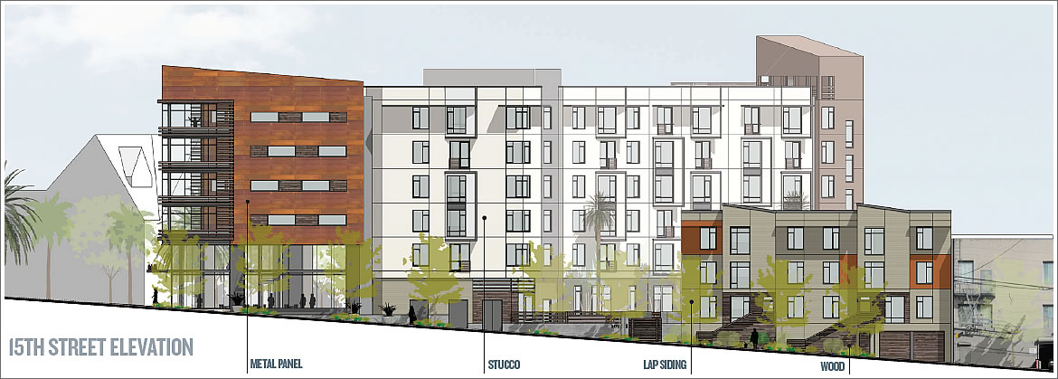
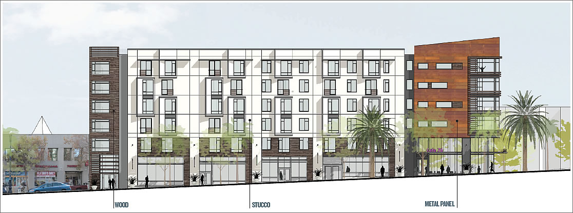
In order for the project to proceed, San Francisco’s Planning Commission must now uphold the Negative Declaration and grant conditional use authorization to demolish the existing gas station at 2175 Market Street and construct the proposed 65-foot-tall building with 88 apartments and 7,300 square feet of retail space on the ground floor, a portion of which would be occupied by a yet to be determined restaurant (click the renderings to enlarge):

As we also first reported earlier this month, San Francisco’s Board of Supervisors has approved the issuance of up to $31,000,000 in tax-exempt mortgage revenue bonds to help finance the project, which if employed, would require 20 percent of the apartments to be below market rate (BMR) and occupied by households whose incomes do not exceed fifty percent of the area median income versus 15 percent of the units BMR as is currently proposed.

Next week, San Francisco’s Planning Commission is scheduled to vote on the six-story 2175 Market Street project, a project the Planning Department recommends be approved. And yes, it’s probably safe to assume that an approval from Planning will be appealed as well.
∙ From 76 Station To 88 Apartments At 2175 Market Street As Proposed [SocketSite]
∙ City Bonds Slated To Finance 2175 Market Street Development [SocketSite]
∙ A Negative Yet Positive Step Forward For 2175 Market Street Project [SocketSite]
I do not understand the current trend of slapping wood siding on steel/glass/concrete structures. It does not age well, is dishonest, and not necessary in such a dynamic streetscape.
Developers are intent on cramming ugly steel boxes everywhere in the Castro. This one’s as ugly as 2299 Market Street. Frank Lloyd Wright must be spinning in his grave.
I’ve seen much worse. This doesn’t look so bad to me — but then often after these appeals the result is a dumbed down project.
Wood is not dishonest. It has been used for hundreds of years on building both residential and commercial. It can age perfectly well with the right substrate and coatings.
This is not an ugly steel box and FLW is dead.
@futurist, wood is dishonest when used in this application on THIS design. This is NOT a wood structure. Sure, 100 years ago it was appropriate and plentiful for structures throughout the city, but on THIS building what is the point of slapping it on the corner. The point is simply a stupid David Chipperfield reference that is trendy today, and not tomorrow.
It is no worse than the catalogue bought victorican decorative wood applications that are slapped on countless “Victorian” structures throughout the city. They were cheap clumsy attempts at “decoration” to hide western wooden sheds of little architectural value. Of course in our city, they must now be preserved so that future generations can admire their “charm”.
And to think many compare us to this!….
http://www.youtube.com/watch?v=hWo-43ObCP8
I often read complaints about building design on SS, but rarely see any examples of how the complainers would design differently.
Wood is not dishonest used in this application or most residential applications, IMO. Wood is typically a cladding, and can last a long long time, applied properly and maintained. Wood does not have to be applied to a wood structure.
I like this a lot. I support it. Let’s get it built and keep the design away from the Nimby’s.
The twits like David who are hung up about the “dishonest” of architecture are presumably the same one’s who fetishize the, boxy, and pedestrian-hostile shit that people like Stanley Saitowitz churn out.
One of the problems with renderings is that they are done by artists with an intent of making a design look attractive. Sometime the finished product lives up to the rendering, but often not (the Paramount at 3rd and Mission being one of the most offensive examples of this – the rendering looked exciting, but the result was awful). So much depends on the quality of the materials and workmanship. Stucco in particular on new buildings can look terrible when the sun is low if not done properly. My problem with this building (as I said in another post about the building going up on the old Thai House/Leticia’s site) is that it lacks imagination and looks just like about six others going up on this stretch of Market Street.
Clear wood siding is a poor choice for high buildings like this one. It’s going to take a lot of weather and won’t be properly maintained. If coated it needs regular recoating; if left untreated it will twist itself off the building.
Copper panels would be better here. Same variegated warm color as clear wood and it lasts indefinitely. Copper doesnt turn green anymore outside and the panels could be patinated red-brown in advance.
Hopefully, those “wood” panels will turn out to be good, honest Trespa “Meteon” panels.
The material on the corner element is not wood, except maybe at the ground floor. I attended some of the community meetings with the architect who indicated that the material is a weathering steel rain-screen panel system with a rust-like coating, like Cor-ten. But the construction is likely to be wood framed on a one-story concrete podium, so wood would be appropriate too.
BTW, the sense at the meetings is that people in the community support the design.
Maybe slapping the plywood on the side of all these buildings is a nod to all the boarded up buildings of MidMarket. One would almost think SF had been going for Detroit sheik. Alas, not one of these developments has created a safe space for the street people to hunker down in. We could lose them altogether if we’re not careful and then what would future generations say?
I re-visiting this too, thanks to redseca and JC. You guys are right. These are not wood panels. I was thinking Trespa as well. In fact they do look more like cor-ten steel panels which will be terrific since they weather a beautiful rusty steel color, with lots of variation.
By the way @ Steve: so you think this building lacks “imagination”? Really? you’ve got to be kidding. Tell us your design solution.
One correction to my earlier post-Since the building will be six stories and not five, it will have to be concrete (or steel, although that is not common here) all the way up, not wood frame over a one-story concrete podium. Buidling code issues, you know.
The end of the building is wood as well as the second story. The far left in the 3rd elevation. It looks like it is rendered the way it will age and not brand new and colorful.