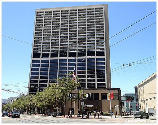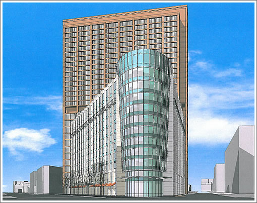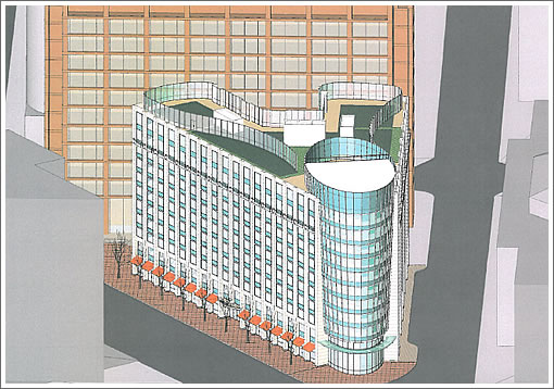
Approved for development in 2009 with a three-year window in which to start building, the developers of the 120-foot-tall, 11-story building with up to 250 residential units over ground floor retail to rise adjacent to Fox Plaza are seeking a two-year extension to break ground “pending future improvements in the national and global economic outlook.”

The new building on the corner at 1390 Market Street would yield 80 studios, 120 one-bedrooms and 50 two-bedrooms. And no new parking would be constructed. In fact, 18 existing Fox Plaza parking spaces would be removed.

With no plans to start construction anytime soon, the extension is expected to be granted.

What an eyesore. It fits in.
Seriously… I didn’t think it could get any worse. What did they use for renderings here, Microsoft Paint?
Just a quick rendering. Let it evolve. I like what I see, so far.
Wow. Not only ugly, but with an 80″s retro flair. At least car haters will be happy no parking will be included.
It is indeed a bad rendering, but it at least portrays a project that would be SO MUCH BETTER than what is there now. I hope it proceeds this cycle.
the thing is that with the new residential projects in the area going rental (55 ninth, crescent heights, trinity plaza, the aaa buildings), if they want to go condos (one can only assume), the only real comparison point is 1 polk, which has been on the market for a while, with a pretty rough history.
man, poor design on all counts, but the idea is right – major density increase and streetscape improvements, with a proper retail wall (though the corner and plaza will have to be redone), no additional parking (wtf is with that weird curb cut on hayes street? couldn’t be for real).
futurist likes a project proposed in San Francisco? I’m shocked!!
Futurist actually likes alot of stuff. I’m not the biggest Futurist fan, but he is not anti-development. (He’s an architect..so that would be a rather dumb perspective).
Very windy area as I recall. Will this add to the cold, nasty zephyr and block even more sunshine?
I think increasing density along Market should be a higher priority than adding sunshine. I only think this building should be larger.
I have found futurists comments to be in blind defense of architecture in any form. It reminds me of public transit unions defending their workers over any misdeeds- late arrivals, excessive overtime, rude customer service, excessive breaks. They are all one big family and can’t see past their own allegiances to get a clear head about the situation. Therefore, I never take any of his “critiques” seriously.
I haven’t seen Futurist post a discouraging word against a proposed project as long as it’s design is modernist/postmodernist and clashes with the other buildings in the neighborhood under the guise of “reflecting its’ own particular place in time.”
Oh, sorry SF I didn’t read you sarcasm. Now I get it. But Futurist hates most Saitowitz projects (and I usually agree with him there)….so it’s not absolutely universal.
And re: sunlight…this is on the north side of the street…shouldn’t make difference to sunlight on Market Street.
Cade, this building is directly in Fox Tower’s wind shadow so it won’t affect that. And how often do you pause to bask in the sunshine behind the Civic Auditorium?
No, I don’t like every project I see proposed for SF. Some are crap. I dislike any work by Saitowitz, to be specific. And no, I have never liked anything “post-modern” as long as you understand the correct meaning of that style.
I like and prefer modern, clean, functionally expressive, with no “historical” pastiche added on to appease those who don’t want a new building to “clash” with existing. And, btw, I really do not know what “clash” means. Not in my vocab.
I’m very pro-development. I’m very pro-green, pro-trees, pro-sidewalk landscape, pro-housing, pro-density and pro-highrise.
And in full disclosure, none of the project here I comment on am I ever involved personally with the design or development.
And one more thing: I have no idea how exactly this proposed project will evolve or turn out. No one else here does either. The concept rendering is just that, with very little complete resolution. Just the fact that a newer building with more residential will replace the hideous, brutal corner that is there now, is a good thing.
The existing building allows for a plaza on the Market Street side. It’s actually not a bad place to hang out, sunny in winter and relatively non-windy, as the building sort of protects it (“non-windy” is, again, relative in this area).
The new design chomps up most of that public space.
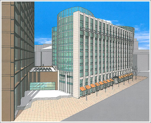
[Editor’s Note: Note the additional rendering added above.]
[Editor’s Note: Note the additional rendering added above.]
Thanks! Any comparison shot of what’s there now?
Isn’t this a Heller Manus design? I’d much rather have a Saitowicz over a Manus. Saitowicz at least has integrity and cohesiveness to their designs- I like the Market and Buchanan project and Yerba Buena Lofts. Manus projects always jumble together mediocre design inspirations and, like all mishmashes, waters it down even further to a mediocre mediocrity. Have you seen the Infinity towers before a talented architect took over? Yikes!!
This project is a total Manus. I think Webster’s is calling. Or at least urban dictionary.
SF…that is totally a word for the SF version of urban dictionary. Unfortunately, there’s way to much Manus around.
The plaza in the new rendering is identical to the current plaza. Looks like it will be unaffected. Not even the stairs are redesigned. The new building replaces the 2-story annex that currently houses a Starbucks, Patrick’s office supplies, and Post Office.
Well, I wouldn’t say “identical”.
http://maps.google.com/maps?q=10th+and+market,+san+francisco,+ca&hl=en&ll=37.776875,-122.417074&spn=0.001221,0.002642&sll=37.778754,-122.414711&sspn=0.009769,0.021136&hnear=Market+St+%26+10th+St,+San+Francisco,+California&t=m&z=19&layer=c&cbll=37.776875,-122.417074&panoid=2W7k4Hqf0YT-h4tEyhF5GQ&cbp=12,303.08,,0,1.01
The steps area is largely the same, though more closed on the right side. The two smaller plaza areas are gone entirely. It’s hard to tell from the renderings, but it looks like the new facade extends closer to the street than any of the corners of the existing structure that separate the the three sections of public space.
Details aside, there’s a significant loss of open area. Not the end of the world, of course, just unfortunate, as there aren’t many along that part of Market.
yes, the building is pulled out to align with Market, so if you consider those triangular dead zones part of the plaza, they will be lost. I was thinking of the area around the steps where the cafes put their tables — as new commercial tenants will also activate the pavement better with the new building.
I take issue with those who call this new design “modern”. This new structure looks more post-modern to my eye and is dated AND ugly before it is even out of the Heller Manus door. Even the free version of GOOGLE Sketch Up could have produced a better rendering.
Better money could have been spent updating the skin of Fox Plaza and combining this new exterior with a complimentary structure in front. Hiding one ugly building behind another different version of ugly is not my idea of a great design solution.
Looks like a ringer binder of some type:
http://www.hichinaprinting.com/images/folders_printing/A4_Landscape_Ring_Binder.jpg
Corners and hard edges can make wind that much worse, but details can break up an slow down the wind. This looks like it could worsen the winds there. This would be a great location for some retro-faux-beaux-arts futziness with statues on it, but I guess we don’t do things that way any more.
Every time Chris J.O. Daily, Christina Oh-lague, Scott Weiner, Tom Ami-ammo, Err’n Pesky, Ed Lap Lee and the rest open their collective pie holes, I wonder thusly:
How can you pretend to care when you let absolute tripe like this, the Marriott, the ANA, and the other countless tripelings blossom so in our city.
If I were French I would SPEET on vous et al.
Looks fine. Build the damn thing.
Meh. Uninspired but hardly horrific.
Pretty much impossible to win an Ugly contest against Fox, so it could be an improvement.