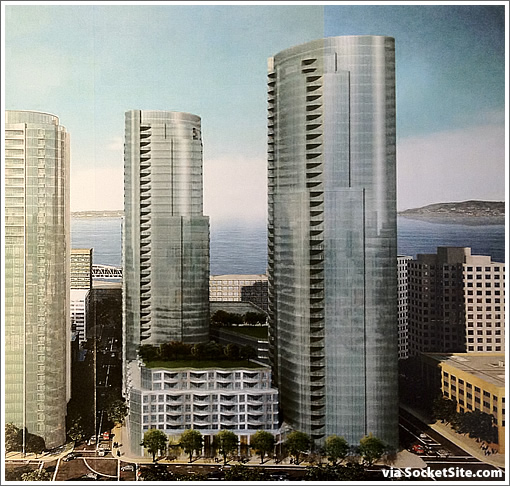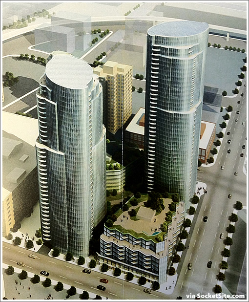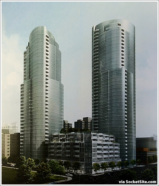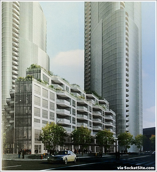
Arquitectonica blows the 725 doors off the old Heller Manus design for Tishman Speyer’s development at 201 Folsom. And as promised, we have the rendering and design scoop.
The 80 foot full-lot podium is gone, instead two podium buildings topped with park-like outdoor areas for residents rise on the northeast (Folsom and Main) and southwest corners of the site while the two towers rise on the northwest (Folsom and Beale) and southeast corners with pathways and green space between.

Continue on for a few more renderings, design details and links…

Once again, the two towers of 201 Folsom will still rise 38 and 43 stories, but instead of 725 units, the new plans call for 671 units with 12 studios, 234 one-bedrooms, 333 two-bedrooms and 92 threes across the four buildings.

Per the terms of Planning’s approval, Tishman Speyer currently has until September 3, 2012 to commence work on the project, the “sister” to Tishman’s Infinty across the street.
∙ 201 Folsom: The Revised Plans For The Two New Towers To Rise [SocketSite]
∙ 201 Folsom: Three More Years To Contemplate And Start Construction [SocketSite]
External aesthetic is important and this is definitely an improvement over the original design. However, I hope the floor plan designs will be better than those in the Infinity next door. I have several friends who own units in the high rise towers and they’ve all complained that they just are not functional.
I can’t imagine the shape of these towers allows for a functional layout. It always frustrates me to see the full glass, non square footprint in a dense city like our own.
Though, it looks far better from the ground in these renderings.
Also.. the “green space” in between the towers will never get used. That’s where people take their dogs to shit. Designers must be out of their mind to think that people look forward to sitting in what is just short of an outdoor hotel lobby.
For the morning architecture porn, I salute you socketsite.com.
Well done, SocketSite! Nice scoop. I wonder about the color of the glass. It’s so muted here that I wonder if the actual color is yet to be determined. It almost looks like they just want to hint at green or gray glass of some type. So far, so good though!
@Rob, as a current Infinity resident I can tell you the outdoor space could be a great asset to 201 Folsom; one that the Infinity doesn’t have (but residents really wish we did).
Does anyone know if this project will also have a one to one deeded parking space for each unit like the infinity?
Seems like the ground-level green space will spend a good deal of time in shade, although that one particular rooftop spot should catch sunlight almost all day long, no?
Wow…modernism lives. I love it!
“Actual”, I take back my previous comment. In the second pic from the top, west is towards the right, is it not? (At first I thought that was the south.) If so, that rooftop in the foreground will be in the sun only after it emerges from the shadow of the tower in the afternoon. Still, not bad. The other rooftop catches some sun in the AM, but the ground-level almost never, despite what the picture shows.
what’s the expected time-frame on completion on a project of this size following ground-breaking?
@Willow, I definitely agree with you. Majority of the floorplans at the infinity are not functional at all. The living room layout (in most units) is terrible!
With that said, I have new hopes for this 201 folsom project. I love the new renderings so far. Reminds me of downtown Vancouver, BC.
WAY better than the previous design. I like that there are lots of balconies and they appear to be big enough to be usable.
Hmmm… the rooftops in the renderings are beveled and smooth. Have the architects just omitted prosaic details like HVAC cabins? are they cleverly hidden? Or, is the building so green that it doesn’t need this stuff at all…?
How do these new towers affect the views of the Infinity units?
Love the subtle setbacks and the integrated balconies. If they extruded these to be 300% taller, then we’d really have something.
“How do these new towers affect the views of the Infinity units”
Well, any unit with a western view is going to have towers blocking a huge portion of their view…and thus unit prices on that side of the building will take a bit of a hit. But any smart buyer knew that these were coming sooner or later so shouldn’t be disappointed.
Next up will be the 450 units at Fremont and Beale…and then more units when the temporary terminal is removed. It’s going to get crowded there!
[thud]
Is this before or after value engineering? This is better than the previous design though I was hoping for something at least equal to the Infinity. A little more asymmetry perhaps? That’s what I’ve grown to admire from Arquitectonica designs.
If they go for a green window treatment this could look like a small fragment of the Emerald City, especially adjacent to the Infinity.
——————-
“I can’t imagine the shape of these towers allows for a functional layout. It always frustrates me to see the full glass, non square footprint in a dense city like our own.”
Only the top is curvy. Four floors down and all the way to the foot the cross section is basically square with rounded corners. So with the exception of the corner rooms this design will allow floorplans almost as efficient as a true square building.
So maybe Arquitectonica is on to something here: a building that looks curvy but lives square.
Hate to say it, but the design reminds me of the Oracle campus in Redwood Shores. And if that glass has any green tint, even more so…
I appreciate all the comments on how superior this design is to the prior one. This is the best looking design to be seen in these parts. Naysayers be damned. No boxes, no bay windows, no victoriana flourishes, thoroughly modern but not cold. Any green space is desired, with or w/o direct sunlight.
Wish we (Infinity) had the rooftop outdoor space.
The Infinity did have a roof top garden planned in the original rendering but the city wanted a park everyone could use. The rooftop garden was killed off to sate naysayers. The landscaping was originally more ambitious below but it too had to be open for all. On the plus side, this is the last building with the more generous parking rules. There is a reason for valet not deeded parking in the newer buildings although others tried out the valet concept prior to it being necessary.
With all of this development this neighborhood could use a decent grocery store and perhaps a children’s playground.
Love the density. Build it.
A tiny chunk of view is gonna disappear for the ones in the hills from BV Park, Corona Heights, Upper Market, Dolores Heights, some of the upper NV and other Laidleys. ORH already took its pound of flash. One day we won’t even see the BB. Sigh.
Maybe we should all chip in a few Ks each to buy up all the semi-empty parcels left before we get our BB views blocked forever 😉
Given the very low proportion of 3 BRs in any of these towers, are there really that many children in this neighborhood?
These are significantly better than the previous design but are way too office-y for my taste. And I think Infinity is more interesting, if less functional.
@d_b: I don’t know anything about playgrounds, but there’s a Whole Foods 3/4 of a mile away, and a Safeway about a mile. Probably better served than most neighborhoods in SF.
^^^There’s a big playground at Yerba Buena that’s slightly closer than that Wholefoods. But I imagine d_b is talking about something closer — I don’t consider that the same ‘hood. And you’re definitely driving if you’re doing your shopping at those places. Fine for a weekly shop but one typical benefit of urban living is the ability to to walk down to the corner to pick something up for that night’s cooking.
Curious – are the roof spaces going unused at the top?
Am I the only one who likes the old design more? The new ones look like squished Infinity buildings. The whole area will look boringly repetitive.
Count me in Fish,
I don’t see why people are gaga over this design. It’s really rather mundane…and it could be anywhere…Atlanta…Houston…there is nothing distinctive to SF about it.
There’s currently a local market at Howard and Spear, two blocks away. Not much for playgrounds, but there’s open space the Embarcadero, also two blocks away. There are some local services nearby, but it’s currently pretty quiet after dark. I believe the intent is to liven up Folsom St at the end of the Transbay Center project.
This area has no public schools whatsoever, and very few grammar school aged children. Maybe a good use of a pier once the America’s Cup is done with them. Or it could be the old, “Hey kid, go play on the freeway.”
I like this “squished Infinity” look. I hope the glass color is the same as The Millennium.
I don’t really understand the interest in this design. It defies the urban aesthetic in such a cheap and hasty way. Why so much glass? How does adding soft corners make it unique or important? How soon will this one be considered one of the drab and unappealing highrise structures that currently plague our confused cityscape.
In addition, I think that any green space that isn’t public space is destined to be underutilized and poorly mistaken.
Happy the “replacement parking” is history. Also very pleased to see the family-friendly (or multi-roommate friendly) 2-bed and 3-bed units. Most of all ok king forward to the millions in property taxes that could be leveraged via the Pilot Infrastructure Financing District to build out streetscapes and parks. Only ding … It’d be better if this wasn’t a SUD that has inconsistent planning codes compared to Rincon Hill Plan Area and Transbay Redevelopment Area. Cool stuff though… We’ve got 2 buildings already under construction in Rincon Hill will this be the next or will 45 Lansing get moving next as expected?
What uses will the commercial space have? Tishman Speyer had trouble filling the commercial space at the Infinity; and so, has ended up with a dental office on the corner of Folsom and Main Streets. One of the restaurants in another commercial space is not open yet. InfinityResidents would concur that a neighborhood cafe and other commercial spaces that would serve as meeting places and to increase foot traffic, especially, on weekends would be a real asset. I hope that the City planners can designate particular commercial uses that would serve those purposes.
Hope the curves allow for good floorplans because curves on Infinity look great on outside but floorplan is gre..atly sacrificed. I still think that hood is without a soul and wluld never live there.
Same curves define the floor plans. Nice exterior architecture shaves space off second bedrooms and cuts across what would be the dining area. Most units are shaped like a teardrop ( in 2 & 3 bedroom models). This makes for wide view panoramas. Minimal closet space, not typical of a luxury condo tower may disappoint. Good news is you can buy one parking space per unit and they’ll offer tons of amenities in the bldg.
“Happy the “replacement parking” is history”
Jamie,
What about the .5 parking requirements in the area?
@kory I agree. Definitely not much to do in the immediate area… something that I think the Transbay Center will eventually help with, but also… less private courtyards. The win:win situation is more public space, worthy of a crowd or two. Unfortunately I think that Mission Bay is already strides ahead of this little stretch of city.
Kory, yeah, there is not much in the immediate area, sure… But the Ferry Building is very close, and it is easy to walk to North Beach, Union Square, SoMa, South Beach, etc. Not to mention some of the best weather in SF and easy access to public transportation (Caltrain, BART, MUNI) and freeways.
Thiis would look much better with one tower stacked on top of the other – i.e. one tall & graceful tower rather than two stocky ones. Better views, more space between buildings, etc.
Alas, planning and their myopic fear of heights. It’s collective lateral bulk they should be worried about: A cluster of towers all the same height makes the skyline congeal into an unattractive lump – just like the financial district did after the 500′ height limit was imposed. Same, same, same, no variety.
“park-like”
Tee-hee. Joke’s on us.
Another beautiful building and some green space is better than the current parking lot despite the fact that it will block some views and some sun. Does it include any new green, gray or brown space for residents with dogs? (This should be a requirement!) A casual restaurant, cafe or a grocery store would be awesome!
UPDATE: T-Minus Two Days For Towering Folsom Street Project To Begin