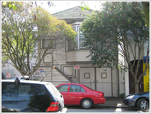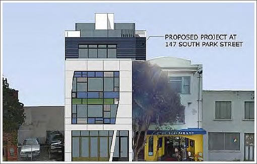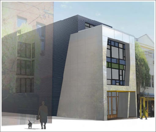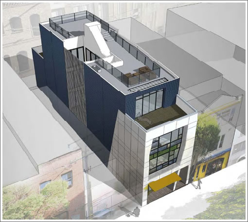
Approved for demolition in 2003 and having sat in neglect since, it was a year ago we first plugged you in to the initial designs for the proposed four story building to rise at 147 South Park.
Originally scheduled to be reviewed six months ago, a couple of Planning Commission hearings were postponed in order to provide additional time for the developer “to refine the design and…overall proposal” in conjunction with the Planning Department.

The proposed replacement structure is a four-story, 40 foot high, two-unit multifamily building with a ground floor commercial space identified as an eating and drinking establishment. The Project proposes to meet the usable open space requirement on site, through the provision of open space on decks at the 3rd floor, 4th floor and the roof.

The Project will provide one off-street parking space designated for the ground floor commercial use and one off-street parking space for a dwelling unit. Automobile access is from the rear of the lot, on Varney Place, and away from South Park Avenue.

In addition to the approximately 2,133 square foot ground floor commercial space fronting on South Park Avenue, a three-bedroom residential unit would be located on the second floor while a four-bedroom unit would occupy the third and fourth floors.
The Planning Department recommends the Planning Commission approve the project as long as façade finish materials are less reflective than rendered and the fourth floor is set back 15 feet from the main building wall, “as is standard for any proposed floor whose height exceeds those on adjacent structures.”
Credit Geddes Ulinskas Architects for the design.
Needs more parking for residents.
I am not sure why, but this project has pushed me over the edge and I am now officially bored with “modernism” as currently being ruined by most architects. I think this was an attempt at some sort of tribute to Le Corbusier, but UGH, what a sorry attempt.
I don’t know…maybe we should keep the blight instead. I think the modernist cyclone pastiche really enhances the street scape.
Ah yes, the fallacy of the false choice. Are we limited to either just the high modernist design presented above or the original run-down SFH? No?
If you follow the link above, you’ll find that there was nothing wrong with the original contemporary design.
But of course, we have a few people on the planning commission who bristle at the thought of anything being built that isn’t modernists, and they ram their choices down the throat of anybody they think they can do it to. Even if the resulting design clashes with its surroundings in the most obvious way. Haven’t looked at the minutes from the approval vote meeting, but yet, but I’m pretty sure I know who forced the developer into this…
I’m not psyched about the color in the windows. But it will be nice to have something new at that end of the park (which needs sprucing up) and it will contribute to South Park’s overall look and feel. A great part of SF, IMHO.
The angles might be seen as a reference to diagonal structural elements, the angles of the hills, or distortions of perspective. At least this attempts to extend the form instead of merely presenting another cubist block to the street. This kind of panelized modernism is relatively cheap and easy to build, maintain, and later replace, so these components are going to be hard to avoid.
Why are they blocking the light well with the stairs to the roof? Shouldn’t they at least put windows there?
Needs more parking. The 15 ft set back rule is ill advised and should be dropped. This rule often conflicts with good design.
To get more cars off the street build more off street parking.
Why do we need a planning department and a planning commission?
In some ways, this very blog and comments seem to mimic the very devisive bickering and meddling that goes on the the Planning Commission, over every single project brought before them.
We have people here complaining about the “modernist” design.
We have people here complaining about the color of the windows.
We have people here complaining about the 15′ setback.
We have people here complaining about the light court.
And on and on and on.
This is what’s wrong with the Planning Commission from the start. And here we have SF citizens acting the same way. In our fair city, we are proud of the fact that EVERYONE seems to get a say in our we grow and change. And yet, that’s what stalls many projects and also creates “design by committee”. This also weakens original design and thought.
What we should do:
1. Take away any “visual and aesthetic” design decisions from the Planning Commission. They should deal with only issues of setback, height, bulk, footprint, parking issues and similar defined parameters.
2. Eliminate the DR process completely.
3. Let the architects design.
[Editor’s Note: Hold that thought (and be prepared to cut and paste your comment this afternoon).]
I like it as rendered here. The design seems fresh and interesting at least to my unprofessional eyes. I think it would fit in well with the block.
I also like it completely as rendered here. Let’s see it get built.
well put futurist
well put bubblesurfer
Oh Oh! I guess I’m in trouble now.:)
[Editor’s Note: Not at all: An Attempt To Appease A Conservative Planning Commission?]
How the hell does one determine that, after the construction is complete, “façade finish materials are less reflective than rendered?”
I’m serious.
@Brahma: This is a very good question, and I’m serious too. I agree with you completely.
This is one egregious example of the kind of “stupid” questions the Planning Commissioners bring up. It should be outside their jurisdiction and control. One more example of how out of control the commission is.
BTW: from my research, and to my knowledge NONE of the commissioners has any relevant professional experience (currently on the board).
Michael Antonini (one of the commissioners) is a dentist. How does that relate to ANYTHING presented to the commission.
And, as a side note: Commissioner Sugaya has made several offensive jokes during commission meetings.
I think they’re all a bunch of clowns.
Brahma,
The material selected for the front of the building is “polished stainless steel”. They are saying pick something less reflective than that.
“Michael Antonini (one of the commissioners) is a dentist. How does that relate to ANYTHING presented to the commission.”
Does one’s profession need to relate to their position on a commission? A lot of people have expertise that lies outside of their vocation.
How can “open space” become defined as “separate,” with limited access” and a “balcony”?
Modern design has become very dull around here. It all looks corporate, as in a church for the terminally hip. Having a secreted internal space for the select few surrounded by a monolithic exterior with a weirdly set back balcony so occupants may look down on groundlings while blocking out any view of the neighbors – who have been put in shadow by the extened frontage – has become required.
South Park didn’t become trendy by being trendy, it became trendy because it wasn’t just another blob of harsh statements of authority and enforced “good” taste. The working class is now an historical artifact that’s translated into a style of clothing that modernists wear while extolling the value of expensive sculpture they call “multi-family living units.”
@ MOD: Most definitely do I feel that within the context of Planning Commissioners, yes, they should be closely aligned in the field of architecture, urban planning, construction, visual arts; meaning they should be in that particular profession or have proven expertise and knowledge in those areas.
They can certainly have an “interest and passion” about, say architecture, but without direct knowledge and experience, I don’t believe they are serving the public interest in the best way.
Are these really the kind of people we want to determine the urban design future of our city?
I like the color of the windows — it’s a church, right?
neo-noe futurist – Having not interviewed or even met any of the commissioners I really cannot answer your question. However I would never outright discount someones opinion simply by knowing their profession. For example my dentist turns out to be a competent mechanical engineer too. Who would have known that from his DDS credential?
MM2 – South Park used to be a rather elite residential neighborhood. Maybe it is returning to its roots.
The colors must be a reference to the colors of the restaurant Butler & The chef. See the adjacent building.
@ MOD: well, you’re kind of twisting around what I said, but that’s ok, and somewhat missing my particular point.
I have seen and heard the Planning Commission in action (sitting at meetings), and we all see their decisions, both good (sometimes) and bad (much of the time). To my knowledge, none of the current commissioners have any “actual” professional experience or degrees or licensing in the professions I mentioned. I think that is a problem with the Planning Commission. And honestly, I’m not sure how and why they are appointed to the commission,and why they are not REQUIRED to be trained and degreed experts in the particular professions RELATED to the business and power the Planning Commission holds.
Yes, your dentist may be a “competent mechanical engineer” as you say. That’s fine. How does that relate to the specific Planning Commission I am addressing?
Moore is an architect isn’t she? Yet I agree with Antonini way more than I agree with Moore.
Just giving an example of someone who has expertise outside of his credentials. And he happened to be a dentist as well.
In general I agree that the members of the commission should be competent to understand the issues placed before them. I’m not sure how the SF Planning Commission vets its members but they should ensure as you suggest that they have adequate understanding of the issues that they will decide. If not then I agree that the process of placing members should change.
However I don’t think that professional credentials should be required for membership. Save that requirement for the actual professionals in the Planning Department.
I hope that nomination isn’t politically driven. I do know that for some commissions and committees the selection process can be somewhat political. I was offered a seat as a political favor once. Though I had the right background I refused. And then I got a seat on the same committee via another no-strings-attached avenue. And no, I have no professional background directly relevant to that committee.
[I’d really like to see the jury selection process weed out people who lack basic critical thinking skills as well but that’s a little too much to ask.]
Oh, dear. Not an improvement at all. Looks like this thing got beat up pretty good.
So glad this project was approved today!
looks like this project has finally started construction!
UPDATE: Two Modern South Park Condos Asking $8M Combined.