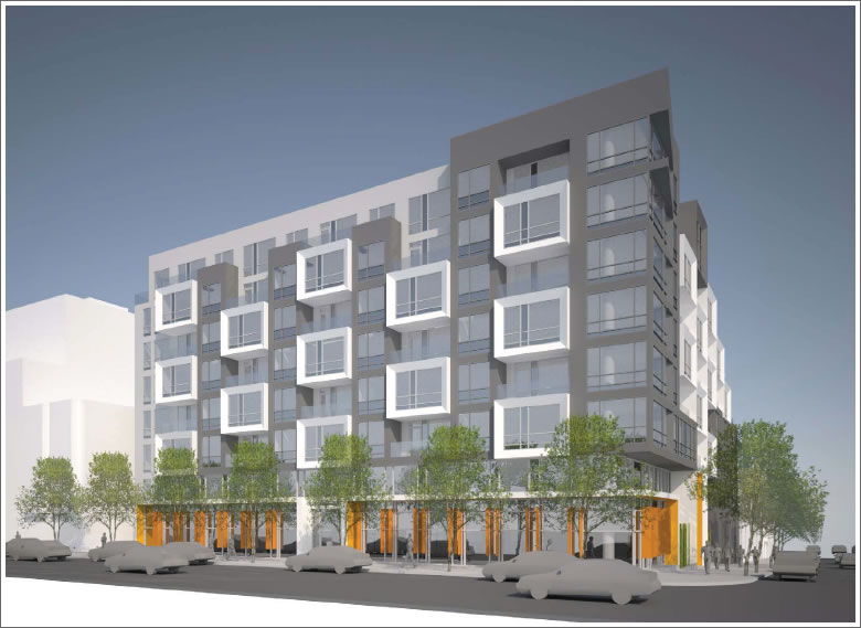
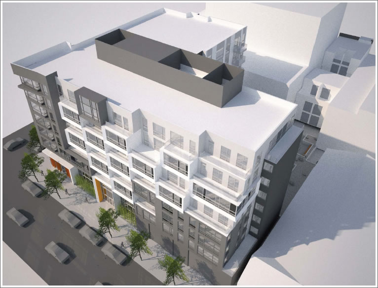
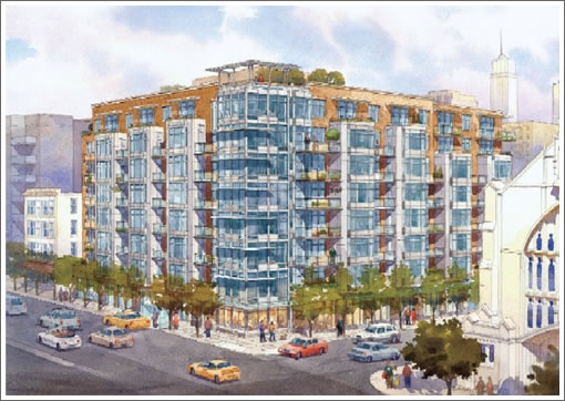
Once slated to become “The Sterling of San Francisco,” an eight-story, 62-unit senior living community, the latest designs for 1800 Van Ness at Clay call for an eight-story, 94-unit mixed-use building over 95 parking spaces and 4,900 square feet of commercial space and a four-story, 4-unit residential building with 4 parking spaces on Washington.
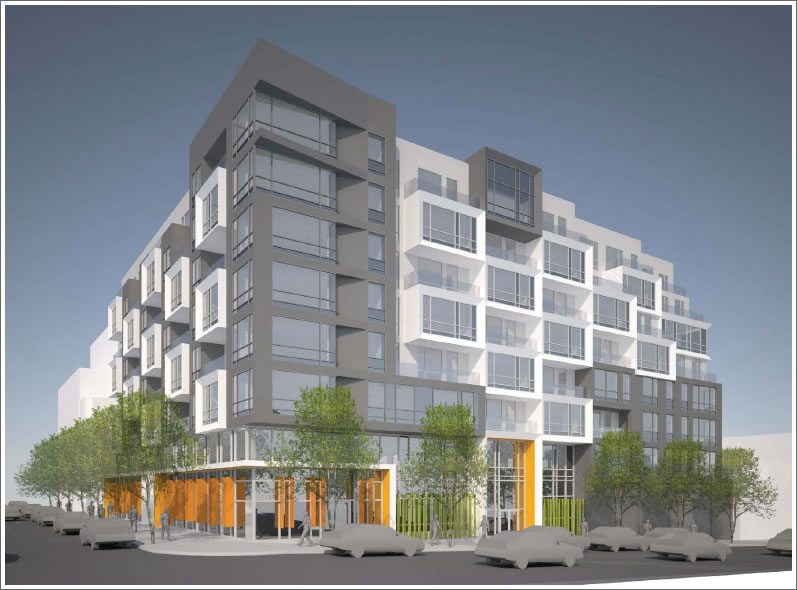
As proposed, the development will yield 1 studio, 44 one-bedrooms, 51 two-bedrooms and 2 three-bedrooms. And by way of negotiations with the Middle Polk Neighborhood Association, and in exchange for their support, 15 of the units will be Below Market Rate and parking for 41 bikes and at least three car share vehicles will be included on-site.
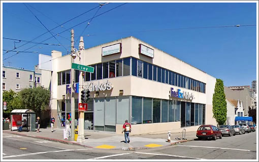
As the corner of Van Ness and Clay currently appears:
And as was once proposed for The Sterling:
∙ Copy That, 1800 Van Ness/1754 Clay Street Site Sells For $4.25M [SocketSite]
∙ Serving Up The Seniors (Rather Than The Copies) At 1754 Clay Street [SocketSite]

Who is the developer on this one?
[Editor’s Note: Oyster Development founded by former Intracorp executive Dean Givas.]
Why the exterior design change? It went from boring sophisticated to more modern, but ready to look dated very quickly.
Nothing very nice to say about the new design, but happy to hear about more residential development on Van Ness — big win in that regard.
Really great solution to the new design. The facade is articulated nicely with lots of variation, and different sizes of balconies.
Love the color at the retail level and variation in height.
Fine, sophisticated design. Who is the architect?
Does this include the California Club at 1750 Clay?
If so, where will another generation of San Franciscans be tortured (I mean, learn ballroom dancing) with their private school counterparts? I swear I still have nightmares about MidWeeklies!
http://articles.sfgate.com/2011-05-15/living/30221247_1_boys-and-girls-dance-hall-dance-competition
socketsite wrote: “And by way of negotiations with the Middle Polk Neighborhood Association, and in exchange for their support, 15 of the units will be Below Market Rate and parking for 41 bikes…”
All of these things are the minimum things required by law. They are not the result of negotiations with any group and are certainly not a case of a developer offering up more than they are required to. In fact, if they only provide 41 bike parking spaces they wouldn’t even meet the minimum legal requirement of one bike space for every two units.
[Editor’s Note: By law, the BMR component doesn’t have to be on-site (think in-lieu of fees or off-site options) and in this case the three car share spaces will increase to four “in the event that there is an excess of unsold space among the closed units after 12 months of commencing sales.”]
Q: Who is the architect?
A: Kwan Henmi
Click any of the new renderings above to enlarge.
Reminds me a lot of the arterra in mission bay. Eww. I much preferred the previous design.
It has design elements similar to the Arterra, because the same architects are designing this project.
And Arterra is a very handsome, elegant building.
Check out the work of the archtects. They design outstanding urban architecture.
And by the way: only 14 year olds say “eww”. No adult would use that word to comment on architecture.
Yay, Socketsite is exciting again!
Cool design! (wouldn’t label it “handsome” or “elegant” as some others have)
Too much parking!
Too short (but not bad for what it’s replacing).
Good use! (I’m all for senior housing and think it’s a great use of my tax dollars)
“Why the exterior design change? It went from boring sophisticated to more modern, but ready to look dated very quickly.”
Exactly – remember, modern was current in the middle of the prior century (“Mid-century modern”) but was detested for decades before return to being appreciated by some market segments.
While the previous design might have been less than inspired – too much uniformity perhaps?, the re-work is not an improvement. But it’s trendy and that’s why it will probably be built.
The biggest deficiency in the new design is the lack of outdoor space. The previous design provided a wealth of balconies. The new design has very few. If anyone is deserving of outdoor space it’s seniors.