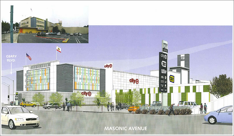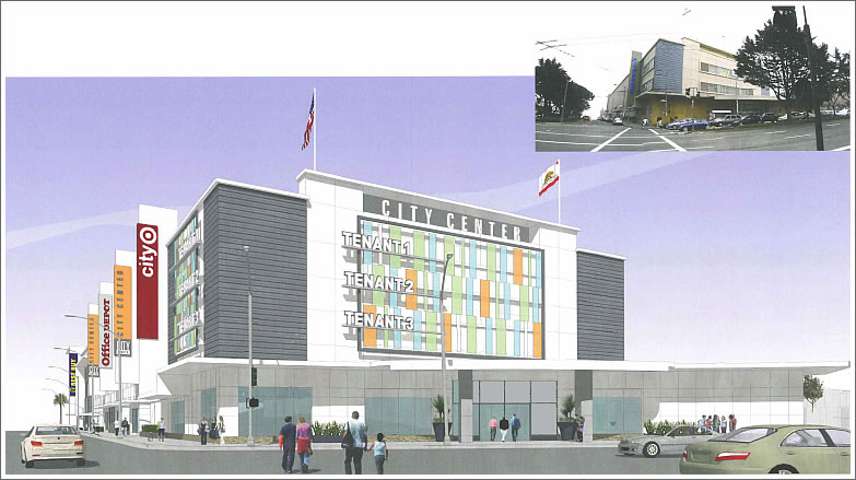
As we first reported earlier this week, this coming Thursday the Planning Commission will hear Target’s request to open a 106,000 t0 120,000 square foot store “offering clothing, personal accessories, household goods, including home furnishings, electronics and groceries” in the City Center development at the corner of Geary and Masonic.

Target’s stated design goals for the project (click either image to enlarge):
Activate the street edges to make the building pedestrian friendly and contribute to an active street life
1. Increase the amount of street-front display windows along Masonic Ave.
2. Maintain and add display cases along the Geary elevation to create activity, visual interest and pedestrian scale.
3. Refurbish the base building materials to provide a higher quality, durable pedestrian environment.
4. Rehabilitate grade level planters and plantings along Geary Blvd.
5. Explore building-mounted, pedestrian scale lighting.
Apply elements to the facades to moderate the building’s bulky scale and give it an updated appearance
1. Add blade sign elements appropriate to the Mid-Century Modern character of the building that introduce rhythm, color and movement to the facades along Geary Blvd.
2. Add screen elements to key facade areas that provide contemporary hints of warmth, color and texture to the building.
3. Repaint the building in a new color scheme that emphasizes 1.g texture and articulation over monotonous bulk.
Create a more sustainable building
1. Update and reuse the existing building, employing recycled materials whenever possible.
2. Enhance bicycle parking and storage.
Add landscaping to soften the environment
1. Vines at existing retaining walls.
2. Add drought-tolerant plants.
3. Replace landscape in existing planters
The Planning Department recommends the Commission approve the request.
∙ Target Prepares For Planning Vote On Geary Store Next Week [SocketSite]
∙ YIMBY’s Set Their Sights On A Target At Geary And Masonic [SocketSite]
∙ One Word: Target. Okay, Five: Target At Geary And Masonic? [SocketSite]
Great design comments. It sounds like they really care about the urban environment. It’s hard to reconcile my new urbanist sensibilities with how much I like shopping at Target!
I agree–great design goals, but the pastel colors already make the building seem faded and out-dated. I’m not excited at all about this design. Such a missed opportunity for such a prominent location.
While I do think that there could be a lot more on that lot, it could be done in stages. You could keep the existing building and build on the eastern half of the lot, maybe, which is all parking lot now.
It is nice that they propose to activate the street edges to improve the pedestrian environment though they really aren’t doing much. Display windows and a rebuilt edge help but what would really activate the street edge would be to line the perimeter with small commercial spaces of about 500-1000 sq. ft. That would increase the “doorknob count” along those bleak blocks.
Barring a truly activated street edge at least they can do is to place a couple of entrances to the big box on each street. But I have a hunch that the design will include a single mega entrance.
I also noticed that from the renderings that the square footage of tenant signage is significantly increased. Advertising tends to degrade the appearance of the street.
In my experience, additional entrances to large retail outlets in San Francisco are eventually reduced to the fire code minimums to prevent theft.
The old Virgin Superstore on Market once had three entrances. The two side entrances were eventually closed, leaving only the main entrance on the corner.
Milkshake: Please tell us more about activating the street edge. More importantly, is street-edge activation the new pergraniteel?
My street edge is activated to the point that I just want to move. Its poopgraniteel.
Stucco: perhaps it’s just not properly activated.
Mostly comments from people that are not from here. My mom and I got my first pair of “Toughskin Jeans” there. Happy that Target is moving there.
^Why would you assume that the people commenting are not from here? I live five blocks away from the proposed store location.
mike kennedy: i’ll see your toughskins and raise you a gemco.
Please bring the toughskins back to SF!
http://www.searsarchives.com/brands/detail/toughskins1976.htm
Love this plan. Mervyn’s old eyesore of a building needs an anchor store to revamp a beautiful piece of land!
Theft and vandalism might be a problem for sure. There’s an eyesore a government housing project a couple blocks away that makes this part of the city center very dangerous in the evenings and even during the day. There are many instances of hostile robbery due to that block.
People who have been at that building know how difficult it is to enter and leave the building and drive around. Entrances are awkward, and the streets are such that you enter from Masonic and HAVE TO leave on a one way street all the way down by Divisadero. That one way street which leads to all the parking is poorly planned. The geary street entrance to parking has a very NARROW entrance and a little ramp that rubs up against the underside of the cars. Hope they fix this.
The building does not allow for a great shopping experience. It’s not the MALL format we’re used to at other places. All the stores take a lot of walking to get to as they have they own entrances at different terraces of the structure.
I hope they don’t restrict to that uppermost parking level — it provides one of the best “stealth” viewing platforms of the entire city!