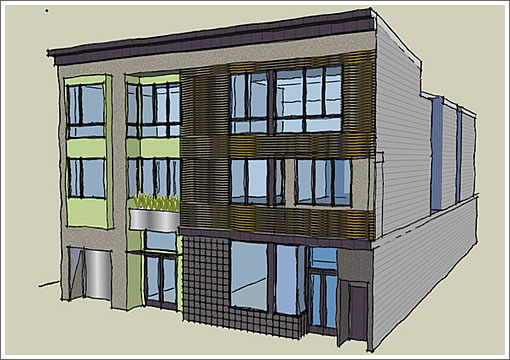
The new design for the building at 435 Duboce will yield three new residential units for a total of five in the building which once housed a 6,000 square foot church as well.

In the works since 2008 and now well underway, a commercial space once hidden will open to the sidewalk and help “breathe life into the [formerly] static façade.”

∙ 435 Duboce Project Design: “Duboce Ave Multi-Unit” [mcelroyarch.com]

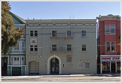
I wish there were a way to keep the pretty detail on the top, which is the only really nice thing about the original building.
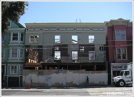
I walked by here the other day and assumed that the facade was being “saved”, cuz there’s precious little left but the facade and some structural beams.
I would have thought starting from scratch would have been more fiscally responsible. Guess I must be wrong.
I too thought the facade was being saved and the work was being done behind the scene. Don’t like it if we were being deceived.
Glad the preservationists didn’t latch on to this one and try to “save” it.
A mediocre facade on a very non descript building. The new design offers a fresh face and more street friendly ground floor.
Congrats!
I’ve been watching this on the “N” on my way in to work and wondered what was going up. Agree that the prior church was an eyesore (the front of the building looked liked it’s the rear) and I’m glad something more appealing is going to replace it. I could swear that this church used to be St. John Coltrane when I was little, but maybe I’m wrong and that was over on Divis.
I always thought it was weird that St. John Coltrane is an AOC church, but John Coltrane went to an AME Zion church. Granted, Coltrane also studied other religions, including Hinduism and Buddhism, it’s sort of like the Catholic church canonizing a Protestant, isn’t it?
In any case, I’m pretty sure the Coltrane church used to be at 351 Divis, not here. 435 Duboce used to be St. Beulah’s Church of God.
Yeah, St. John Coltrane was definitely on divis. I so wish I’d gone there at least once…. How San Francisco can you get?
I also am somewhat sad that they didn’t want to keep the great detail at the top.
as for the new design, hard to tell what it’s going to look like. the top pic is simply a rudimentary drawing that didn’t even have the benefit of a ruler. Looks like the perfect office or home for Dr. Katz, professional therapist.
I wish they kept the top detail of the building.
Hope the ground floor commercial space has decent ceiling heights.
The top picture is simply a conceptual drawing, more of a block diagram, probably using Google Sketchup showing the massing and proposed window locations. It’s merely a placeholder for much more detailed elevations to come.
The existing cornice line, IMO, is not worth saving or incorporating into the new design. It’s dated and somewhat bland. And, anyway, what’s the point of saving a small bit of decoration into a brand new much more interesting facade.
Nice addition to the neighborhood.
I call this “Spam” design, a dozen half- thoughts and witless Junior Designer concepts Cuisinarted together to make a barely nutritious and even less edible serving of foul smelling architecture.
For heaven’s sake, why San Diego-ize a lovely Victorian facade? The one thing worth saving, the cornice details, smoothed over as if to create a nice Thousand Island dressing for the Spam-a-la Developer main dish.
I’m becoming convinced more and more that many San Franciscans simply do not like change of any kind.
They like what exists here today, because it is comfortable,familiar and safe, even if it is bland and boring.
Despite our reputation for being an open minded and tolerant city, when it comes to new architecture many people are close minded, narrow minded and AFRAID of change.
Go visit such cities as Amsterdam, Copenhagen, London, Paris, and Sydney to see how new, modern architecture can be skillfully inserted into the city fabric next to important historic facades, and how both can work to enliven the city.
So many of the new designs we see in San Francisco are so very bland, that’s why people want to keep old stuff around even if it’s not that good.
The new architecture in other cities is so much better than what we are offered here, where it all looks so cookie cutter. And we don’t do a great job at making a nice segue way from one building to another either.
I do like the little wavy thing this one has going on, if I am looking at the picture correctly.
Also, noearch, you’re always so defensive on these stories. Trust me, I doubt anyone here is looking for a city that looks like a Thomas Kinkade painting. Just a little more care and imagination.
Sorry, kthn: but you are reading my comments all wrong. No defensiveness intended. As I’ve said many times before, some of this audience simply does not like my comments BECAUSE I am an architect.
They really have no need to see my comments that way: they are opinions by someone in the design profession.
But no, here is my take on why (perhaps) so much of our new architecture may be seen as bland. Some is, Some is not.
It’s because, and I say this again, San Franciscans resist change in their physical environment. To a certain extent they encourage the blandness because so much “nimby” attitude exists. Neighbors protest ALMOST anything new and different, city wide. Our so called democratic process in the planning dept. and codes allows so much outside discussion (noise) that almost all modern (read innovative) designs are shot down by the public.
This proposed new building and facade change is really very very modest, and not outlandish at all. This is what San Franciscans and the Planning Dept wants; I’m sorry to say.
If we begin to entertain and allow for more expressive, unique and yes “modern” buildings here, we will see the caliber of architecture raised.
The residents of Amsterdam and Copenhagen, as two examples, are far more open to new architecture that we are.
I hope this can change.
Wrong, noearch. I for one don’t agree with many of your comments because I think they lack depth and intelligence. They read like sound bites for your developer clients.
And don’t think you’re the only architect commenting here…..
It’s not so much that I’m “wrong”. it’s just that my opinion differs from yours or perhaps others. I think my comments include depth and intelligence, from my experience as an architect, and my experience in visiting every one of the cities I have mentioned.
Why don’t you comment about this building, rather than about me?
And they are not sound bites. I have no developers as clients. My clients are all homeowners looking to remodel a SFD. that’s it.
And, just for the record, if you have read my past posts I have never assumed that I am the only architect posting here.
But it does seem that I am the only architect “out” as an architect posting here. I welcome others.
The existing cornice line, IMO, is not worth saving or incorporating into the new design. It’s dated and somewhat bland.
seems to me that a brown cornice (from the rendering) is more bland than a multicolored patterned cornice… they went from what you call bland to what I call even more bland.
but that’s just me.
obviously, it wouldn’t work with the slat theme they have going here so I see the “need” to lose the cornice… I just think that one could have taken that one old piece and incorporated it into a fresh new design.
it would have been much harder than just starting from scratch (as they are doing)… but isn’t that why architects and designers have years of training?
but please don’t misunderstand me… I have long been pretty vocal about my hatred of the limitations put on property owners with respect to altering THEIR property in the city of SF.
@noearch: Just because San Francisco likes to keep original buildings, does not mean it hates change. There are countless buildings breaking the norm in otherwise conservative neighborhoods. Also, just because other cities like to tear down all their historical buildings and build new architectural masterpieces, does not mean SF has to do the same. It’s important that we keep certain buildings around, otherwise we’ll all be living in a sea of sameness (this also applies to building new architecture).
“It’s important that we keep certain buildings around, otherwise we’ll all be living in a sea of sameness (this also applies to building new architecture).”
We already do live in a sea of sameness because people resistant to change.
The planning by committee is what really kills things here. I agree that SF is full of closed minded NIMBYs so that we keep stupid buildings like that Ford dealership, but the other problem is that the modernists all think alike too and mostly build ugly impersonal crap (and much of it does belong in “eyesore of the month” as someone posted on another thread). This building is cookie cutter, as someone mentioned, and there’s very little fresh about it. The previous building was even uglier, except for the cornice as people mentioned, so it’s probably net positive, but we can do better.
@sfrenegade: Which is why I said it also applies to current buildings needing to be rebuilt. Quite frankly, I’m getting sick of the mid 70s apartment buildings in the Richmond and Sunset districts. They all look like soviet-era community houses. The older Edwardian, Victorian, Art Deco, Spanish-Mediterranean and Marina houses at least have some character. Of all the modern buildings in SF these days, very few stand out. 185 Post Street by Brand + Allen Architects is an excellent example of modern mixed with a historic element. SB | Architects did a few very nice modern houses (one in Bernal Heights) that are not cookie cutter. The thing is, if we replace everything with these new cookie cutter houses, in the future people will also look at them and be wondering if they are worth keeping in lieu of whatever is contemporary at the time.
Forgot to mention 77 Van Ness by Forum Design. Of all the Forum buildings, it’s probably the best looking. Everything else they’ve done appears too… bland, much like this McElroy design.
getting back to one of the original questions posted here – does anyone know whether the developer is required to preserve the front exterior wall/facade? they clearly must be planning to save it and incorporate it into the new construction, otherwise why not just tear down the entire building? (everything else is totally gone save that wall)