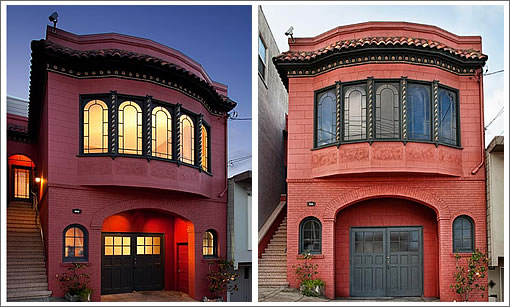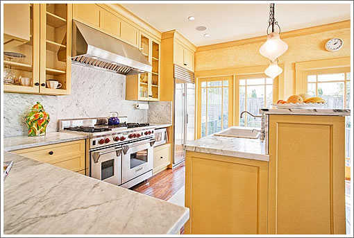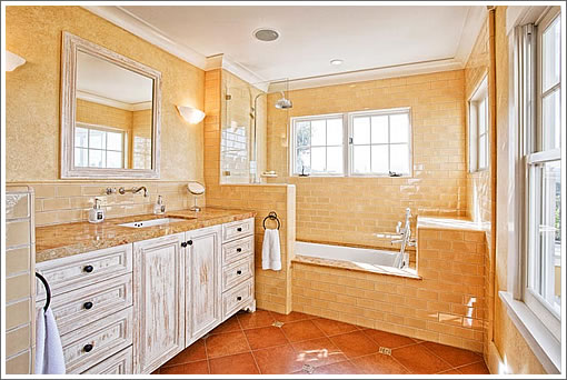
Purchased for $1,540,000 in October 2005 when listed as a 1,750 square three-bedroom home with high ceilinged storage space and garage, 566 Kansas was remodeled in 2006. Think all new bathrooms, a new kitchen, and two new bedrooms below.

This week, the Potrero Hill home returned to the market as a 2,962 square foot four-bedroom “oasis for a deserving buyer” listed for $1,899,000.

Of course you deserve 566 Kansas, our only question is whether or not it deserves you?
∙ Listing: 566 Kansas (4/3) 2,962 sqft – $1,899,000 [566kansas.com] [MLS]

Love it.
I really like the main floor common areas/kitchen and the bathrooms, but I don’t think the pictured bedrooms and media room (?) are “deserving” of this price point.
Really hope they get it. And I think they will. There are a lot of would be Potrero buyers in the market right now.
HA, Ha, ha. i think I get it, the socketsite editor is having fun with the agent who wrote the listing copy. The listing agent probably intended to write the usual cliché…something like this:
But of course, the agent didn’t spell that correctly, the spell checker suggested “deserving” and here we are.
I base this guess on the fact that the word discerning is consistently in the top 30% of word lookups on Merriam-Webster’s web site and my conclusion that the listing agent must not pay too much attention to detail, since of the pictures on the MLS, photo #32 looks exactly the same as photo #25.
Or maybe it’s as simple as the sellers thinking that “anyone who can put together $1.9M in the current economic/lending environment to pay us will deserve a home like this one.”
quite the SF stucco row house rotfl
http://sfbay.craigslist.org/sfc/apa/2282828505.html
Run it through the rent vs buy calculator first.
And I’ll bring up the same thing on using craigslist for rent vs buy. Craigslist has changed over the last couple of years– there are a handful of brokers who spam the listings and are 85% of the listings. The listing price, especially for higher price listings, are often just wishes and not indicative of where the contract will be signed.
Agreed, nanon, I meant to add that I doubt it would rent at 7K a month.
Nice kitchen, though.
Whoah! Are my breakfast shrooms already kicking in or are those photos dramatically manipulated ? Round clocks squished into ovals and sunlit indoors brighter than outdoors. The Mad Hatter is hiding in a closet somewhere.
I didn’t know that jaundice was a color scheme. Did the decorator get a deal on yellow and sponges?
The photos are indeed manipulated. The kitchen is smaller than pictured and the rooms feel more claustrophobic than open. The living room & dining room ceilings have a “popcorn” texture that looks cheap. Plus it’s near the freeway so gets a lot of ambient noise, which I suppose if fine for yet another oversized house remodel that consumed the backyard.
As to the note about Craig’s List being full of span, well Socketsite has it’s own contingent of realtors posting as uninterested parties.
What an odd mish-mash of styles, color, proportion, everything. It seems like they tried to do some nice things on the renovation, but there are so many glaring mismatches. Strange, just plain strange.
(and yes, there’s some heavy-duty photoshopping happening. realtors, at least try to publish faintly realistic photos)
Who was their interior designer, Aunt Jemima? The whole place has a color scheme of “Pancake Sandwich,” down to the bacon-colored exterior and rugs.
Yeah, pretty sure the designer was Aunt Jemima. Huh? Perhaps you should stay away from the medium rich magenta hued bacons moving forward.
Anon.ed: It’s maroon or burgundy, just like I get at Drewes. Magenta is really more of a Mission/Castro/Upper Haight color.
You’re right. Burgundy is the correct call. And nice one, because Drewes rules. That place and the 30th market. Boom! Love knocking out the grocery shopping within 15 minutes on one city block. But for fish, it’s gotta be Sun Fat.
wonderful – but show the whole street picture. don’t be shy. close to fantastic projects on the south side of town.
@The Milkshake: They are not manipulated, per se. Just adjusted to be square. Typically a photographer will use a wide angle lens (in the 10-20mm range) which makes the photo look rounded and odd. You can solve this by shooting with a Tilt-Shift lens, but those are extremely expensive ($2500 for a Canon 17mm TS-E lens). The next best thing (and this is a common practice) is to do a perspective correction. You take a photo shot with a wide angle lens and then adjust the perspective, then drop the edges. Parts of those shots like the clock were not manipulated, but a by-product of ultra-wide lenses. I would go on a limb and say that if there is any manipulation, it’s probably with the use of HDR. And trust me, compared to other property photos, these are FAR from “manipulated.”
FYI: When using the NYT Rent Vs Buy calculator it’s important to note that it does not calculate property taxes properly for California. It uses the expected home apperciation rate, rather than the CA Prop. 13 2% rate.
“wonderful – but show the whole street picture. don’t be shy. close to fantastic projects on the south side of town.”
There are projects all over San Francisco. The Potrero Hill projects are not particularly close to this property. In fact they’re about as far away as possible, Potrero Hill wise.
“They are not manipulated…just adjusted.”
Ha, what BS.
Yeah, they’re “corrected”.
The typical lot is 25ft. Most Victorian layouts allow for rooms 12-16ft wide. Even with the current trend of opening the space, it’s pretty daunting to take a relevant picture of a room without resorting to a sub-20mm lens. Then you have distortion, then correction.
You want pictures to gawk at, you’ll have to accept the drawbacks
Viewing ridiculous photos distracts people from understanding the house. For example, look at the kitchen photo above. The doors on the 48″ viking stove are waaaaaaaay too stretched-out. It just looks absurd.
The manipulation/adjustment/correction shown in these photos immediately makes me wonder what other ways the realtor is trying to shade the truth.
Then again, maybe I should wonder:
https://socketsite.com/archives/2011/01/weve_got_ours_so_we_dont_want_yours_in_pacific_heights.html
Nice views…however this seems seriously overpriced by about 200K for Potrero.
So how much does this place sell for if it’s located in Noe?
Yikes! Somebody needs to fire their decorator.
SFer – Those photos are definitely manipulated. The perspective correction is awkward and heavy handed, far more than required to compensate for lens distortion or perspective. By the way there’s no reason why real estate photos need to be shot with ultra-wide lenses. “Normal” focal lengths can be used to produce more naturalistic photos which require less correction. Just use more photos. The HDR work is also overblown.
The manipulations on this listing are not very deceptive though. I’m not complaining about the photos, just amused. It looks like they were trying for “dreamy” but overshot into “psychedelic”.
More please 🙂
The listing for 566 Kansas has been withdrawn from the MLS after 75 days on the market without a reported sale.