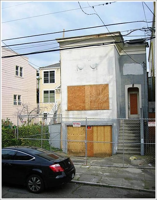
Purchased by Mr. Muhawieh for $920,000 in 2007, as plugged-in people know, a 33 Prospect in progress was taken back by the bank and resold for $770,000 this past April.

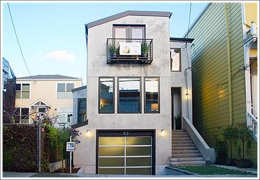
Having since been redesigned and rebuilt as “a modern showcase for urban living,” the now 2,770 square foot home is back on the market and asking $2,350,000.

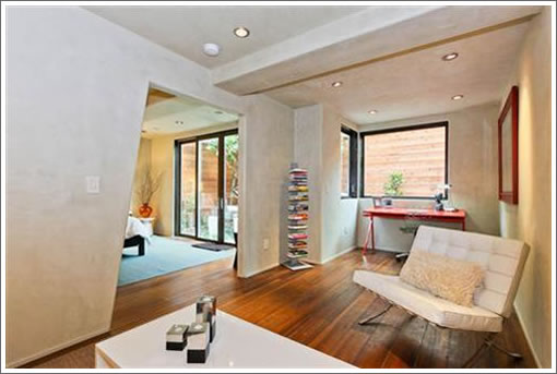
Wood, stone, and a few odd modern showcase angles abound.
∙ Listing: 33 Prosper (3/3.5) 2,770 sqft – $2,350,000 [MLS]
∙ Two More Muhawieh Comps Of Yore Head For The Courthouse Steps [SocketSite]
∙ A Not So Prosperous At (And Under) Asking Sale For 33 Prosper [SocketSite]
∙ An Ironic Address For Another Ex-Muhawieh Property (33 Prosper) [SocketSite]

Someone likes odd angles.
The exterior design is underwhelming. Looks like a townhouse from the suburbs. Too bad because one block Prosper is filled with visual delights.
At first I thought that $2.3M was way too high for this house. But now upon reading further I see that this is no mere house but rather “a modern showcase for urban living”.
It will tooooootally go for over asking.
(can we get C-S to break out “modern showcases for urban living” as a separate dataset as they have done for condos ? Mixing them with ordinary SFRs just clouds the information)
Reminds me of the fairly nice, but bland, places we’ve rented in Tahoe and other vacation locales. Least common denominator. But kudos to the developer for removing a dump from the neighborhood and replacing it with a perfectly nice home. I hope he/she makes enough on the project to do more as it is a shame there are so many run-down shacks in this city.
fugly and ridiculous. A.T., are you sure you want more buildings like this? Nobody wants to live next to a shack but…more buildings like this, really?
crappy exterior for $2.35 million.
just my opinion
I initially like it from the pictures, but I like modern and contemporary. I will withhold final judgement until after I go see it. I likely would have done a couple of things differently, but hard to know without seeing survey of original property and what they were up against at planning dept. Here is a link to developer/builder. Kudos to them for getting this done in less than 10 months.
http://centerlinecustomhomes.com/portfolio/tomassini-development/
Hipster house schmaltz: slap on an odd angled roof and you feel hip, no matter how clunky you look.
The exterior is overwhelming- just like a highway overpass is overwhelming.
The textured ceilings and walls are truly disturbing (as are the random angles). This is not modern but the dreaded “contemporary.”
The floor installers did not even bother to stagger the end joints.
“The floor installers did not even bother to stagger the end joints.”
This might help me settle an argument. I always thought that staggering the end joints randomly was more aesthetically pleasing than aligning the end-joints. But I know at least one other person who feels that end-joints should be aligned for the best effect. Does anyone else hold this favor towards aligning end joints ?
Milkshake- you’re absolutely correct. Industry standards call for every other board’s end joints to be at least 4″-6″ spacing for both aethestics and function. Amateurs who don’t follow (or even know) such guidelines typically line them all up. Where else were shortcuts/oversights taken here?
How can one see whether the end joints were staggered or not from the small photos? Or, maybe I don’t understand the reference?
Yes, this place is a bit idiosyncratic. The interior angles make it look a bit Star Trek, but I don’t mind seeing some uniqueness and individuality in SF housing. So much of it is bland.
I’m sure someone (an upper middle class or rich someone) will enjoy this place.
I think it’s pretty nice, but not exactly my taste. However, the point is moot, as a middle class person won’t be able to afford this place.
Sigh…I’ll mist the duct tape in the cracked living room window of the pre-remodel version….
Is this what you get for a $500+/sqft rebuild in SF? Eep. I hope it’s more appealing in person. For the ask on this, one could have bought 3911 19th just up the hill, done $200k of work, and had side-by-side parking, an elevator, and views.
The house looks like it is wearing a béret! Oui! Oui!
@John
The staggered end joints show up because the planks end lined up in the middle of the floor. This causes a lines to form on every other plank. Terrible!
“The interior angles make it look a bit Star Trek, but I don’t mind seeing some uniqueness and individuality in SF housing. So much of it is bland.”
The problem you often have here with houses like this is that people think their own designs are really clever, but the house is really customized to one person’s tastes for the most part.
Certainly doesn’t feel $2.35M. I’ve noticed some exorbitant prices in the Castro on houses targeted to DINKs, but this house may not fit in that category, and moreover does not have the curb appeal of those houses.
I actually don’t like this house from the pictures, and think the pictures are quite terrible, but it’s possible I’d like this place more in person.
when i think of a well designed modern home , i think of the unhappy hipster /dwell type of home.
even though the unhappy hipster /dwell homes are for douchebags but i like them more than this.
(apologies to all the douchebags “living in the modern world”)
God do I hate that couch or whatever the hell you call it.
2.35 million is not an upper middle class home, you are definitely wealthy if you can afford that price.
If I had that kind of cash there are other places I would choose before this one! Those ceilings are so bunker-esque.
tripp
a Knoll hand built barcelona chair goes for $7,000
it’s de rigueur to stage any hi end modern home with at least one.
I thought more like 1.8 to 1.9 for this one on the exit.
Mis ojos son enfuegos! Aye Caramba!
unless the pictures are really poor, this home is a mistake and the developer is not going to be happy with the (eventual) sales price.
The knoll is de merde. Or chic merde de rigeur.
They leave the box level on the truck when they built that interior door way?
Kirk to Enterprise
Some. Sort of. Modern… Showcase.
No signs of life. Here.
On looking at the after facade photo again I’m amazed that this thorough remodel didn’t include burying the electrical service entry into the wall. Surely they gutted the walls, right ? But there it is to the right of the front door greeting everyone on the way in : a big ugly vertical piece of conduit. I don’t understand why they didn’t bother to remove that wart especially since it is on the face(ade).
(Kurt – thanks for the laugh !)
The last photo (#22) of the listing shows two cheap IKEA wine racks in the “wine cellar”. I would expect a little nicer in a $2mm home (or at least take the half hour with a hole saw and cut the racks improving the poor design so you can store wine on the ends like I did to mine)…
absolutely horrid
Saw the home this weekend, and agree with all the above comments. The other issue for me is the micro-yard (which is visible in the pics), and the view of the property to the rear (which is not). The first level living space looks directly at a very ugly lot line structure. Nothing to be done about it.
NOT worth the listing price.
Kitchen surface wasn’t as bad as I thought it would be, but I would want to investigate whether the marble would stain.
450 * 2770 = 1.25M + 300K coolness effect = 1.55M
Reduced to 2.199.
I toured it. Ok inside, awful “view,” tiny “yard.” 3 en suite bathrooms. Good location. Overpriced.
Still on the market. Saw it once again and the place is growing on me. Fantastic location.
Mark, am I sensing a low-ball offer?
Attitudes seem to be shifting toward a desire to be right in the thick of things. Look at this one, it’s maybe a block off 16th and Market. And lots of people are calling it a great location.
Well, I do like the location.
The lot is a turn-off for me. Instead of the typical 25 X 120 of this area, prosper is in the 25 X 80 zone since the larger grid block is split in 3 instead of 2 like Hartford or Sharon. This means no green belt effect and a much more “urban” feel. Then again, this is expected there. Still, this price would work on ford. Maybe not on Prosper.
Also the door angles are strange. My shoulders are wider than my feet. I assume most humans are like that. Maybe the target segment is clowns with giant shoes (and feet) who are tired of crushed pinkies. In that case a regular door profile with a big foot-shaped cut-out would have been better…
reduced to $2.149
After 126 days on the market (last asking $2,149,000), the listing for 33 Prosper has been withdrawn from the MLS without a reported sale.
Now showing as sold for $2.040 M in July. And no, I didn’t make an offer. 🙂