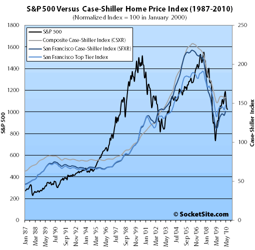
A plugged-in reader plots the past ten years of S&P performance versus the composite* Case-Shiller Index.
Currently up 11 percent year-over-year, the S&P 500 has fallen 13.6 percent since the end of April, down 34 percent from an October 2007 peak, and back to September 2003 levels ignoring the roller coaster that commenced at the end of 2008.
UPDATE: Sorry folks, we blew it by missing the word “composite” on our reader’s graph. We’re working on another which will include the San Francisco MSA.
These plots are suspect. They imply that the SF CS value was similar in 2000 and 2007, when in fact the Jan 2007 SF CS index value was more than doubled the Jan 2000 index value (211 vs 100). IN contrast, the Jan 2000 vs 2007 S&P500 values were about even with opening values of 1469 and 1418, respectively.
Are these data plotted on a log scale?
is there a time shift on? and can you post the chart with the values on the axes?
Interesting chart, but it cannot be accurate. CS at 1/2000 was 100 and at 4/2010 was 139. But this chart shows the current level below the 1/2000 level. And the CS peak in 2006 was 218.4, more than double the 2000 level, but this chart shows nothing like that kind of gain, unless the scaling is really, really weird. And there was no dip followed by a rise in CS between May ’07 and January ’08, as indicated on the chart — it was straight down during that period.
I too am suspicious of this graph. I would expect some correlation between SF MSA real estate prices and the S&P, but eyeballing the graph suggests an extremely tight correlation. Every single squiggle in the S&P appears to be reflected as a squiggle in the Case Shiller Index.