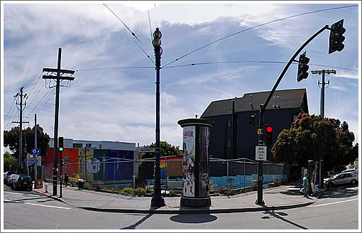
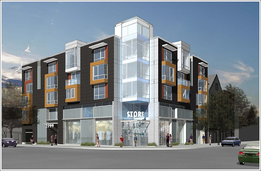
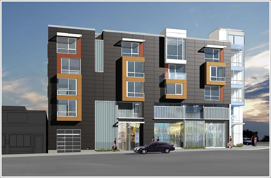
With objections ranging from its impact on pedestrians and bicycles (“circulation and safety issues”), to parking ratios (1:1 as proposed), to ground floor retail ceiling height, to how its affordable housing component will be handled (in-lieu versus onsite), the proposed design of 2299 Market is opposed by Castro Area Planning & Action, Duboce Triangle Neighborhood Association, Eureka Valley Neighborhood Association, Hayes Valley Neighborhood Association, Walk SF, Livable City, and the San Francisco Bicycle Coalition.
In response to the concerns raised by the groups, the project sponsor has increased the ceiling height of the commercial space on Noe from 10 to 14 feet. And the Planning Department recommends the Planning Commission approve the project as proposed.
The basis for the Planning Department’s recommendation:
- The project complies with applicable Code requirements.
- The project is well designed and would contribute to the urban character of the neighborhood.
- There is no mechanism for the Department to require the sponsor to provide a project that is totally consistent with the Code requirements of the Upper Market NCT [“the western boundary for the Upper Market NCT District terminates at the intersection of Market, Noe, and 16th Streets leaving the Upper Market NCD intact from 16th Street to Castro Street”].
- The sponsor has made good faith efforts in revising the design to address the DR requestor’s concerns.
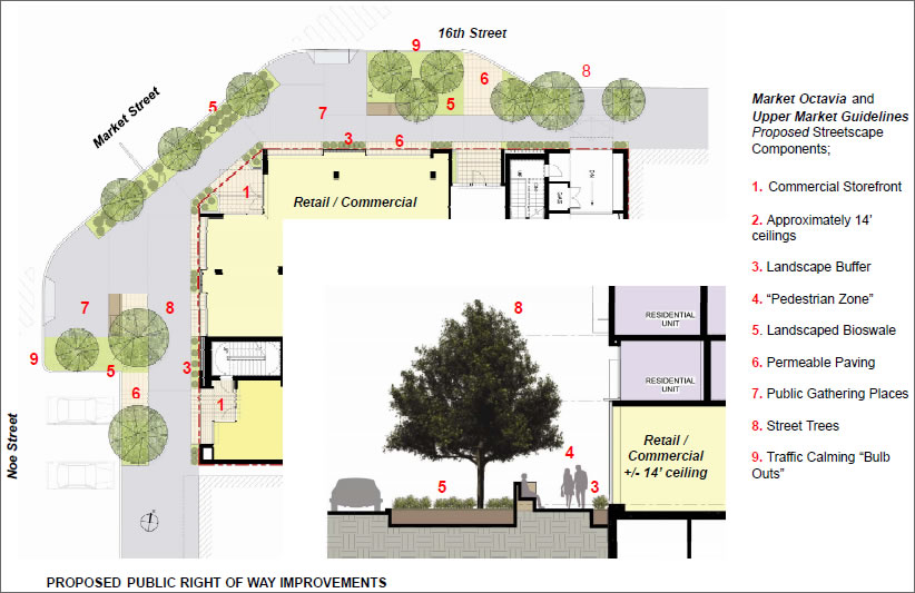
The project also includes proposed public right of way improvements.
The Planning Commission will review the objections to the project on Thursday. And once again, as the site currently stands (as the “hole in the ground” has for the past 29 years):

∙ Moving Along On Market And Trying To Fill That Hole (2299 Market) [SocketSite]


Curious about the “circulation and safety” issues, I tried looking on the Walk SF ( http://www.walksf.org/ ) and SFBC ( http://www.sfbike.org/ ) websites and could not find any details of why these groups were opposing this project.
Does anyone know the specifics ?
Editor’s Note: Planning’s summary of opponent’s transportation related concern:
I will be requesting DR on this project due to the breakneck speed that this is proceeding. 29 years is not an adequate amount of time to analyze all of the adverse impacts this building will have on the nayberhood.
Walk SF and SFBC are opposed to it because they are busybodies that have nothing better to do. That is their raison d’être and have given up even the pretense of offering realistic complaints, much less realistic alternatives.
Hayes Valley Neighborhood Association weighed in on this? Really? Now that’s funny. What’s the name for that sort of longer distance NIMBYism?
Also, if they fail to build this, I’m betting Ike’s could move it’s operation into the pit. That way we’d have all those unsightly hipsters hidden from street view. Win win!
One of the nice things about walking down Market in this area is the WIDE sidewalks. Little itsy bitsy parcels of “greenscape” just squeeze people into narrow bottlenecks. Silly idea on a pedestrian boulevard.
Thanks for the deets, editor. I’ve reviewed a lot of project plans from the standpoint of bike and ped safety, yet I barely understand many of these points.
On point A, seeing a site plan would help to understand what is meant by “a continuous pedestrian crosswalk spanning 16th Street and Noe Street”. I doubt that they mean that this creates a Tokyo style “scramble” crossing where all of the auto traffic is stopped while peds can cross every which way across this multi street intersection. The Muni tracks would be too much of a complication. I wonder what the opponents of the project want the developer to do to resolve these “hazardous conditions”.
Point B makes sense – the garage entry should be far from the crosswalk.
Point C is baffling. Um, yeah the Muni track does turn there. What is expected of the developer ?
Point D is just plain goofy and should really be an issue for the farmer’s market organizers to solve anyways.
Point E is just obvious : yes things are more dangerous at night. What is expected of the developer ? Better lighting ?
S.W. – though I agree that it looks as if some nit picking is happening here these two orgs generally don’t waste time. Unless countering Rob Anderson’s moves is considered wasting time (and now there’s a real busybody)
I hope these issues can get resolved and finally fill that big hole. Too bad the original taller building isn’t on the table.
@milkshake:
1. The garage entry IS as far from the crosswalk as possible. Look again at the building footprint. The garage entry is at the eastern edge of the building. Best place for it.
Rest of the complaints by opposition is irrelevant and a waste of time to discuss.
The bike org opposes almost everything that doesnt involve adding more bike lanes. I, for one, basically support what Rob Anderson has done.
Hayes Valley Neighborhood Association weighed in on this? Really? Now that’s funny. What’s the name for that sort of longer distance NIMBYism?
NITBYE: Not In Their Backyard, Either
“NITBYE: Not In Their Backyard, Either”
I suggest NOSEBY: Not In Somebody Else’s Back Yard
never mind, I like NITBY better, sounds more like a pest.
If you look at the site on Google, the proposed garage entrance appears to be waaaaay down the street, a good 60+ feet from the well-marked pedestrian crossing. If you’re worried about pedestrian safety, make it a right-turn-only exit (seems unnecessary to this pedestrian, but I’m just saying..).
The overhead view sheds no light on what is meant by “a continuous pedestrian crosswalk spanning 16th Street and Noe Street” other than perhaps that the corner sticking out after development, in much the same way as it does now, sort of serves as a way station if you don’t make both lights and have to stop after crossing 16th or Noe on a walk further up or down Market. One might argue that providing pedestrians with a place to stop and do something, like shop or window gaze, makes this better than having an empty lot there.
You can also note that the exact same “problem” of continuous crosswalk occurs across Market in front of The Lookout. Clearly the only solution to these “dangers” is building walls blocking pedestrians on Market entirely. So it’s “safer” for them.
ooops.
http://maps.google.com/maps?f=q&source=s_q&hl=en&geocode=&q=2299+Market+Street,+San+Francisco,+CA&sll=37.776633,-122.430708&sspn=0.0125,0.027874&ie=UTF8&hq=&hnear=2299+Market+St,+San+Francisco,+California+94114&ll=37.764235,-122.43295&spn=0.000781,0.001742&t=h&z=20
Hmmmm… If the garage entrance is the farthest possible from the crosswalk and the building is entitled to parking then I do not see what the complaint B is about, unless it applies to an earlier rev of the design. And as BobN points out there are other ways to mitigate the conflict.
As for the continuous crosswalk concern, if this is the case of someone walking the SE side of Market and crossing both Noe and 16th with a tiny little diagonal part of this project’s Market Street frontage thrown in, I do not see why this is any more hazardous than what exists today.
These concerns would be so much easier to understand if the opposition described possible solutions.
“why this is any more hazardous than what exists today”
I don’t know about hazardous, but the thought of walking past anything called “bioswale” kind of creeps me out.
A link to the Planning Department’s Discretionary Review Analysis for 2299 Market (which includes the oppositions detailed argument against the proposed project) has been added above.
Thanks for the link to the actual DRA. That clears up a lot. I learned :
1. The original DR issues are much better described in the doc that opponents drew up (starting on page 21 of the DRA). The six points above are not individual complaints but rather characteristics that make this intersection exceptional with respect to a prior design, not the latest design shown here.
2. The response by the developer (starting page 27) garbled the opponents explanation of the site’s characteristics and presented them as the individual “issues” A-F. Note that they left off the opening sentence from the opponents document that presents these six items as separate characteristics of the intersection. (page 30)
3. It seems as if the developer has addressed all of the street hazard points nicely. They moved the garage entrance as far as possible from the crosswalk and have proposed to reduce crosswalk lengths via bulb-outs.
I hope the opponents are satisfied at least with the response to ped safety issues.
(FYI, a “bioswale” is just a landscaped patch designed to filter rainfall runoff)
[Editor’s Note: Apologies for any part we played in the confusion. And thank you for helping to clarify.]
The architects and developer have done a superb job in addressing all of the DR issues, and resolved all of them in a professional and creative manner.
The garage entrance should never have been an issue, since it was initially located in the best possible location anyway.
The design is fresh, clean, modern using interesting and long lasting materials. The interior residential units are spacious and well laid out.
Hopefully there will be no more objections from anyone. This is a good example of appropriate, modern, infill housing and retail for the Upper Market neighborhood. Let’s see this built. Many of us remember when the church burnt down at this site, and the ugly hole has remained there far too long.
I agree that the revised design is great. Bulbouts at that corner would be very helpful,particularly since a successful retail project will only add to the pedestrian volumes.
Crossing both Noe and 16th should be made both more pleasant and safer by these improvements.
So glad they increased the height of the retail space as well. That is really important for the use of the space, and something that residential developers sometimes do not pay attention to.
And of course it would be GREAT to fill in that hole in the ground! I hope the project finds financing to go forward.
@Joe — LOL. Most of the opposition wasn’t born when the thing became the hole thing, and have only lived in SF a few years altogether. My only hope is that the guys who sell crap on the curb there all day everyday can pull together their pennies and rent the retail space. That or American Apparel.
Oy. I hope not American Apparel. Their freakishly bright fluorescent-tube-lit stores have less style and appeal than a 7-11.
It’s the Castro. I’m hoping for something local that the boys love, with a cutesy name — “Auntie Mame’s Shoe Pavilion” or somesuch.
* flips hair back over shoulder, melodramatically *
The acronym you are looking for is BANANA: Build Absolutely Nothing Anywhere Near Anything. It applies to many in SF who believe that construction of a building in an appropriate site with a building that is code compliant and actually provides amenity is a capitalist plot to destroy all life forms that exist now or may exist in the future.
And I agree that 29 years – the fire that took out the Trinity Methodist church was in October 1981 – is barely enough time for the BANANAistas to evaluate anything…or the Planning Dep’t!
Or maybe it will just be an empty store front to go along with all of the other ones in the Castro.
Why hasn’t this hole in the ground been designated historic yet?
DTNA – This is another example of Peter Cohen attempting to control what people can do with their property. Everyday another storefront goes vacant on Upper Market Street and still DTNA fights every single project that is proposed on Upper Market and wants to control what home owners can do in DT. Open your eyes people, he is lobbying the Board of Sups to get a position on the Planning Commission – if this happens there will NEVER be any new development in the City. Speak up or lose your voice – call or write Scott Wiener and the other Sups and let them know you vote & you don’t support Peter Cohen’s ideas or anyone who supports Peter Cohen!!!
I would love to see a photo of the old church. Anyone know where I can find one? larrygentry@sbcglobal.net