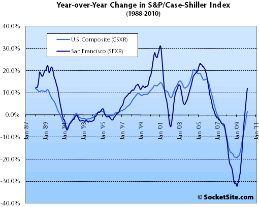
According to the February 2010 S&P/Case-Shiller Home Price Index, single-family home prices in the San Francisco MSA fell 0.7% from January ’10 to February ’10, down 38.3% from a peak in May 2006 but up 11.9% year-over-year.
For the broader 10-City composite (CSXR), home values fell 0.7% from January to February (the fourth consecutive slide) and remain down 30.7% from a peak in June 2006 (up 1.4% year-over-year).
San Diego was the only market that continued to show improvement in home prices between January and February. All other metros and the two composites showed declines from their January levels, some of these being fairly significant, with 12 of the MSAs falling by at least 1.0% during the month. Six of the MSAs – Charlotte, Las Vegas, New York, Portland, Seattle and Tampa – posted new index lows as measured in the current housing cycle where, depending on the market, we saw peaks in 2006 and 2007. The two latest markets to post new index lows, New York and Portland, showed peak-to-February declines of -21% and -23.0%, respectively.
Charlotte and Cleveland have shown seven consecutive months of negative monthly returns. Atlanta, Boston, Denver, New York and Tampa are not far behind, with six consecutive negative prints. Six of the 20 MSAs – Atlanta, Denver, Las Vegas, San Diego, Seattle and Washington DC – showed some improvement in monthly returns compared to the prior month.
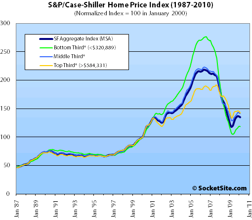
On a month-over-month basis, and for the first time since March 2009, prices fell across all three price tiers for single-family homes in the San Francisco MSA.

The bottom third (under $320,889 at the time of acquisition) fell 0.4% from January to February (up 5.3% YOY); the middle third fell 0.3% from January to February (up 6.4% YOY); and the top third (over $584,331 at the time of acquisition) fell 1.5% from January to February (up 2.7% YOY).
According to the Index, single-family home values for the bottom third of the market in the San Francisco MSA are just below September 2000 levels having fallen 57% from a peak in August 2006, the middle third is hovering around June 2002 levels having fallen 37% from a peak in May 2006, and the top third slipped back below February 2004 levels having fallen 26% from a peak in August 2007.
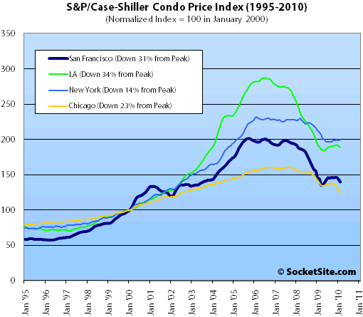
Condo values in the San Francisco MSA fell 2.6% from January ’10 to February ’10, down 3.0% on a year-over-year basis and down 30.5% from an December 2005 high.

Our standard SocketSite S&P/Case-Shiller footnote: The S&P/Case-Shiller home price indices include San Francisco, San Mateo, Marin, Contra Costa, and Alameda in the “San Francisco” index (i.e., greater MSA) and are imperfect in factoring out changes in property values due to improvements versus appreciation (although they try their best).
∙ Home Prices Mixed in February 2010 [standardandpoors.com]
∙ January Case-Shiller Index: Bottom Tier Up, Middle And Top Tiers Fall [SocketSite]
I guess it’s all how you spin it:
“The best performing market in February was San Francisco, which posted a double-digit gain over the past 12 months of 11.9%. San Diego home prices jumped 7.6% and Los Angeles gained 5.3%.”
http://money.cnn.com/2010/04/27/real_estate/home_prices_up
Interesting statistical observation:
Overall, the index is very close to the early 2009 bottom.
Individually, each tier is still way off their bottoms. The tier that bounced most is the bottom one. The most tepid bounce is the top tier.
The conclusion: More activity in the bottom tier mecahnically pushed the overall numbers down.
March numbers might prove very interesting. Are we having another seasonal bounce this year and will it be stronger than last years?
Does anyone know how this is calculated? I thought it was ‘repeat’ sales of homes, but not sure. If it is calculated as purely re-sales of the same exact homes, my question would be has there been enough of same home sales to have a graph without huge confidence intervals (meaning the ‘n’ was very small?)
[Editor’s Note: You might want to try a simple search of this site for not only links to the methodology but also past discussions and debates with respect to its relevancy.]
The headline says prices fell but the first line says SFRs are up 12% since last year, ??
^ Different time periods…
I get the overall methodology, but I’ve never fully understood the tiers in the following respect. Since the tier breakpoints change every month (by a lot over the last few years), how can one ascertain the performance of one tier or another over time? Does CS go back and recalculate the historical performance of each tier every time the breakpoints are re-set? I don’t think so. So while the aggregate performance might be consistently measured over time, the graphs of the tiers over time appear to be charting apples to oranges.
seasonally adjusted the tiers increased 0.5%/1.1% at bottom/mid and fell 0.2% at top.
Prices rose overall 0.4% in Feb – the 11th consecutive month that posted a price increase for the SF MSA.
“S&P has cautioned that the seasonal adjustment is probably being distorted by irregular factors. These distortions could include distressed sales and the various government programs.”
Up 11.6% YoY is impressive, no matter how you cut it. Definitely much more relevant than looking at ~30% drop from peak.
The tiering is mostly irrelevant, given the fact that the top tier of ~$583k doesn’t really buy you much in SF.
What makes 12 months specifically more relevant than: 3 months, 24, 36 or 48 months?
I made a CS prediction 5 months ago. Let’s see how accurate that prediction was:
CS SFRs will continue to rise until February.
This month’s condo numbers are a blip. Condos will rise next month too.
Posted by: tipster at December 29, 2009 10:59 AM
We Realtors ® pride ourselves on being right. 😉
Compared to 3 months its obvious: seasonality.
But then why stop at 48 months? Why not 120 months? 240 months??
I made a CS prediction 5 months ago. Let’s see how accurate that prediction was:
CS SFRs will continue to rise until February
Not so accurate, actually. The index fell the two months prior to this one as well.
“But then why stop at 48 months? Why not 120 months? 240 months??”
Who said stop? I say take it all into consideration. Look at how stable prices were for the last 100 years, leading up to the loose lending strategies that started with the repeal of the Glass Steagall Act.
Interesting indeed. It looks like SF MSA is up 15% since what is increasingly looking like the bottom, which was March of ’09. All three tiers are up from their respective bottoms in spring ’09, and notably – the top tier is up 9%. It’s not perfectly correlated, but I still think it’s the best proxy for SF proper. The top tier is also down 23% since it’s peak in early 2007, which is a large drop, but that’s a far cry from the 40% drops that many on here predicted. I also think it’s debatable whether SF proper has really dropped as much as the upper tier as a whole. Time will tell, but this is not bad news for RE.
@AT
In a lock-step market, where all properties track in essentially the same direction, the tier boundaries are fixed with respect to properties, as they divide the market into three equal parts.
In a complicated market, where properties may exchange their relative positions and move, e.g., from a bottom-third property to a middle-third property, then the relative index values would be apples/oranges. However, I don’t think that happens that frequently, especially in our MSA.
So, S&P is trying to divide the market into 3 segments, and, because of price movements, the boundaries between those segments must change, otherwise, over long periods of time, all properties would slowly migrate into a single segment.
If it helps, rather than focus on the specific price, just think of ‘top third most expensive, middle third expensive, cheapest third’
Someone wanna take a stab at explaining this?
YoY for 20 composites:
San Francisco 11.9%
San Diego 7.6%
Los Angeles 5.3%
Washington 5.0%
Denver 3.6%
Cleveland 3.2%
Minneapolis 3.0%
Dallas 2.6%
Boston 1.8%
Atlanta -0.9%
Phoenix -1.6%
Charlotte -2.5%
Chicago -3.0%
New York -4.1%
Miami -4.4%
Portland -4.8%
Detroit -5.4%
Seattle -5.6%
Tampa -6.0%
Las Vegas -14.6%
as J mentioned above (and as was discussed on some of the financial blogs like Calculated Risk a while back), S&P/Case Shiller came out with a warning about seasonal adjustment this year.
Typically, seasonal adjustment works quite well and helps us to understand Month over Month data… however the last 2 years have behaved differently than years past, and thus the seasonal adjustment is not working
Thus: we should prioritize Year over Year numbers over Month over Month numbers (I always do this anyway)
AND if you are trying to analyze Month over month data, then use the NONseasonally adjusted data and compare that directly to years past NONseasonally adjusted data.
From S&P
“After reviewing the data, the S&P/Case-Shiller Home Price Index Committee believes that, for the present, the unadjusted series is a more reliable indicator and, thus, reports should focus on the year-over-year changes where seasonal shifts are not a factor. Additionally, if monthly changes are considered, the unadjusted series should be used.”
more analysis of this issue at CR blog:
http://www.calculatedriskblog.com/2010/04/s-concerned-about-seasonal-adjustment.html
[Editor’s Note: Yes, there’s a reason why we’ve always eschewed the seasonally adjusted Case-Shiller data set while others jumped on the bandwagon.]
I’ve heard that it might be the large amounts of government intervention that’s making the Seasonally Adjusted numbers questionable.
I’ll re-post the running stats for the MSA thirds.
Month…Upper 1/3….Lower 1/3
Sep-07..$860K……..$614K
Oct-07..$853K……..$605K
Nov-07..$834K……..$586K
Dec-07..$816K……..$566K
Jan-08..$794K……..$545K
Feb-08..$756K……..$513K
Mar-08..$734K……..$589K
Apr-08..$722K……..$474K
May-08..$722K……..$474K
Jun-08..$707K……..$447K
Jul-08..$696K……..$432K
Aug-08..$675K……..$410K
Sep-08..$648K……..$386K
Oct-08..$562K……..$321K
Nov-08..$592K……..$342K
Dec-08..$561K……..$321K
Jan-09..$527K……..$298K
Feb-09..$502K……..$281K
Mar-09..$482K……..$268K
Apr-09..$479K……..$265K
May-09..$486K……..$267K
Jun-09..$508K……..$276K
Jul-09..$533K……..$288K
Aug-09..$558K……..$300K
Sep-09..$577K……..$309K
Oct-09..$592K……..$318K
Nov-09..$601K……..$323K
Dec-09..$601K……..$326K
Jan-10..$593K……..$324K
Feb-10..$584K……..$321K
[Editor’s Note: Remember, the price tiers are based on the initial acquisition cost for each sale pair, not the sale price of the properties today. In other words, a property that was purchased for $550,000 in 1998 and sold for $900,000 earlier this year would have fallen under the middle price tier in February.
Statements such as “The tiering is mostly irrelevant, given the fact that the top tier of ~$583k doesn’t really buy you much in SF” demonstrate a fundamental misunderstanding of the index.]
sfgate on Understanding The Case-Shiller Housing Index:
http://www.sfgate.com/cgi-bin/article.cgi?f=/g/a/2010/04/28/investopedia5867.DTL
Someone wanna take a stab at explaining this?
YoY for 20 composites:
San Francisco 11.9%
San Diego 7.6%
Los Angeles 5.3%
Washington 5.0%
Denver 3.6%
Cleveland 3.2%
Minneapolis 3.0%
Dallas 2.6%
Boston 1.8%
Atlanta -0.9%
Phoenix -1.6%
Charlotte -2.5%
Chicago -3.0%
New York -4.1%
Miami -4.4%
Portland -4.8%
Detroit -5.4%
Seattle -5.6%
Tampa -6.0%
Las Vegas -14.6%
R, I guess SF MSA fell harder than most (but not all).
maybe it overshot on the way down.
Either way, I don’t think many expected it to bounce back so soon – who would have though the SF MSA would be posting double digit appreciation already?
REp: Good point. If it was only the government intervention, you would see indices be close. Perhaps this is saying that SF is a stronger area in terms of jobs/salaries, which is why it will be the first to recover
Editor’s Note: Remember, the price tiers are based on the initial acquisition cost for each sale pair, not the sale price of the properties today. In other words, a property that was purchased for $550,000 in 1998 and sold for $900,000 earlier this year would have fallen under the middle price tier in February.
Statements such as “The tiering is mostly irrelevant, given the fact that the top tier of ~$583k doesn’t really buy you much in SF” demonstrate a fundamental misunderstanding of the index.
Yeah, fluj never understood how the tiers worked. He consistently told us that Case-Shiller was meaningless because even the bottom third of SF was higher than the top tier mark of Case-Shiller.
The thing is, I’m not entirely sure what exactly the tiers tell us. If a Noe house sold for the last time in 1995 for $450K, it would be in the middle tier now. And if a South of Market condo last sold in 2007 for $700K, it would be in the top tier. But the inferences from tiering are hard to discern, other than the fact that there are definitely SF properties in high tier, there are likely many SF properties in the mid tier, and there are likely very few SF properties in the low tier.
The Case-Shiller methodology notes also point out that the top tier tends to be closest to the aggregate typically because the aggregate index is value-weighted. The methodology notes also say that, in larger metro areas, a property with 10 years between sales is weighted 20-45% less than a property with 6 months between sales.
[click “Methodology” in the link below for the document]
In March, SF made up approximately 12% of the properties sold in the 5-county area (500 homes sold here vs. more than 4100 in the 5-county area), but note that Case-Shiller reports a 3-month moving average, so the March report will have an average of January, February, and March data.
As I mentioned in November (September data), I am still waiting for the tiers to ramp-up because of all the recently acquired properties (’05-’07)coming to market due to forced sales from option ARM recasts, etc.
I guess that what could be happening (although I don’t see it) is that these properties are becoming REOs and havent re-sold and been recorded in the CS yet.