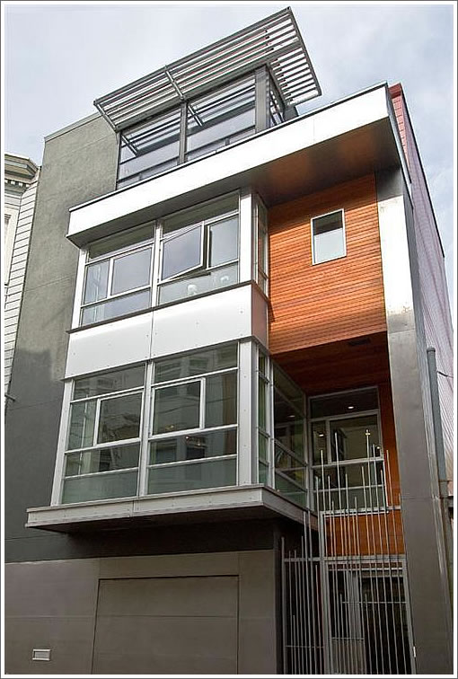
If we’re not mistaken [which we were, see UPDATE], 124 Lily is a Topetcher Architecture design built on a lot split from 229 Oak behind. Single-family new construction in Hayes Valley with four bedrooms, three and one-half baths, and two car parking (albeit tandem).

Asking $1,895,000 for its 2,650 square feet ($715 per new construction square foot).
UPDATE: Some tandem parking color from a plugged-in reader:
The tandem parking is kind of neat, actually. It is side by side, but because the garage door is big enough for only one car, they have a platform onto which you drive a car. There is a control panel on the wall which slides the platform over (via belts in tracks, I believe) so that another car can be parked in that place.
UPDATE (1/9): Well, we were mistaken. While Kennerly Architecture & Planning was retained during construction to refine details and materials, Mark Topetcher of Topetcher Architecture is the architect of record. Our appologies for the confusion.
∙ Listing: 124 Lily (4/3.5) 2,650 sqft – $1,895,000 [124lily.com]
∙ Topetcher Architecture [toparchitecture.com]
∙ Owen Kennerly Architecture [kennerlyarchitecture.com]
Ouch, having to get on Octavia Blvd in order to get to your house sort of sucks.
This is a really nice place. While I like this neighborhood, it is quite, um, “urban” and this price is way out of line for the area. And no yard. My bet is it will take a $400,000 drop in price to sell it.
I live (quite happily) in the neighborhood and have been following (sort-of) the construction of this house. Hayes Valley has some great alleys, but, unfortunately, I don’t consider this block of Lily to be one of them. It’s seems to me to be a bit dark and dirty. It is, however, very nearby to a lot of great stuff (restaurants, park, schools, etc.) It’s a 30 minute walk to downtown, and super convenient to the freeway for those who work down south.
The tandem parking is kind of neat, actually. It is side by side, but because the garage door is big enough for only one car, they have a platform onto which you drive a car. There is a control panel on the wall which slides the platform over (via belts in tracks, I believe) so that another car can be parked in that place.
Regarding the above comments, I’m not sure why it sucks to get on Octavia to get to your house. I’ve been doing that ever since the boulevard was built, and it hasn’t sucked yet.
Yes, it is an urban environment. I consider that to be a good thing. The person who buys this house would probably not consider buying a house in West Portal or Forest Knolls or some such place.
Regarding the price, I don’t think it’s likely to go for asking. Most families with children who could afford such a place I think would prefer a yard. You can get that at this price not too far away. Also, it’s a lot of house for just a couple, so it could be a difficult sale.
BTW, this kitchen design reminds me of the discussion in the 1155 Vallejo thread (see name link) regarding burner vs. sink on/in the island. I much prefer this sink in the island design.
I’m new, hi. Anyway, I find it somewhat amazing you don’t get enclosed showers for the price. May need to lower my expectations when I leave the Northeast.
Johnette, that shower situation is a bit odd. You would typically get at least a fixed glass panel, usually also with a door, like in the master bath.
Johnette,
You absolutely should get enclosed showers for the price. They may be on the way, if they just finished the build and wanted to get it to market as fast as they could and didn’t want to wait (a few weeks) for the shower enclosures.
gmlight — I tend to find Octavia to be backed up, etc. whenever I’m on it because it’s a glorified Oak/Fell Street ramp now. Certainly not a good street to walk on either — dangerous because of the odd traffic patterns. The only way to get to this place is to get on Octavia to get to that one-way part of Lily.
Of interest, possibly: I believe it is built on the other half of a lot split of 229 Oak, which is also for sale:
http://www.redfin.com/CA/San-Francisco/229-Oak-St-94102/home/22000100
It looks like 229 Oak was bought for sub-$1M in ’02. Even if both properties sell at substantial discounts, the investor/developer will likely do well as, as the aggregate ask is $3.4M.
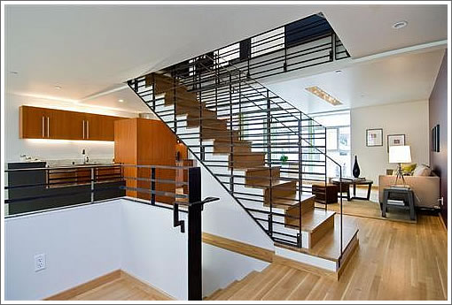
I can’t say that I love this place, especially its layout. However, it might look more livable with furniture rearrangement.
as it is you have this odd space next to the kitchen that they’ve used to put a couch and a breakfast nook. Huh? someone is going to sit at the couch and look at a 35 degree angle over to the kitchen? or out that window into a wall?
someone needs a breakfast nook there when you have counter/stools right there? (too bad the counter/stool area isn’t bigger)
the dining room is around a staircase and down the hall?
the living room is down a floor?
unfortunately, that kitchen/great space leaves me with the “what do I do with this” feeling. However, my guess is that this space is big enough if you ditch the breakfast table, and add a few chairs or a second sofa, and maybe a small TV or something then the space could act as your great room, and you’d have a more formal dining room downstairs.
IMO this is a poor division of space in a space-constrained area. terrible plan. much of this comes from the ill-conceived placement of that staircase with everything having to work around that.
The 2 story windows in the formal LR are nice, as are two of the outdoor spaces. (the one outside the LR is really a fishtank… that kind only works if the entire space is surrounded by YOUR domicile IMO… that’s too open for me).
the rest of the place is new and clean but otherwise unremarkable.
The living room is very nice. Love the double height ceiling. The fire place could be better. Put an ecosmart type of fireplace would be a lot sexier. The current one looks dated. The dinning area is really odd. It felt like a left over space. It’s too narrow to put a dinning table there. The area next to the kitchen is a much better area. Better to have a great dinning room area than a family room and a narrow dinning space. By the way, the purple is hideous.
I don’t like this living plan at all. It’s interesting that this is the same architect who was responsible for the modernized Duncan St. Victorian. I visited that house and it too had a terrible living plan IMO. The rooms all felt disconnected, very similar to this place. I don’t think this house will fetch asking price. I like the location, personally, but the finishes seem cheap. The kitchen is so blah. And as above, the wall color choices are just horrendous.
UPDATE: Well, we were mistaken. While Kennerly Architecture & Planning was retained during construction to refine details and materials, Mark Topetcher of Topetcher Architecture is the architect of record for 124 Lily. Our appologies for the confusion.
Gotta agree with most everyone — the planning is just weird on this one. In two senses:
1. the location is a definitely not-sweet block of a one-way alley. Fine for a couple of edgy condos, but not for a large SFR, with no clarity around “for whom it is designed” (single couple, family with kids, etc).
2. the space planning is just goofy — why the full-width, nearly double-height first floor living room? The dining loft above that space does look awfully narrow, yet is that a closet door of some sort at the far chimney wall? The kitchen has a dead-end that overlooks the double-height part of the living, while the family room feels lost looking at the kitchen and eating area (which has the only windows in the whole space). Laying the stairs across the width of the space may make sense for the first and top bedroom levels planning (hard to tell from these pics), but it cuts the 2nd level living areas in half, with circulation pinched to the landing that joins the dining loft to the kitchen/family space. Is there a powder room on this level? Or just on the first level? And what is that door in the single-height part of the inside wall of the living room for — a closet under the stairs?
Based on all of the reactions, this looks to be a tough sell as a large, oddly layed out single family residence.
Wonder how difficult it will be to remove tags from the exterior material…doesn’t look like a painted finish.
I look at this house and see clear intent with regard to whom the buyer might be. It was designed for DINKs, whether straight or gay. Could they have known that this particular market segment 1.5M to 2M, would be a really tough one right now? As for design, I agree that the layout appears odd. But maybe some of you design bashers should go look at a place in a while too.
The Oak street firehouse that just got into contract might be a decent indicator of what this one will sell for. They’re roughly the same size, yard challenged, funky layouts, and on busy corridors.
The list price for 56 Lily has been reduced $100,000 (5%), now asking $1,795,000.
The sale of 124 Lily closed escrow yesterday with a reported contract price of $1,775,000 ($670 per square foot).
UPDATE: Modern Hayes Valley Lily Pad Back on the Market for $3.6M