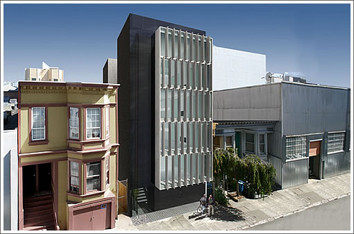
It’s a proposed Stanley Saitowitz design for 1029 Natoma that riffs off the award winning Saitowitz project across the street of which we’re rather fond (1028 Natoma).
The plans for the urban infill project would turn a mostly empty lot with a little tear down into a four unit building with three car parking. Asking $859,000 for the property.
∙ Listing: 1029 Natoma – $859,000 [MLS] [Map]
∙ 1028 Natoma Street: Inside and Out [archdaily.com]
This build does not pencil in, and that’s why it has sat. If Saitowitz thought it was a winner it would already have been built.
Ok so I live just around the block. I know Stanley both personally and professionally from work he did for our institution. Do I like his work, yes…particularly the residential he did on Howard. Do I like this particular infill project which Socket Site editors claim “riffs off the award winning Saitowitz project across the street (1028 Natoma)” … well the design speaks the “Stanley vernacular” however this one is more the “silver capped tooth” in a mouth otherwise filled with some excellent remaining residential units from the 20s. Don’t get me wrong the neighborhood (yes a real neighborhood with plenty of people from all walks of life, even kids living here!) wants more neighbors asap, the neighborhood has embraced change with the possible exception of the proposed Octavia/Mission planned future 400 foot monster towers along the west side south van ness and south side of mission. Change is good …but i see enough silver and gold capped teeth running around in the City, i don’t feel like looking at one everyday before and after work. Sorry Stanley.
This will come as a big surprise but I don’t like either design.
BTW, what is that “screen” covering most of the front of 1028? Or is it the rendering/photo? Looks blurred with no window detail evident.
1028 seperates itself from its immediate neighbors. No continuity, no visual integration. Just a large “break”. It might be different if the building on one side was industrial looking but that is not the case.
Hmm, the warm yellow of the building to the right (see photo) is reduced to a washed out pastel in the renderings.
Hideous
Cold
Unlivable
Wow, that looks truly awful. I would rather have a generic Vancouver-looking glass tower than that POS.
out of place
Like all his other stuff, looks good as an art object but would be horrible to live in.
Thankfully, many of the comments agree that this is just a bad design..scaleless, out of context with any elements of the neighborhood..
another cold, lifeless, ego-centric design by the great and powerful Saitowitz..I dont like this one at all.
Living in this building would be like living in a medical-dental building. Imagine coming home for the holidays to this monstrosity. Eek!
Alright, I’ll bite: I actually like the design, but I agree with everyone otherwise. It’s pretty out of place compared to what’s around it and would look better if next to industrial buildings (or buildings of similar scale). Putting it between some old vics just seems a bit harsh, and I’m even a big fan of SF’s “jumble of boxes” aesthetic.
The building is not on Alamo Square’s postcard row. It is South of Market, which has lots of industrial looking buildings– and a modern Saitowitz right across the street!
Living in a Saitowitz building is not for everyone, but I have friends who love living in YBL. If you don’t like modernism, live in a Victorian! There are plenty of them around. I’d much rather see this built than a neo-Victorian with stucco and bay windows.
@dan: I partly agree with you, and partly disagree. it’s not really an either/or question: Victorian or Modernism…not true..both can co-exist.
I’m an architect and I live in a great Victorian with a thoroughly modern and fresh interior. I like and respect good modern architecture a lot. I dislike very much new faux victorian buildings as well.
My dislike about Saitowitz’s work is essentially this: His buildings lack human scale, rich detail, and even some sense of color. they don’t seem livable. they are cold appearing, almost unfriendly, clearly stark, and designed as stand alone set pieces. Good architecture, including modern, looks around at the neighbors for clues as to character, detail and context. His work never does that..this is supposed to be architecture for housing humans. it comes off looking like a 5 story Sub-zero refrigerator on Natoma.
Two reasons why this may not pencil out:
1. Saitowitz’ lazy planning: 1K sq ft units that can only be occupied as open 1-bedroom apts (short of a drastic remodel)
2. Revised BMR reqmts: the lot could handle 5 units (four 1-br lofts + a 2-br flat on top), but you’d have to give away the 5th.
Agree wil Gil. It looks like a LA medical building.
This building matches well with the area in scale and style. It is pretty inside and out and designed for a high level of livability. One bedroom units of around 1k sqft is what the market is demanding.
Most of the complaints are coming from people who wouldn’t consider this location anyway, and even if they would there is plenty of old style inventory around. These points of view assume that impressions of warmth are universal so that barbaric holdovers like fireplaces are considered essential decoration. What one person considers to be tastefully remodeled Victorian architecture translates to backward looking regurgitation.
False dichotomy by some to make this about modern vs. Victorian. The real dichotomy is ugly vs. not.
@moleman: you know, I can handle all your commentary about barbaric and fireplaces and universal and regurgitation..
but, my god…PLEASE dont use the word “pretty” when describing architecture. your credibility drops way down in my book when you use that word..
so..if it’s so “pretty”, please explain in detail and words why. thank you.
I think saitowitz deserves a lot of credit for developing a sophisticated design approach for small scale, infill sites. these projects usually get mediocre design or worse.
modern or traditional is all in the execution and either one done badly is just bad. I think he has the skills to pull this off.
If you dont like it obviously you wont live here, but the oppressive anti modern streak in san francisco arch design “culture” lessens the quality of the city and its culture.
i wish we got the rem koolhas prada.
I still disagree…I like good modernism when it’s humane in scale, detail, materials and livability. I still say Saitowitz’s work lacks all of that..
Yes, his work may be stunning to look at, first glance. It’s very photogenic, striking, artful, creative (maybe)..and perhaps intriguing…
but he remains aloof to the real needs of good modern infill housing in this city, or others. He prefers to be a “starcitect” and just get lots of press. that’s my take on him.
Noearch wrote, “Yes, his work may be stunning to look at, first glance. It’s very photogenic, striking, artful, creative (maybe)..and perhaps intriguing…but he remains aloof to the real needs of good modern infill housing in this city, or others.”
Isn’t it a real need of this (or any) city to have some buildings that are photogenic, striking, artful, creative, and intriguing? Especially when so many newer buildings in this city are none of these?
“a high level of livability” ???
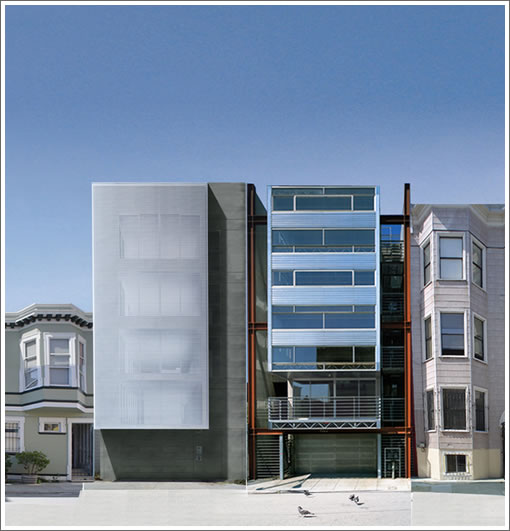
While this facade is more interesting than the penitential #1028 across the street, the plans are almost identical.
Some signature features:
*Exposed flourescent tube lighting only (we don’t need no stinking valence!),
*An under-counter refrigerator (cute!),
*and bath…..fixtures! (Amtrak eat your heart out!)
1029 will miss out on the bird-cage windows 🙁
These projects represent Stanley-the business man, not Stanley-the humanist. Some will lap it up nonetheless.
@dan: nope, I disagree..art may serve the purpose of those things. architecture should not SOLELY exist for that purpose.
@loveitorleaveit: totally agree. stanley is foremost not a humanist.
Noearch, I would agree with you if this were a proposal for a whole Saitowitz city. His buildings don’t meet the needs of most families. But sprinkled lightly around South of Market, his buildings provide visual interest to the passerby, and meet the needs of a small niche of customers that seek his striking flavor of modernism.
yea, I would basically agree with that, but honestly, I just don’t like his work.
I’ve lived in 1028 for two years, both the penthouse and as of two weeks ago the ground unit. Visual continuity with the neighborhood aside, both units are very livable! Warm, comfortable, with suprising privacy via the grated external panel. It is an optical illusion, one can’t see inside unless you in eye-line with the slats. Of course, I never depended on the design of the building to make my unit feel like a home.. that’s what personal style is about!
Over all I look forward to watching this building go up. Stanley is a bullheaded celebrity but I guess that’s why he has the clout to monopolize this otherwise nondescript little alley with his aesthetic.
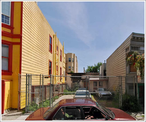
Gotta say, Natoma has some nice people on it but it’s otherwise a shit alley. Fresh shit piles on a three day cycle everywhere… clearly human, too.
After 474 days on the market, the list price for 1029 Natoma has been reduced 15 percent to $729,000.
At least three of the completed units are currently listed on the MLS, ranging in price from $789 to $829K. With a quite-reasonable HOA between ≅$287 and ≅$393, the “Brand new exquisite Saitowitz-designed condominium” units were “finely built by the esteemed Carolan Construction Inc.” Pictures at the building website.
Pity that it clashes so hard with the buildings on either side, but Stanley Saitowitz seems to get a perverse pleasure in doing that kind of thing.