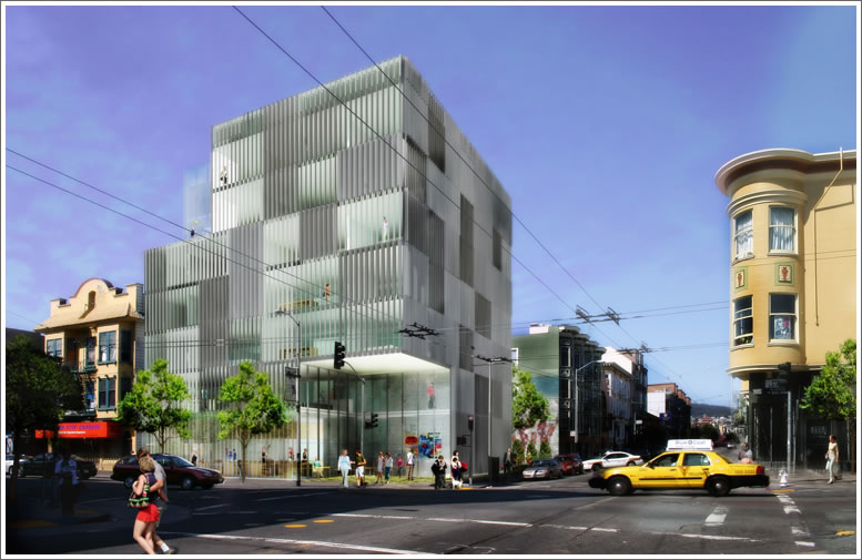
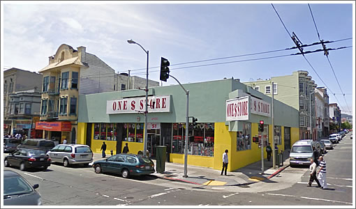
Mission Mission has the scoop on a proposed Stanley Saitowitz designed new development for 2100 Mission at 17th. As proposed: six (6) stories, twenty-nine (29) units over ground floor retail and underground parking for fifteen (15).
And as said corner currently looks in its un-rendered glory:
Ol’ Saitowitz sure is into light-colored cubes.
Oh god. At the risk of attack from architectural purists…the last thing the Mission needs is a cold Saitowitz project. I’m not saying we don’t need more development on Mission, and we cetainly don’t need more POS junk like the Duc Loi market/condos at 18th and Mission, but this is really going in the wrong direction. It will be everyone’s argument for why higher density development on Mission should be killed.
I admit it, I really really hate YBL, and haven’t seen anything in Saitowitz to love so far. But even I think that there may be a place for what he does in a neighborhood like SOMA in which cool industrial chic can sell. It doesn’t seem to fit contextually, in any sense of the word, to the gritty, colorful,chaotic world of the Mission.
I agree..like I’ve said many times before.Saitowitz just doesnt give a damn about context, style of neighborhood…only cares about his own ego and endless repetition of his obsession with light colored cubes..
Curmudgeon and Noearch beat me to it, but I’ll say my piece anyway:
While almost anything would be an improvement on a $1 store, shouldn’t good architecture relate to its surroundings somehow? That design doesn’t look very pedestrian-friendly. It’s the kind of building that would make a person glad when they were finished walking past it.
Don’t really know the nabe but have to believe that the architect could have incorporated some local elements/themes into his design.
Nothing about that design makes me think of San Francisco or The Mission. Some of the buildings in that photo are 100 years old.
You guys are all driving looking in the rear-view mirror.
In thinking about the context for Mission Street, you must ask, “What WILL this street look like in 20 years,” not “What dose it look like today”? If you want context today, you’ll need a crappy low-rise building that looks like a thrift store. Surrounding properties will be redeveloped over the coming years and will change the look of the neighborhood. This project is just taking a lead.
Also, construction, if it is to be affordable as it must be in this case, must use materials and be of a design that fits the current times. Trying to build something Victorian either costs a fortune or looks bad.
In any event, the Mission is a melting pot and can withstand varied construction styles.
What other affordable, attractive style, exactly, would you recommend?
Ironic that San Francisco, with among the strongest building codes of any major city, keeps producing the ugliest, sterile and uninviting projects.
This is even worse than the loft designs foisted on us in SOMA in recent years.
There is nothing inviting, warm, friendly or interesting about this building. It’s just bleak.
It doesn’t seem to fit contextually, in any sense of the word, to the gritty, colorful,chaotic world of the Mission.
Uh… wouldn’t this enhance the chaos?
Regardless of what eventually gets built here, let’s hope the Preservation Committee doesn’t get the idea that we must somehow preserve for future generations evidence that a single greenback was actually worth something…
Like it or not, the future has a tendency to show up and make its presence known despite frothy nostalgia-obsessives.
Why are we supposed to care that neighboring buildings are almost 100 years old? That’s neither a significant period of time nor particularly relevant. In Amsterdam, beautifully realized modernity coexists with the 17th century everywhere you look. And it works.
If put to a public vote, this building would end up a mishmash of Victorian and Spanish/Mission, and end up looking like a Taco Bell/Holiday Inn mashup. No thanks.
Gil wrote “There is nothing inviting, warm, friendly or interesting about this building. It’s just bleak.”
I couldn’t agree more. The only place it might be more at home is in Hunter’s Point.
Even Alcatraz has better architecture than this.
It appears Stanley Staitowitz is a one-trick pony…we’ve seen this before!
While Mission St. has lots of ugly low-rise buildings, it also has many attractive wood Victorians and stone Edwardians (and later). There is no reason you can’t have modern architecture that incorporates some of those themes.
As has been said, this is cold, sterile and out of place.
Love it!
I love this design. SF needs to take some chances and quit being such a scared little town. We love the word progressive here…live it.
If this was a rehab project then you might chock this design up to economics. It might make more economic sense then to only spend money rehabbing the interior.
This design though was created from scratch so there is no excuse for ugly.
Modern design doesn’t equate to ugly.
Victorian design doesn’t equate to ugly.
No matter which you like (I personally like both even when mixed together in the same ‘hood) ugly is in a league of its own has no place anywhere, imo.
“While Mission St. has lots of ugly low-rise buildings, it also has many attractive wood Victorians and stone Edwardians (and later). There is no reason you can’t have modern architecture that incorporates some of those themes.”
Exactly! An organic development of design – not a total break with the past.
There are elements of Mediterranian and Victorian that should be carrie forward and incoporated in modern design. Like warm materials, interesting roof, window and break lines, setbacks. I could go on.
This monstrosity does not even try to relate to its surroundings. Modern design can be attractive but it can also be banal and ugly as is the case with this design.
As has been said, this is cold, sterile and out of place.
IMO, it being “out of place” is what makes it exciting.
Jumbles – do you mean like a nun at a hookers’ ball?
Beautiful, and far less obtrusive than some of the bulky and awkward loft buildings that have been constructed in the last decade or so. Opening up the corner in such a dramatic way does much to integrate the building with its context which is more about lively crowds at street level than staid Victorian details and ornament. I bet this turns out looking really good in driving rain.
The over hang on the corner will provide a nice spot for our “urban campers” to sleep if it is raining like today.
RSVP,
Yes, exactly.
In a word Brilliant. More please. We are re-inventing ourselves with the elements at hand. Steel, glass, light, reflection. It is at once grounded & solid while also being Pacific. It’s in a fine location and is a welcomed interesting building. Build it.
This town is drowning under the weight of its own context.
As a city we seem to be completely unable to imagine that we have any kind of future in architecture, choosing instead to constantly rely on what has worked in the past.
Cities all over the world that are much older than us, have managed to integrate the new with the old without turning into the museum preserve everything town that SF is now.
I say this to people all the time and it always gets some pushback, but SF is the most architecturally conservative “large” city in the US.
That thing looks so huge and blocky — the only word that came to mind when I first saw this on MissionMission was “monstrosity.” the least they could have done is have some stepped up part on the 17th St / Mission side instead of having it seem to loom out over the street. And that covered area looks like a great place for bums to sleep and heroine deals to go down. If you notice the covered areas on the loft building at 17th and Albion — they had to add posts into the ground at intervals to keep people from sleeping there. Many architects forget two SF City Rules of Architecture: (1) Don’t make it pigeon-perchable and (2) Don’t make it bum-sleepable.
I like the clean, modern envelope, but I’m not sure about the vertical bars covering the facade — they make the residents look they’re in jail.
20 years from now that building would still stand out because the rest of the street would be exactly the same.
lots of good comments; mostly I agree that we don’t necessarily have to mimic the past…but housing for humans should in fact feel humane, be welcoming, be friendly,(perhaps be a little colorful: are you listening Stanley?).
he does seem to be a one trick pony..it’s VERY easy to identify his work anywhere in the City. pretty boring if you ask me.
You seem to have decided that this style of building is not humane, welcoming or friendly.
I couldn’t disagree more. It’s all about light and air. It’s not oppressive and leaden, with small windows. Best of all, it avoids pointless ornamentation.
The Howard Street building is, to me, quite different than this. And YBL is remarkably different. Why he’s considered a one-trick-pony is beyond me.
LOL…reminds me of the interior designer I worked for years ago. Her “signature” was the color chocolate brown. Even if you didn’t want any chocolate brown anywhere in your home you would still get it if you worked with this design Nazi. Trust me, those who knew her style could always identify her work.
This architect’s work looks like gray variations of the Rubic’s Cube.
This is the 21st century folks. Time to stop fearing modernity. One hundred years from now, Saitowitz’s work will be landmarked. As has been duly noted above, get out of your nabe and travel to the great cities of the world, and you will see great modern architecture like this interspersed with five hundred year old buildings, and it looks just great. “Contextualism” has produced more dismal buildings and neighborhoods than all the other isms put together.
Being a “one-trick pony” is not necessarily a criticism. Richard Meier is a “one-trick pony.” (For that matter, so are Renoir and Chagall.) It just has to be a very, very good trick.
It seems most people on this site dislike this building, but count me as one who thinks it looks interesting. I like it.
love what RSVP had to say..I’ve worked with and known interior designers just like that..awful to work it..
I do think there is a place for modernist work in this city. but, IMO Saitowitz prefers to sculpt a building to call great attention to itself and to remind everyone of his innate skill at fineness of detail..and..ah…shall we say finesse.it’s still ego based on and humane and liveable like an Esherick project is.
Interesting that this building seems to polarize this board – everyone either seems to love it or hate it. I’m a mission resident (16th+Guerrero) and I definitely like it – +1 in the build it camp…
London is an example of a city almost completely destroyed 65 years ago and then rebuilt. So many of the buildings there relate to their surroundings and include an interesting mix of ground-level retail and services to engage pedestrians and other passers-by. Yes, they have some modern buildings but their residential neighborhoods look like residential neighborhoods.
Much of Paris is the same way (to give another example of one of the world’s most popular destinations).
Modern design doesn’t have to be sterile and uninviting. I really don’t understand the direction that San Francisco’s planners have taken.
not true about Richard Meier..he’s not a one-trick-pony. Each of his buildings engages the site, and develops a rich architectural dialogue with shape, form, material and modernist purity.
whereas, Saitowitz seems to use the sterile white/silver cube approach over and over and over..and…
Architecture should be more than just a collection of abstract art pieces. Buldings have a function to perform. I’ve always resonated with Kunstler’s views on the built environment.
Looks very cool. Like the density too. This is only one block from BART and could help set a new tone for what is now a very rough block.
Gil: I’ve had it with this bankrupt fixation on “warm friendly inviting”. Great architecture (like great art) is not about being warm and friendly, its about pushing some boundaries. To say this is not “interesting”, or “worse than the lofts of SOMA” is simply reactionary and closed-minded. The always changing louvered facade will be far more ‘interesting’ than the tacked on faux historical crap we usually get in this town.
I say build it — it “fits” the Mission just fine (what do you want? fake Spanish style complete with fake murals?). This is miles beyond the average SF development architecturally.
diemos: first off, Kunstler is a knee-jerk blowhard curmudgeon. Are you claiming this building is not performing a function, just because it doesn’t fake like its old as most of the crap new development in this town does? Besides this project’s obvious overall functionalist stance, the whole point of the movable louvered facade is to offer the functional integration of privacy and sun control for each unit.
Believe me, and I know what I’m saying (*cough*cough* work in city hall, privy to mayoral, bos, and community group bs) it’ll never get built in it’s current form. Nuff said, next.
I assume we are working on a budget here, right? It looks kind of well… cheap.
But given this location, it is probably a choice between this and another bland pastel stucco building with bay windows. This one wins easily.
I like how in the architectural drawing, Mission Street still needs to be repaved, just like today.
dr.who is no doubt correct though, MADC and the rest of the Mission crowd will never let this get built.
Mole man thinks this will “open up this corner” and be “far less obtrusive”.
invented thinks this will be “Steel, glass, light, reflection.”
amused says “You seem to have decided that this style of building is not humane, welcoming or friendly. I couldn’t disagree more. It’s all about light and air. It’s not oppressive and leaden, with small windows”
—
First of all: I hope they build this. But then again I always hope that everything that is propopsed be built. I’m tired of the “planning” process in SF. I welcome a lot of new development, both bad and good.
HOWEVER:
I for one can’t tell if I’ll like this or not. The rendering is so cartooney. my guess is that the final building will look NOTHING like the end product. That is what I’ve noted with Saitowitz’s work in the past.
is this to be made up of glass and be light and airy and reflective like the above posters claim? or is that all going to be concrete like what’s happened in the past?
as example, anybody remember what the rendering for YBL was supposed to look like? I do:
https://socketsite.com/archives/2006/12/a_couple_of_questions.html
that rendering looks cool and light and airy.
and the reality? looks more like a prison to me, and I’ve been inside these too (both YBL and prisons!). The semitranslucent window things block a lot of light, and lead to the units feeling very closed off to the outside world. then you’re surrounded by concrete of course.
but that’s because I’m one of the plebes I guess that doesn’t understand that “concrete prisons” are “light and airy”
this is “light and airy”?
http://farm1.static.flickr.com/75/418324803_c58ad3d7a8.jpg
and this? is it light and airy? is it opening up the block?
http://863katy.com/dynamic_images/listings/855-Folsom-931_Front2.jpg
overall, I think YBL is interesting to look at, in a very severe and angular sort of way. I don’t dislike the building. I’m glad it was built. Many modernists really seem to love it. But I hardly would think “wow, that’s so light and airy” when I look at that.
I definitely wouldn’t say YBL “opens up” the corner or that it is “less obtrusive” than other buildings. I also wouldn’t say it is “steel light refelection”.
I would say it is concrete and heavy and dominating.
My thought is that 2100 Mission will look the same when it’s built.
(not light, not airy, not reflective, but instead concrete blocks in the shape of prison cells with partly obscured windows).
only time will tell.
build it. SF has enough room for lots of architecture, even/ESPECIALLY the architecture I’d never dream of living in.
it also adds density that I’d like to see in SF.
Hello everyone. I’m the Sales Manager of the Acme Louver Company. I appreciate all the positive comments. You would not believe how many times I had to take Stanley to lunch at the Gold Club before he agreed to design a building out of Acme Louvers. Which if I may say so myself, are some world class louvers.
“first off, Kunstler is a knee-jerk blowhard curmudgeon.”
Indeed, but an entertaining one.
I don’t feel the need for modernity for the sake of modernity. Some of it works well but 90% turns out to be just concrete brutalism.
I’m not sure the architect really gets the neighborhood. That roofed entrance area is going to be a great place for homeless people to sleep off their drink.
Fort Pile.
I really dislike the look of YBL. But the rendering (posted by ex SF-er) was beautiful. I would have loved if YBL looked like the rendering.
But I LOVE 1234 Howard. I make a detour past it anytime I am in the area. But I don’t know how it looked in its renderings. (And when I am in the market for a 2BR, if one is available there, I’ll take a look)
I love the renderings of 2100 Mission. I hope it turns out more like 1234 Howard, and less like YBL.
[Editor’s Note: The rendering to which ex SF-er links is for 555 Fulton (not yet built) versus Yerba Buena Lofts. In terms of 1234 Howard, the rendering and the reality (which we happen to quite like as well).]
I hope this cool design gets built as soon as possible!! The current building is a filthy dump…
I think “the gritty, colorful, chaotic world of the Mission” can stand a little variety, a little architectural “chaos,” and needn’t be endlessly mimicking its surroundings. Look at the 18th & Mission condos…they seem to have a “Mission-y” vibe to them, with the curve and the stucco…but you know what?…they look like Hell.
But while I disagree with the panic regarding anything modern in terms of style, I do agree, however, that the size of this thing–7 stories?–seems a bit colossal for the location. Lop off the top two stories so it doesn’t dwarf its neighbors, and I think we have a vibrant counterpoint to the existing older architecture.
I think this is a great building, in terms of style and, as some have noted, helps to move the city forward. If this were the last Victorian being replaced I’d be upset. If this were even a slightly nice building being replaced I’d be upset. But it’s a junky building on a major corner being replaced by an exciting, different building that, although really quite large manages to not be overwhelming. Embrace modernity people. This is the change we hoped for!
Most of the condos and apartments that have been built along Mission St, from Mission and 18th to Mission and Powers (just south of Cesar Chavez) are dreary stucco boxes. By comparison to the dreck that has been built in recent years, Saitowitz’s design is worthy of the Pritzker Prize.
UPDATE: Redesigned Dollar Store Development Slated for Approval