From the comments with respect to 2125-2135 Leavenworth:
I rent a block north of these. The local homeowners were up in arms with this project and there were posters circulated to “Save Leavenworth Street.” I think the neighbor to the south of these was particularly peeved: theirs is a beautiful & stately Julia Morgan home.
Story goes, as I understand it from the public hearings…was that someone purchased the place and then intimated to one and all that they were going to rehab the place and live in it with extended family. Whether or not that was ever the intention, they then requested to transform the existing and deteriorating 3 (or 4) units into the current six units. The owners/developers claimed that the existing structure was in too far a state of neglect to be saved, including troubled foundation. The locals/neighbors claimed that the owner was leaving the place in intentional neglect to facilitate the desired teardown/development.
From a plugged-in tipster’s personal archives (and our inbox) above and below:
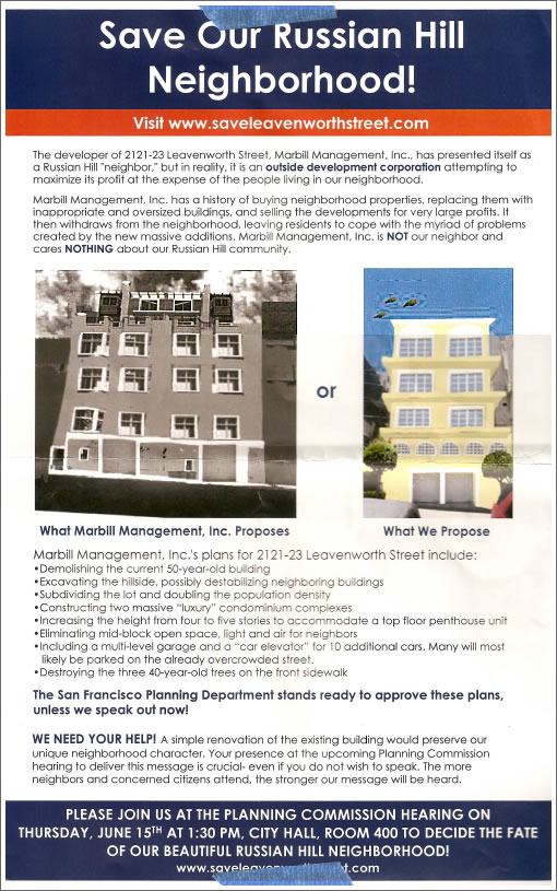
I love how they made the picture of the proposed condos in B&W and to appear threatening or haunted in a Vincent Price sort of way. The pictures of the proposed rehab of the existing structure is in happy color and even has three Telegraph Hill parrots flying happily over it.
That didn’t apparently persuade the planning commission…but I figure the delay the locals created cost the developers a hell of a lot of money, since if this has been started in 2004 and completed in 2006, they would have been in the thick of insanity and have pulled down Big Ca$h on each condo very quickly.
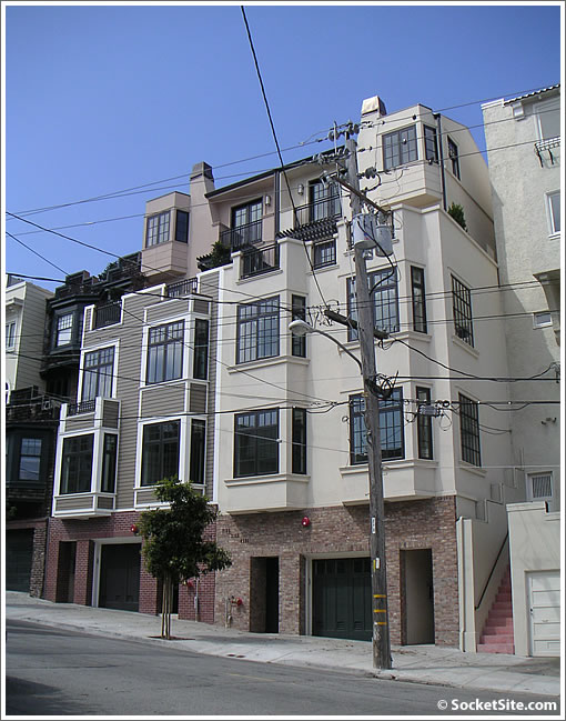
And once again, as constructed (less the ominous clouds):

∙ 2125-2135 Leavenworth: From One To Two And Six (New Condos) [SocketSite]
∙ San Francisco Planning Commission Minutes: Thursday, June 15, 2006 [ci.sf.ca.us]
I think they look pretty good…
Considering how many junky, dilapidated rentals there are on Nob Hill, I just can’t shed a tear for these guys.
Though I am a huge fan of the Russian Hill Neighbors Association. They do a damn good job of preventing new development, thus keeping my property valuable.
Much better than in Soma, where a new 30-story, two building, condo complex just pops up next door, and floods your block with inventory.
God bless Russian Hill. God bless the local neighbors association. God bless me for being so awesome.
It turned out to be a compromise.
Doesn’t look like the end of the world to me. There’s worse on the market.
That flyer is great!
however, the end product doesn’t have the scary foreboding clouds, and it seems like the real life outcome is in color.
sad. I was sort of hoping this project would turn all of Russian Hill into a black and white neighborhood with scary clouds!
Now THAT would be a tourist destination! (I know I’d go visit if it could turn me into black and white).
That yellow “what we propose” facade look as if the designer first went to the Pella Windows catalog, chose some windows, and then built the structure around that. Aside from the ledges, the only architectural interest is the windows, and what a dated, banal interest that is.
While not a masterpiece by a long shot, the developer’s building at least looks somewhat custom and includes several elements (balconies, arbors, bay windows, chimneys) to create visual interest.
Did the multi-car elevator get put in?
Typical Russian Hill busybody stuff. It’s always evil except when it’s their own property.
wow. purchased in 2004 and finished in 2009…not only did they miss the peak due to the backlash, they have a heck of a lot more carrying costs.
So ridiculous – it has all the typical calling cards of the NIMBYS in SF:
Lies:
midblock open space will be destroyed – um, there was a house there before
Imply that excavation will destabilize other properties
Add the mentions that the original building is 50 years old (historic!) and the street trees are 40 years old (historic!) and its a typical SF anti urban hootenanny!
Yeee HAR
Well, the flyer was right about one thing – the new building is clearly missing the parrots flying overhead.
Egads. Scroll down and look at the pic of the building that was replaced! Hideous! If I were a neighbor, I would’ve welcomed its destruction.
Well, the new buildings ARE pretty ugly, I’ll give them that.
I love how the clouds on the proposed building look like smoke, as if the building is on fire !
Nice touch by the “concerned neigbors” trying to scare up support !
Let me guess, the person who photoshopped this advertisement scare-flyer worked for the Bush-Cheney Campaign and Faux News ??
God bless Russian Hill. God bless the local neighbors association. God bless me for being so awesome.
…and god bless SocketSite for showcasing entertainers like NewBuyer. you rock !
I hate NIMBYs.
I hate NIMBYs.
I’m a broadminded San Franciscan and have nothing against NIMBYs, just as long as they make sure their meddling isn’t in my back yard, damn it!
To quote the Curbed SF blog:
“A city wants to be dense, and you can only push back for so long.”
Keep the NIMBYs out of Noe Valley, I say!
Who’s with me in guessing some neighbor business owner got their company web designer to create the flyer and stood over their shoulder the whole time. “No, make it darker.”
Their proposal looks straight out of Broderbund Home Architect 2002.
It would be hilarious if the penthouse buyer put up fake parrots on the top corner.
More propaganda: you almost never see an odd number of parrots flying together.
This Russian Hill Neighborhood people need to get a life!! They just like to complain about anything they can. Everyone hates to see someone make a buck. I think this was a great project, due to the following reasons
-Original building was a piece of s#!t
-This broke city was able to make some $$ with all the demo/permit fee’s.
-Brought new housing to the city
-And now we have brand new nice condos that the realtor gets to sell so he can feed his family.
Ohh wait what?!?! The realtor shouldnt make any money? Yea their just all greedy money hungry bums right? They dont have a family to feed and bills to pay just like all of us right?
The neighbor’s proposed building looks ridiculous.
I live around the corner and drive by this place almost every day. I never realized how big these are and that there are two more floors on top. So, I just thought they were 3-story buildings. I like that they gave each building a bit of its own character.
At least the Telegraph Hill Neighbors got them to add some stucco and bay windows. So at least we got that.
Don’t let them have so much parking! It will make them park on the already crowded streets!
Scratching my head on that one.