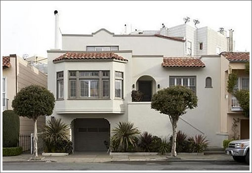
Purchased for $1,750,000 in June 2007 but then deconstructed and reconstructed as those designer types are wont to do with their homes, 12 Rico Way returns asking $2,495,000.

UPDATE (7/22): A bit of before and after.
∙ Listing: 12 Rico Way (4/3) – $2,495,000 [12ricoway.com] [MLS]
∙ A Bit Of Before And After And Plugged-In Perspective For 12 Rico Way [SocketSite]

Nice typo in the opening line of the details tab.
LOL, Maria living? For $2.5M, you’d think the marketer could spring for a spell check.
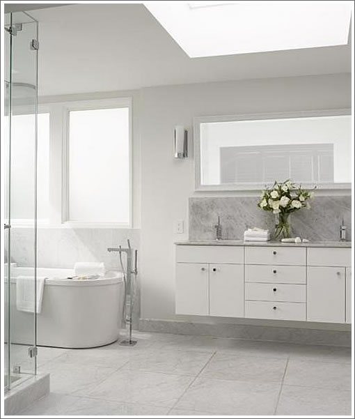
White and white.
Tabula rosa?
I get the feeling this will end in tears – for the designers. It appears to be a competent redesign, but it give me the feeling of living in a West Elm catalog; I’m sure there are people who find that appealing. But I get the feeling that this pricing is a bit too optimistic.
Are those realtor names or porn actor names?
Think this is the house that Green Couch built. They didn’t skimp on materials and don’t think it was intended to be a spec remodel.
Agree with embarcadero i believe the sellers are going to have a tough time with this one!
Also I love how many great realtors there are out there today. They score a 2.495 million dollar listing but cant even spell the neighborhood!!
Pretty nice work.
Negative is small top deck with only two bedrooms, the other two on the lower level, maybe a refinished basement? A comment in the listing’s web site delicately claims a Golden Gate bridge view. No pictures of it suggests maybe it’s a stretch.
For $75K you want spell check two?
[Editor’s Note: You mean “too?”]
I thought the childs room was tending Rosemary’s Baby, but otherwise very clean.
Not far from where I live – nice looking place and a great street but pretty expensive digs for these trying times.
Just for giggles I did a quick search on trulia for houses sub $1m and >1750 sqft in Piedmont just to see what life is like these days on the east side. 11 properties come up – and every single one of them is in foreclosure/default. Every. one.
Try it in your favorite neighborhood – of all the high-end places Menlo is particularly bad…
“I thought the childs room was tending Rosemary’s Baby” Exactly!
How long do we have to suffer with this David Hicks retro design phase? It was fun 15 years ago when Kelly Wearstler did this look in her husband’s hotels in L.A. and Palm Springs, but now it is just ugly and tired.
@citydad and others, you have GOT to love that typo….$2.5 million listing and the first line has a typo.
I love a stark modern look, but this must have been the former residence of an ice princess. Everything is cold and sterile. I guess you are expected to add the color with your own furnishing. Too cold for me in this fog.
The wallpaper in photo #8 gave me one of those animae seizures – damn them!!!
Anyone else realize the $1200/ sq ft asking price? According to Trulia and the House’s Website the house is only 2010 sq ft.
What’s the difference between deconstructed and destructed?
“Are those realtor names or porn actor names?”
It’s only Monday and Embarcadero may have already delivered the funniest quote of the week.
Dick and Butch don’t mention any features that will prevent Rosemary’s Baby’s bedroom from being swallowed up due to soil liquefaction during the “Big One” just like at the end of “Carrie.”
Or am I just confusing the Maria with the Marina?
I kinda like the design. I have a block of ice where my heart should be, tho, so there’s that.
After reading the above comments, I’d really like to set up a tour of ALL of your homes/rentals. Walk into your worlds and enjoy the view of your miserable living quarters….What? the economy eating you all??
One of them there ironic paradoxes:
To look rich you have to spend money,
To be rich you have to not spend money.
See, The millionaire next door.
Our amazing team created a home that feels comfortable, refreshing and spacious. When I first walked into this house, I felt that we could build an approachable floor plan that would honor the formality of a Marina home and deliver something quite different. The wide lot allows for a formal living room on the left and a den directly on the right. It just feels so much brighter and alive than the typical 25′ wide lots all over the city. The rediant heating is amazing, I highly suggest that on your next remodel you install the Cal Steam system. (if you have to budget, at least do the master bathroom–warm on the feet!) Makes such a difference on the chilly evening and foggy mornings. The square footage is 2520, the master suite alone is 500 square feet. This is to-date the best house that we have lived in, what’s next?…. upward and onward socket site-ers…..
Oh, my wife loves white : ) very fresh and elegant she says…
Nice to have the owners posting on SS! thanks for chiming in.
the all white palate also isn’t my thing, but this place could be warmed up nicely with a weekend and a few buckets of paint!
May I suggest to the owners: put WAY more pictures on your website.
I am in the income bracket that this house is geared for, as are most of my colleagues and friends. I will tell you that almost none of us will go and see a property unless it has lots of pictures up. The pics you have are good, you just need more. Especially of the kitchen. I don’t feel you have good kitchen pics up.
if something isn’t pictured, I assume that it’s being hidden. (this is clearly not the case with your property, I’m just saying that is what I tend to assume). if I assume it other buyers might too!
god luck.
I fully agree with ex SF-er. When a listing boasts luxury features, but does not provide pictures to back up the claim I assume the listing is exaggerating. Rico Way,IMHO, is the best street in the Marina.
Where are the photos of the GG view and bamboo lined patio?
What is this obsession with White ?
This is the 3rd such white remodel I am seeing in recent times on SS alone.
To me, walking into such “all white” units feels like I am entering the Dentist’s office…. not a happy feeling.
Note on website: Resizing the browser is rude.
Nice catch on the spelling error! When did the Chron lay you off? Just a guess: Positive correlation between petty criticisms of a property and how much you cannot afford a 2.5m house
Two vs too meant as a pun that would only work in print. Zipped right through the subtlety radar