From one reader with respect to 550 18th Street:
Architecture actually looks ALOT more interesting (on the bay side) than most other condos that have hit the market over the last few years.
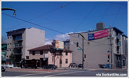
What they don’t show is the union building this wraps around on the third street side. I’m curious to know how that turned out. Anyone have pictures?
And from our original tipster in response: “Here it is. Not all that pretty.”

Agreed. And then some.
∙ 550 18th Street Unwrapped (And 35 New Condos Now Renting) [SocketSite]
It’s officially a toss up as to which angle on this place affords its ugliest facade.
Those blank walls aren’t really a facade. When (if) the corner parcel becomes developed to the permitted height, both of those blank walls will be covered up.
I’ll bet that the developer tried to acquire the corner parcel too to create more of a complete building. But it doesn’t make sense to give the developer or architect grief over the look of these blank walls.
Notice that the corner parcel contains a permitted billboard. Any to-height development of the corner parcel would lose the billboard rights. They aren’t making any new billboard rights anymore.
I see this a lot : low billboard on an underdeveloped parcel surrounded by newer taller structures. I’m not sure how much revenue a billboard brings in but it does serve as a disincentive for redevelopment.
[Editor’s Note: With respect to the “facade” we’re not referring to the blank walls but rather the front of the five stories to the far left.]
6 of these units are already rented at full asking and 2 tenants have even moved in already.
Does anyone know the definition of “banal”?
Peoria, Illinois high rises moved to San Francisco on double-wide trailers. Charming. Is that a combine repair shop next to it? Oh Deere.
I love this race to become Fresno-by-the-Sea!