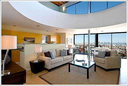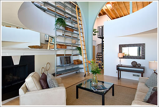
123 Laidley offers big city views and a few green features (think commercial grade 4kw solar panels). And of course, a modern living room and second floor loft befitting architect Jeremy Kotas’ design aesthetic and home.

Sold by Kotas in July of 2003 for a reported $1,042,500, 123 Laidley is back on the market today and asking $1,700,000.
∙ Listing: 123 Laidley (4/2.5) – $1,700,000 [123laidley.com] [MLS]

I went to see this place a week ago. I liked photos.
well… Arches are nice. LR space arrangement is clever. Other than that… sorry, it looks like a shack. All fixtures in the house look cheep and out-dated. Not sure about the bedroom that faces the street, it IS on the street.
I was thinking I wouldn’t give more than $1ML for this place. Interesting that it was sold roughly for that amount in 2003. I don’t think any improvement was done to it.
It’s a make-me-move price 🙂
Either that or Glen Park has arrived.
I really like the look of the exposed ceiling rafters but…non-insulated is non-green!
Sorry, I see way too many negatives.
The living space + kitchen + dining area seem awfully small. I’d rather lose a bedroom and have more living space but the layout doesn’t really allow for that.
Uninsulated ceiling?
Ugh. Heating nightmare.
Mezzanine-level master with spiral staircase? Double Ugh.
I’m sorry, but for me, mezzaine does not equal a real bedroom – completely non-private and exposed so that you get woken up by anyone in the kitchen or living room.
It’s an extra room/office that can serve as a guest room in a pinch but it’s pure hell carrying anything up and down a spiral staircases, (think laundry, baby, luggage).
Might as well get a loft in SOMA, atleast their mezzanine bedrooms have normal staircases.
Street facing bedroom? Triple Ugh.
And I agree with Miu-Miu, the fixtures look cheap and outdated. The one picture of the bathtub looks like a Home Depot special, cheap and small.
If I’m going to spend anything near 1.5 million on a home, it has to be 90% perfect in terms of functional layout, quality materials and aesthetic.
Agreed with everything you said GG, but it *is* a stunning use of the view. I like the fact that they opened the two floors, and yet you can still get to the window from the upper floor.
Contrast that with 2848 Union (the $5M pit of fire). The entire second story nearest the window was opened, (photo 5 in the link below) and so the second floor seems very distant from the view (photo 11). http://www.sfproperties.com/properties/2848_union/index.html
I think the circular opening is a better approach. Almost as dramatic as opening up the entire second story, but more usable. However, the rest of it comes off as cheaply done. The post in the middle of the bedroom of photo 25 of the website of this property (Laidley) looks really bad.
Tipster, I hear you on the view and on the Union St place.
For me personally, though, I much prefer a view of the ocean.
I wonder if the ceiling really is uninsulated — the exposed rafter-and-decking look may be purely decorative. I thought current code requires insulation for all roofs, whether covering an attic or cathedral ceiling.
There is a view of the bay from the Laidley house as well. I’ve been to a neighboring house, and can say that the views are quite spectacular. I understand why some may prefer the Union St. house, but one could buy 3 of the Laidley St houses for the price of the Union St. house.
I saw this property before and after it went on the market. As an empty shell it was laughable at $1.7M.
The architect probably originally bought it in the eighties and remodeled it with what he could afford – which was probably not very much, given the pay scale for architects. Clever use of prosaic materials mixed w/ his ‘signature stylistic treatments'(no further comment there).
Fast forward two decades (of deferred maintenance) and some lipstick on this ‘designer’ pig. It’s easy to see right through it. Painted plywood floors in the ‘master suite’…? A little new blue paint over badly sun-degraded plywood…?
I think the real hero in this story is the home-staging company (business card said ‘FreshHomeStaging’), who with their keen eye and nice furniture, made the place look like a million bucks… just about the amount the current owners may get…not the $1.7M they want…
just saw this home listed on craig’s list for rental at $5,500.
the math definitely does not work to buy this home for $1.7MM