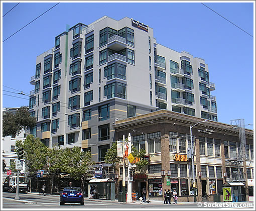
The Artani has been unwrapped. Feel free to compare and contrast (and spill the scoop).
∙ 818 Van Ness: Building Still Wrapped, Name Unveiled (“The Artani”) [SocketSite]
∙ The SocketSite Scoop On The 52 Condos Rising At 818 Van Ness Ave [SocketSite]
Looks better than the rendering, IMO.
Busy. vaguely art deco. Not the worst thing to have gone up there in the last year.
Meh. Preferred the rendering, but this isn’t horrible.
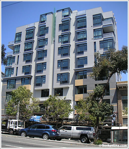
looks a bit better in person. modern lines and black detailing looks good.
not amazing.. but as someone else already pointed out — not the worst thing to have been built in this city lately.
too bad the rest of the development-to-be on van ness don’t seem all that promising.
“not the worst thing to have been built in this city lately.”
True, EXCEPT this is Van Ness, one of the major boulevards in the city. I still wonder why again and again we settle for less than is deserved. Would this look “acceptable” on Wilshire or State Street? Van Ness, Lombard, Geary and Market all have some of the worst architecture in the city, yet they are thought to be some of the most important streets in the city.
Boring and it should be twice as tall but this is SF so…..B-.
Low standard esp for this key route.
Van Ness Avenue? 3x as tall; the colors? clincally depressing, the building not as disturbing as some of the crap on VNA; the name – not that again.
Van Ness is an SUV corridor and a wholly unpleasant place to walk, to be, to even have to trans – every block is tedious and fumey and adds to urban angst. Every single block is creepy; try it some day; positively gloomy.
It could be golden which is a shame as it weaves through interesting areas.
Traffic calming, taller buildings, smaller scale retail and pedestrian/bike friendly changes are in order. If it is only envisioned as a passage to the GGB however — expect more of same. Planning – anyone home?
Why is this permitted? We’re in look-away-everything-is-gasp!-good San Francisco.
SocketAction rising.
I disagree I think VN is a great walking street. Where else can you walk past antique car galleries. It is also one of the greenest streets in the city. SoVN is a different story. Building is an improvement for the area. And VN has some of the best classical architecture in the world. You guys are nuts or you just don’t pay attention.
yea, van ness is great for walking around if you like getting run over.
Nice, but the older building in front of it looks better and wouldn’t be hard to emulate. You people of Earth are idiots!
Yes this beautiful section of Van Ness where you are two blocks from drugs, shootings and murders. Where your guests parking at night on any street nearby are guaranteed to have their cars broken into if they leave so much as a jacket on the seat. This is no exaggeration. A friend bought across the street and has experienced all that (many times) and more. Delightful.
Why does SF settle for such boring architecture? Berkeley has one of the best architecture schools in the nation, and the Bay Area is filled with creative minds, yet we have some of the most boring, uninventive buidlings rising. We need to give architects/developers more freedom.
This is what happens when “group think” dictates the architecture of SF. I don’t have the posting but there was another Gothic type building that was being proposed and after the town meeting it was modified to something nice but very boring in comparison to the original rendering. It was on SS not that long ago. I don’t know why the owner of the land and building gets to chose what they want to build. And its not for consistency unless we’re talking consistently boring.
Good, solid looking building. I like the orange accents on the lower half and I’m interested to see what the interiors looks like.
This is no doubt an up and coming area due to the new CPMC.
looks like the commercial space below is still being worked on…
What you need to do is go walk Van Ness and tell me a better looking new building. Symphony towers looks like a piece of crap compared to this building. The building looks way better in person than it does in these pictures. Very solid looking and you notice the details that went into the outside of the building. Notice the comment above about seeing it in person if you don’t believe me.
What did you expect here? I think the thing to do is study the development process in San Francisco. Developers are at the complete mercy of the Planning Commission and the Board of Supervisors. To me, This is a BOLD design for Van Ness and actually surprised it got approved.
Looks awesome
Great building, but the grey is dull and severe. If I were the developer, I’d repaint a warmer color, more similar to the one in the original rendering. I think the units would sell faster.
I am not entirely sure the CPMC development up Van Ness Avenue will be an asset for the neighborhood. I hope it will be, but am concerned about the sirens of emergency vehicles throughout the day and the night. With close to 600 beds (twice as big as the city’s current largest hospital?), there will be a lot of emergency vehicles.
If Van Ness was SOOOO bad, Why do you think there is massive investment going into the corridor? CPMC is going to have a MULTI BILLION dollar project on Van Ness. The entire transit line down Van Ness is going to be vastly improved in the near future. At least 1000 new homes are going to be built on Van Ness in a 5 year span. I guess nobody wants to live here though? Think again
It looks like crapppppppppp!
Are there any innovations here? I think not.
This building tells me that the floor area ratio was maxed out in typical developer fashion with cheap symmetry. It also tells me that the open space requirement was satisfied with small private balconies that will probably never be utilized, as opposed to a collective community space where neighbors can meet. It also tells me that the architect got caught up in some weird idiosyncratic aesthetic that only he/she could rationalize. This building took no clues from some of the outstanding and proximate buildings on Van Ness. This building could be anywhere, although the result would still be pure banality. Don’t be fooled by some slick lines here or there – this building will be dated (if not already) rather easily. It kind of reminds me of the movie theater gone bust a few blocks up.
Someone above mentioned the wonderful Cal Berkeley’s architecture department. Cal has two architectural programs. One is a four year non professional program that awards a Bachelor of Arts with a major in architecture. The other is a 1, 2, or 3 year (depending on undergrad qualifications) Master of Architecture program. In my opinion, in most cases, neither program turns out competent architectural interns. I would bet that most of the BA’s don’t become licensed and stay in the profession once they realize the rigors. The ones that do stay need years of training if they are open minded enough to endure it. (The open minded part is a difficult find.) The MA’s don’t want to be bothered by the minutia of practice and construction because their ideas “transcend” those things. Heavy hands a plenty.
Practicing architecture with the arrogance of ignoring architectural theory is wrong. You wouldn’t ask your doctor to ignore reason based upon empirical evidence or scientific method would you?
It would be easier to compare the building and the rendering — if the photo was from the north as well.
Jerry—haha. How can symmetry be cheap? “The floor area was maxed out in a typical developer fashion.” Developers are subjected to 20% BMR among many other fees. Why wouldn’t they maximize in an appropriate fashion? Pretty soon, there will be no more development in San Francisco because the numbers won’t work so you’ll have nothing to complain about 🙁
I found their listing on craigslist by the way and it mentions a landscaped rooftop–neighbors can meet.
You say the building is banal on Van Ness? You would rather stick to the REAL Van Ness cheap look? Generic traditional bay window crap???? Putting a building in this exact lot that reflected “old” Van Ness architecture would look ridiculous. The buildings directly around it are new and ugly—this will be a leading example for the future of the corridor.
And since you love and adore “old” Van Ness architecture you would surprised to find out the same architect that designed this building is the same architect working on restoring 1400 Van Ness! He also designed 77 and 1501 Van Ness…but you already knew that because you know everything. He incorporated the beautiful old Van Ness design in these buildings because of their surrounding buildings. I think he has a grip on how Van Ness should be shaping up-not you, that’s for sure. Wow!
http://sanfrancisco.bizjournals.com/sanfrancisco/stories/2008/02/18/story3.html
Maybe go drive by those sites and take a lookski?
P.S. you sound like a pompous A-Hole.
[Editor’s Note: While we applaud your “enthusiasm” for the project, we don’t applaud your enthusiastic posting of comments about 818 Van Ness under eight different names. And drop the personal attacks.]
Grey beige beige. Yellow beige grey. Brown brown grey. Beige beige yellow. Cream beige beige. Brown brown brown. (The planning departments color wheel).
Dear 1 of 8,
I never said that there is anything wrong with maxing out the floor area ratio. I only mentioned that symmetry is cheap because of the ecomonies of scale in construction. Why the building is symmetrical beyond that reason is lost on me. I guess that it may be symmetrical to emphasize that strange piece of decorative glass.
You are complaining about 20% BMR? Ever try to build in the Mission? What is the average houshold income in this area anyway? Do you think that at least 20% of households in this area fall below that? I don’t know the answers, but if you do enlighten us all.
I stand corrected on the roof top garden. However, could it have been larger and better designed if the private balconies were eliminated? By the way, how desirable are private balconies if your neighbor’s is 15 feet away?
I never said anything about mimicking “old” architecture. There is a lot more to be being contextual than mimicking “old” architecture.
I am familiar with the architect’s other designs. I am not addressing those here because this post is about this building. In fact, all buildings need to judged on their own.
I am all for new buildings and change, and if it helps with your property value then good for you. Sorry, but I just don’t see any art in this one.
Reading curbed NY they have the same complaints about similar ‘boring boxes’ going up in their city as well, so this is not just an SF thing, but perhaps an American thing.
Wow, if nothing else, this building is pretty controversial.
It’s about architecture WITHOUT a purpose versus development WITH a purpose. That’s the controversy as far as I can tell.
SF has a point about NY curbed and American design, but I don’t really think this one looks like a “boring box.” Look closer at the design…there are actually some interesting intricacies. Yes, the shape is square, but there are actually some bold, geometric, strong details/touches. I also like the glass piece at the top of the building. Wonder if this is illuminated at night…
Anyone think this looks like “The Greenwich” at the other end of Van Ness?
I think that you are certainly entitled to like the building.
Perhaps for me it is my architectural education and training that makes me notice some glaring inconsistencies and leaves me unsettled.
I do not object to the “boxiness” of this building. I have other concerns. For example, one thing that I find strange is the reference to an historic plinth-like base for the lower four floors that has the apparent mass to support the upper floors. This is coupled with columns at the upper level corner units along Van Ness that do not rest on top of other columns – they simple float on top of the floor slab. So what is this? An historic reference to buildings with coherent structural systems, or a bold display of what modern engineering can achieve? Unfortunately, once you go down the path of classical historic reference you can’t deviate from it so callously. Otherwise it is all just a stage set (which is another tenet to adhere to, but I don’t think that this building goes there either.)
Architecture is not like shopping. You can’t just start filling your cart with motifs and architectonic elements like they are on sale. You need pick and choose wisely to achieve cohesiveness. The better you are at it, the more you remove personal taste from the equation. This building my function well and the units may sell for gobs of money, but the architecture seems to me to be all about personal taste. I’m not into it.
I read that the first four floors of the building are supposed to relate to its neighboring buildings while the top four floors are supposed be more “contemporary” reflecting the “changing character of van ness.”
The developers bought the airspace above the building to the south to “protect views”- does this really work?
Regarding what you heard:
There is nothing further below reason than some weird, out of proportion, demarcation of material change is somehow relating to the surrounding buildings. For one, when it comes down to it, this building actually ignores the smaller, older building below it. I find it a rather weak argument that this building relates to anything other than itself. Not a good thing in this case.
Regarding the air rights:
It seems very plausable that the developer bought air rights from the neighbor. That site on the corner may not be redeveloped for some time. (In fact, probably never because getting a demo permit for something like that is likely very difficult.) In some areas of the City buying air rights will allow for a higher development. In any event, it seems even more arrogant that the crew involved in this project bought/took the air rights from the neighboring building, then ignored it in the design of their baby.
I am thoroughly convinced that the designer of this thing was so focused on stylizing it that he/she never looked beyound that.
I’m pretty sure this whole building will now be rented; as quoted from the builder/owner.