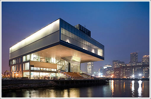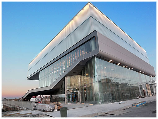
While Mark Dziewulski might have been the only one to submit a design, three other firms remain on the short-list for San Francisco’s Museum of Performance & Design. And as such, over the next week or so we’ll at least take a look a snippet of the other three’s work. First up, Diller Scofidio & Renfro and the new Boston Institute of Contemporary Art:
The building design negotiates between two competing objectives: to perform as a dynamic civic building filled with public and social activities, and as a controlled, contemplative atmosphere for individuals interacting with contemporary art. The “public” building is built from the ground up; the “intimate” building, from the sky down.

The Boston Harborwalk borders the north and west edges of the ICA site. This surface is metaphorically extended into the new building as a pliable wrapper that defines the building’s major public spaces. It folds up from the walkway into a “grandstand” facing the water, it continues through the skin of the building to form a stage, then turns up to form the theater seating, then seamlessly envelopes the theater space, ultimately, slipping out through the skin to produce the ceiling of the exterior public “room.” Above the wrapper sits the “gallery box”: a large exhibition space on one level that dramatically cantilevers over the Harborwalk toward the water.
Engaging the water in a harbor town? Imagine that (especially with respect to another site).
∙ Boston Institute of Contemporary Art [Diller Scofidio & Renfro]
∙ Museum of Performance & Design: Familiarity With The Corner/Design [SocketSite]
∙ San Francisco’s Seawall Lot 337 Design Proposals: In Summary [SocketSite]
Wow! Please open an office in SF, and start doing some work here, especially in Mission Bay and Soma!!!
Reminds me of the Argentine National Library in Buenos Aires:
http://farm1.static.flickr.com/102/284821701_45fa38ad97.jpg?v=0
@ Kevin,
No way it would happen – the Historic Preservation Commission would block anything this progressive from being built, unless it resembled a gigantic Victorian.
I had a similar appreciative sentiment upon seeing this building go up along the harbor in Boston. A nice shot in the arm – high concept architecture in a conservative environment. The problem, which just leaves the door wide open to the status-quo, is that building’s details are a huge dissappointment. I can only hope that if DSR were to win and build in SF, they’ve learned a LOT of lessons from this experience.
That is a beautiful box.
The rolled up egg noodle is so much cooler than this. This is bland.
Diller Scofidio + Renfro are light years ahead of Dziewulski. He’s way out of his league on this one. Never mind the fact that his proposal looks like a project from a second year architecture student.
DS is a huge trade up. I hope they get selected and their project actually gets build. One hopes the san francisco review process doesnt kill this a la rem koolhaas.
I’ve been through the Boston bldg and I have to say it’s a more interesting public sculpture (viewed from the water side) than a successful museum, imho. Exhibition space is not all that big, and a lot of the other spaces in the building seem odd.
For instance, there’s a theater built in the second floor that is glass enclosed with a glorious view of the water. But what is the theater really for, with no wings, and the requirement to pull down curtains if you really want to use it. It seems to me there was collusion between the client and the architect in developing these odd hard to use “public” spaces.
The outdoor space is similarly odd, but fun for the odd passerby with those bleacherlike steps leading down to the water. But this exterior space serves no real purpose for the program of the museum, and as the building is currently quite isolated, it gets very little use.
Finally, although the building is dramatic from the water, it presents a completely bland facade to the back, the direction from which nearly all people actually enter the site. When I was there, there was not even any landscape treatment to guide a visitor across an ugly parking lot to the very understated entrance (on the left in the second pic). Hopefully that will be fixed in time.
I think the the Mark Dziewulski design for a new Museum of Performance & Design in SF was about 100x better than this Boston desing.
Please, dear Lord and Mayor Hair Gel and Board of Stuppidvisors, please approve and allows this.
All that glass is glitzy, but somewhat impractical. Boston gets cold, and it is going to cost a fortune to keep this place heated. This might be one of the last huge public buildings is the US to flaunt a lack of engagement with the green building trend. Paying more than necessary for heating and cooling is not necessarily a good idea, even if the spaces are impressive.
On that site, it looks a lot like a diving board; it couldn’t get permitted in SF.