A reader wonders: “I was walking through the Inner Sunset last weekend and noticed a new building going up on 7th between Judah & Irving. Do you happen to know anything about this development?”
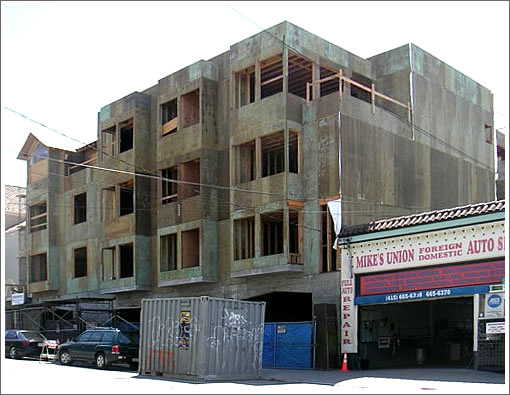
We respond (and we do): Where a three-story mixed-use building once stood (think Golden Gate Radiator & Body with two residential units above), a four-story building is rising (which will consist of 2,400 square feet of ground-floor commercial space with eight condos above and eleven parking spaces below). And in addition to saving the two cottages behind, another unit will be built (for a total of eleven).

From the architects of 1315-27 7th Avenue (Hamilton & Company Architecture):
We had quite a bit of fun with this 11 Unit Mixed Use /Condominium project. It’s located in an established neighborhood in the Inner Sunset in San Francisco, surrounded by buildings from the early 1900’s to the late 1930’s.
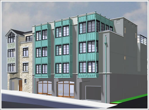
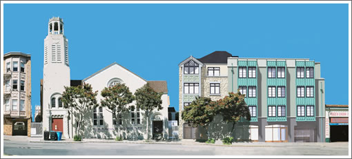
We’ve reflected some of that history by dividing the front building into two unequal masses. The left side is designed as a traditional Tudor Revival, which has an arched gallery leading back to a landscaped courtyard and three cottages at the rear. The right side is an updated Art Deco “riff” on the Tudor, which repeats the broad Tudor arch in a stylized fashion across the base of the building. Above the arched base are three dramatic copper bays across the façade, which create a colorful focal point within the streetscape.

The condos will range in size from one to three bedrooms and according to the architect’s website, the development is “[s]cheduled for completion in Summer 2008” (which looks to be a little aggressive).
∙ 1315-27 7th Avenue [Hamilton & Company Architecture]
fugly.
Interesting idea. Having 2 very distinct blocks will avoid dwarfing the street’s diversity with a big unit.
My only questions is: Why the grey paint on the right hand side mass? I can understand why they need to have different textures to make the 2 masses visually separate but why not an other color that would fit with the copper green? Then again, it’s a matter of taste.
hideous
very interesting and thoughtful design solution. breaking up the total building mass using the expression of two new buildings is nice. The grey color on the larger composition is a good counterpoint to the green copper roofs.
So ugly. So SF.
I don’t think I’ve ever posted an emotional response on this site before as I prefer to stick to the facts that I know, but I’ve got to say that from the renderings at least, this is f*#king uuuuuuugly, lol! I love modern architecture, I love traditional architecture, I love successful marriages of the two, but this strikes me as none of the above. Perhaps the final materials will make a difference?
Gross, and within screeching difference of the N-Judah stop.
Yeah, these will sell…
The developer is also fixing up a duplex across the street from this building,and it will be a three-unit condo building w/parking as well.
yawn, you really paid an architect for this?
I find it interesting that just one of the negative comments posted here give reason as to why they don’t like it. The rest are all practically one word dismissals.
Props for the two mass approach. A major improvement for the site. Not my cup of tea but I bet the copper will look a lot better in person than in the renderings.
Hey, you can walk to tons of restaurants and GG Park and commute downtown quick like. A very convenient location.
fishchum: whereas your support lists tons of reasons why the architecture is great? not trying to be rude, but it isn’t exactly fair to criticize when you are doing exactly the same thing. but since you did, two responses:
one: from an emotional standpoint, one doesn’t need to justify it or not. it is their opinion. you like it, we don’t, ’nuff said.
from an architectural standpoint, very real criticisms can be made: one building with two completely different styles from two completely different times is a bad idea. art deco with faux bay windows and a contemporary version of a tudor arch is a bad idea. a wood-framed imitation of a stone tudor is a bad idea. colors are odd, alhtough that may be the rendering so they get a pass for now. and if you do like different style buildings next to each other to break up the street front, why not a of-its-time modern building built with modern technology and looking like it???
don’t love it, but i must admit that i do at least like that they chose two different styles…if they had just picked one, it would have just overpowered the whole area. I hate some of these massive 50+ bldings that go up as they just don’t give a ‘friendly’ feeling out and overpower the block and make a sfh or small 2-4 unit place nearby look out of place, no matter how well designed. So I’ll give kudo’s to at least trying to minimize the impact / make it look like 2 separate entities.
i’ve been taking pictures as i’ve walked by over the years, here are a few:
http://sanfranciscoschtuff.com/2008/03/20/7th-ave-near-irving-iii/
I give credit for the developer and architect for using high end materials on the facade like Copper and stone. Beats the way less expensive and ubiqutious stucco or hardboard siding. I suspect, this will be a case where actual building will look better than rendering. I would say I like the effort more than the design.
Don’t expect completion in summer. I project building has 5 more months to go if they are only at rough framing stage.
I find it interesting too that all of these armchair critics who “dislike” something can’t seem to offer very much in the way of intelligent criticism.
It’s all good to criticize or support a project or a design expression. But….
why not not go further and tell us why? otherwise, it sounds like a bunch of 13 year old kids on line.
and yes, I like the project.
why do you need a reason to say something is aesthetically displeasing. doesn’t everyone have a gut reaction.
when someone says ugly, what other explanation is there?
Fine .. it is ugly because it looks like a pastel Medieval Times restaurant plunked down in the middle of SF.
It’s like someone is trying to build a mead hall in downtown Miami.
How’s that?
It’s ugly. And undistinguished. And uncreative.
My architect college roommates had some names for the kind of architects who designed with this kind of “flair” in school. Box-heads. Institutional thinkers. Bauhaus Boring.
It’s also unfortunately quite typical looking of a lot of buildings in SF.
And if it follows those buildings, it will also feel ugly inside. And feel shoddily made. And will soon be full of people who feel its ugliness every day and treat it the way they feel treated by its boxes and utilitarian horribleness.
Considering how difficult a previous post made it seem to construct or change buildings in this city, I don’t get it.
ok, fair enough. to some this building is genuinely ugly. (whatever ugly really means within architecture). to some, it may look like a “medieval” building. it may look uncreative to some.
AND..SO WHAT??
look at what is adjacent to this building. it’s average, regular, not special..maybe even ugly. I dont know. not EVERY new building needs to stand out and scream “world class”. Some buildings are meant to blend in, be background buildings, just fitting in with the existing context.
By those standards, I think this building succeeds. I think it succeeds with a bit of obvious irony as well..remember, the architects did say they “..had some fun with this one…”
IMO, it’s a bit weird, especially the tudor part, but I think the copper will actually look good in person. Good materials can do a lot for a building. But, still, tudor?? Strange choice.
I think that this is a nicely-designed building with a low-budget rendering. You can tell that they were going for an oxidized-copper look but accidentally ended up with a Play-Doh teal. Worry not, I don’t think the grass curb nearby is going to be neon green in real life either.
Out of all the multicondo projects I’ve seen on SS recently, I like this one the most. The contrasting “double-hunk” approach definitely decreases the impact of the building (a good thing) and lets an otherwise hulking building fit into its surroundings.
Add in a joggable distance to the de Young and the Aquarium, both of which I’m a member of, and this is a place I could see myself living. To each his or her own :).
As someone who lived in the Inner Sunset for years I really like this – at least conceptually. The architects have rooted this to two styles that you will actually see walking around the neighborhood.
However I think they actually took some artistic license and these will likely look very nice. This building will relate to its surroundings, but with a little bit of timeless flair. Within the confines of saving the cottages and making a project like this they didn’t just build a box – look at the fairly new condos on the corner of Irving and 7th if you want unimaginative.
Give this one a chance. Wait until its done and decide then.
I’d love to wait until its done to see how ugly it will be.
BUt then it will be a big ugly fact.
I don’t have any vested interest in the building, so really, I’m just telling you how it strikes me. Which is that it doesn’t fit into the few surrounding buildings shown in the rendering. And it looks big and hulking to me.
Not to say that “fitting into the neighborhood” is the be all and end all. There are lots of examples of striking architecture made all the more striking by the way they clash with/put in relief their surroundings.
Anyway, it strikes me that some commenting here are over-selling the prince they see in the toad. It makes me wonder if they own some of it somehow. I mean, “with a little bit of timeless flair”? Please.
Certainly, there are more unimaginative buildings in the city, but I simply see no reason to design and build this.
matt-
I appreciate your point of view, although you seem pretty set and closed minded at this point.
The new building does, in fact, fit in with some of the surrounding buildings. the cornice line matches with the apt. building to the left. the church spire is actually taller than the new building. the new building offers variety and originality while, I believe respecting the neighborhood context. Not every new project need be “striking”. Background buildings are appropriate as well.
And..BTW…I’m an architect, but have no vested interest in the project.
As someone who spends a lot of time in this neighborhood (I attend the church in the photo), I like the design. It’s visually interesting without being overbearing. It certainly is a big improvement over the eyesore it replaced.
I agree too that this is a very livable neighborhood. If priced correctly, these units should sell readily.
Matt – Sorry to disappoint but there are no ulterior motives. I no longer live in SF and have no vested interest other than that I still love the Inner Sunset and SF (which is why I still keep up via Socketsite).
The end-result may be displeasing (‘ugly’ to borrow your phrasing) but for the sake of those that live in the area I hope that does not turn out to be the case.
as one in the area (renting, pining to buy), i look forward to these and any new housing in this ‘hood. tudor or multi-personality or ugly (?) facade or — who cares? can i afford it? if so, i’ll make the inside “me” and care f*** all about the aesthetics of the exterior
As another in-the-area-renter-poster I have been dying to know what these units will look like, and what price they will go for. I for one can not wait to see the final project.
On the market and construction complete: From Rendering To Reality And On The Market For 1327 7th Avenue.