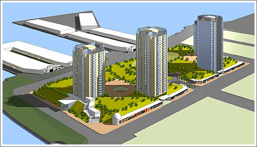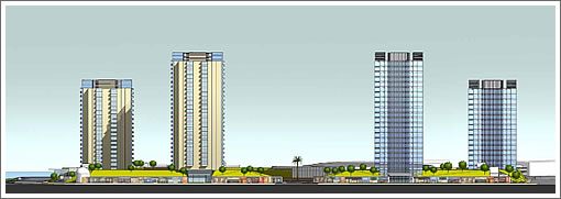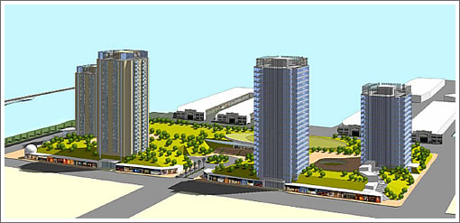
“The Federal Development Project Concept [for San Francisco’s Seawall 337] calls for integrating revenue producing new land uses within a matrix of substantial open space. The new uses include a 170-room Four Star Hotel, two office buildings [432,000 sqft in total], a 450-unit residential building and a 2,500 seat theater facility.”
“The open space will be created primarily at the podium (top) level of a 4-story parking facility [with 2,745 spaces] that will cover most of the site and serve the parking needs of the new uses as well as providing replacement parking for the AT&T Ballpark.”

“At the key intersections of Third Street and Terry Francois Boulevard, and at the corner of Third and Mission Rock Street, meandering and gracious upwardly sloping walkways, lined with retail shops and restaurants, will invite visitors onto the site to enjoy the views and to access the podium level attractions. A major expanse of podium level open space at the site’s northeast corner will accommodate and be made available for active sporting events including soccer, football or baseball or could be the temporary (but long-term) home for Cirque de Soleil. Retail space with 30’ deep modules will front along the 3rd street frontage.”

“In the near term, uses for Pier 48 would include maritime related activities as permitted under the Burton Act and consistent with the BCDC Seaport Plan. These might include exhibition events and leasing of raw shed space (as is) to conventional maritime-related businesses such as boat rental and storage, ship chandlery stores and the like. In the longer term, Federal Development will seek approvals to permit private offices for maritime related businesses, restaurants, retail, and visitor entertainment space.”
∙ SWL 337 Proposal: Federal/Lehman/Construction Management (pdf) [Port of SF]

Ew. This is straight out of Le Corbusier’s Garden City concept, which brought us such great (sarcasm) developments as Park Merced, Park La Brea, and Stuyvessant Town. Absolutely awful. How about some densely packed buildings with an appealing streetwall, narrow streets to slow through traffic and FUNCTIONAL open space, instead of open space just because it sounds good on paper.
As Jon Stewart once said (I think): Stuyvessant Town. It’s Swedish for crap!
I’m still rooting for the Giants. This one is particularly uninspired.
4 story parking garages that cover the whole space, and then space your towers out so much that you get that empty suburban feel. are you joking? why did these guys even bother submitting the proposal? oh, sorry… we actually thought the site was in huston… our bad.
“sustainable open space” AKA “roof of parking garage”. LOL.
Wow, did we step back into 1952?
Absolutely horrid.
Le corbusier without the acclaim. What a farkin joke.
Is this proposal a freaking joke?
wild, looks like SF’s going to look alittle like HK.
@BAM you stole my thunder 😉
I can’t believe this is a “viable” proposal in 2008. Unfreaking believable. It makes the other ones look like Haussmann….
i lived in park la brea in LA for one lousy yr of my life. i do not ever want to see it or anything that looks like it again. this is a horrible concept, and it doesn’t even have the upside of tar pits.
These look like housing projects
Umm…HELLO? We tore down the crime ridden Geneva Towers projects mid-city just to rebuild them again along the waterfront? Yuck!!
This is an example of brilliant urban planning – if the year was 1952. Uninspired architecture surrounded by bland landscaping. If you want to get an idea of what it would feel like, look here:
http://www.crystalwindows.com/images/commercial/lefrak.jpg
awful awful awful – someone should go read Jane Jacobs.
This makes -almost – the Golden Gateway look good.
Tons of public open space along the waterfront; this is a travesty. Oh, and its elevated so you can see the water from the park. Horrors!
I actually came into the City a couple of weeks ago with the family and went to a kids playground on top of the Moscone Center. A great public space. We need more of these, not less. And I’m sure they will do better than the lollipop trees indicate.
BTW, it would feel nothing like LEFRAK, for cyrin’ out loud; the LEFRAK buildings are piled right next to each other. Probably would look like more like this: http://www.djc.com/news/co/11149498.html
Oh the humanity! Its a tough job, but someone’s got to defend the big green monter. At least they’ll have plenty of parking.