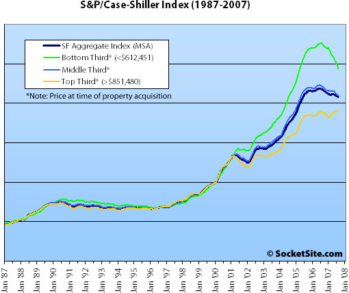
While it’s still not the county level detail we’d all love to get our analytic little hand on, Standard & Poor’s has started publishing its S&P/Case-Shiller Home Price Indices by price tiers.
Each tier represents approximately one-third of the number of sales transactions recorded in each respective market. For example, for each market, Standard & Poor’s defines low, medium and high by defining breakpoints in one- third intervals for all sales found at each point in time. The methodology looks at the first sale in a given sale pair to define the price level.
Two things that caught our attention: the divergence in the performance of properties between price tiers in general (which shouldn’t catch anybody that’s plugged-in by surprise); and the time at which the divergence occurred in specific (easy money anyone?).
And while tempting, we wouldn’t go so far as to assume the top third is a better proxy for San Francisco as a whole.
UPDATE: And we somehow managed to forget our standard S&P/Case-Shiller footnote: The HPI only tracks single-family homes (not condominiums which represent half the transactions in San Francisco), is imperfect in factoring out changes in property values due to improvements versus actual market appreciation (although they try their best), and includes San Francisco, San Mateo, Marin, Contra Costa, and Alameda in the “San Francisco” index (i.e., the greater MSA).
∙ S&P Publishes Low-, Mid- and High Price Homes Indices (pdf) [S&P]
So are the lines coming out from the y-axis supposed to be spaced by 20% intervals?
Err, scratch that guess. I just realized how far back this graph goes…
So for the top tier, I guess the question remains, is the relatively flat two years followed by the recent minor bump for the top tier a “last gasp for air before a drop” or a “sign of overall strength compared to the bottom and middle tiers”?
Wouldn’t we all love to know which answer is correct…
Are the three tiers really so in sync before 2001?
If so, maybe the indication is the three will merge back?
The index is normalized to January 2000 (an index value of 100) and the lines on the Y-axis represent 50 point shifts in the index.
I am going to make a bold prediction.
By the end of 2008 to mid 2009, all three tiers will be just below 200, meaning the bottom tier will drop another 20% (from 250 to 200), the middle tier drop 5% (from 210 to 200), and the top tier increase another 5% (from 190 to 200).
While one can’t say the top tier is a marker for SF proper (since most single family homes in the SF MSA are outside SF), clearly the less than $612k graph does not represent single family home sales in SF proper, since very few single family homes in SF sell for less than $612k, especially in comparison to the East Bay.
“since very few single family homes in SF sell for less than $612k”
The tiers are based on what people initially paid for the homes not what they are currently selling for. It wasn’t too long ago that homes in the Sunset/Richmond were selling for $600k.
According to the MLS, there are currently 117 single family homes for sale in the city under $612K.
John — your prediction is actually not that bold. In fact, it is on the conservative side. The Chicago Merc trades financial products based on CSI data. Some of the current market prices for the SF MSA are:
Nov ’08 — 190; May ’09 — 180; Nov ’10 — 163
I did not go through every market, but it appears that those willing to put money on this are predicting that SF MSA prices will drop quite a bit more than any other region of the country over the next few years. The Merc does not trade the individual “tiers”
And apparently 92 of those 117 are in district 10.
First the SF MSA includes more than SF by a long shot, so the sub prime problems significant in the east bay play a big part in the value of C-S for the SF MSA. The application to SF itself is significantly distorted. An interesting question as to to the separation of values among the tiers after 2001 and how much of that is driven by cheap money, weak or non-existing underwriting standards, while one could argue such underwriting may not have had such an impact on the top tier.
Trip,
My point is really about the indice of the tree tiers will merge back together.
Whether they merge at 200, or 180, or even 160…who knows…it depends a lot on whether the “100” at 2000 is the fair price. If it is, then 160 is possible. However, I would say the 100 at 2000 is a little bit undervalued, after a long bottom of 90’s. 125 at 2002 is about fair. Based on that, the index should be about 191 in 2010 (8 years of appreciation at 5.5% per year – about 2.5% above inflation).
So, it is not a bifurcated market. Rather, it is a bifurcated markets merging back.
First the SF MSA includes more than SF by a long shot, so the sub prime problems significant in the east bay play a big part in the value of C-S for the SF MSA. The application to SF itself is significantly distorted. An interesting question as to to the separation of values among the tiers after 2001 and how much of that is driven by cheap money, weak or non-existing underwriting standards, while one could argue such underwriting may not have had such an impact on the top tier.
Who cares what district the houses are in? The fact is- is that they exist.
We have seen this kinds of statements before, that general say the numbers for the City of San Francisco are being brought down by poor performing outlying areas and that if you could fact them out you would see that the City of San Francisco was doing fine, possibly even still rising.
Unfortunately, no matter how you slice it the numbers do not bear that assertion out. Out of all the available data out there it is clear that as the Bay Area declines the City of San Francisco declines right along with it. There might be a slight delay as outer areas feel the effects first. But gather all the Data Quick, HPI, CSI, Affordability indicators, and any other metrics you can find, slice and dice them however you like and you come to the same conclusion.
The real estate market in the City of San Francisco follows the exact same trends lines of the Bay Area as a whole.
If someone has the historic data to disprove this, I would love to see it. Otherwise, all the data out (much of which has already been posted on SocketSite) only goes to prove that yes, gravity does exist in SF just like everywhere else.
“According to the MLS, there are currently 117 single family homes for sale in the city under $612K.”
Single family homes in SF under 612k are still a very small fraction of the single family homes for sold for under 612k in the metropolitan area.
^^^ sorry for the typos, I “posted” when I should have “previewed” ^^^
According to S&P, the definition of the San Francisco MSA is San Francisco, San Mateo, Alameda, Marin, and Contra Costa.
There are 117 SFRs for sale in San Francisco under $612K, according to the MLS.
In the entire MSA, there are 349 homes listed under $612K.
The San Francisco MLS may not be taking all the Contra Costa and San Mateo inventory into account. Otherwise, the homes in San Francisco account for 33% of the total MSA under $612K. Pretty large portion.
If we remove the $612K filter and just search for all SFRs, there are 660 listed in San Francisco and 1,279 listed in the MSA. So San Francisco accounts for 52% of the listings.
This is very interesting data. As some other posters have said, I also think that the lines will converge as lower tiers come down in price and the upper tier stays flatish. It also seems that while San Francisco makes up a relatively small percentage of total Bay Area sales, it makes up a pretty big chunk of the upper tier. At $851K and up, the upper tier is probably heavily weighted toward SF and Marin. According to the detailed charts, this price tiers are based on the price as of August 2007. A previous poster suggested it was based on the price back in 2000, which it appears is NOT the case. Dude – your stats from MLS are also interesting and provide more insight. I realize that they are based on listing price and not selling price, but based on these stats – only 18% of homes in SF are listed for $631K or less. For the other areas that you recapped, it jumps up to 38%. This is probably even more dramatic if you add in Solano.
Dude, using the San Francisco MLS greatly undercounts the surrounding counties, so your percentages are way off.
A quick search on realtor.com shows 1,104 single family homes for sale for under $600,000 in Alameda/Contra Costa, 69 in Marin County, and 267 in San Mateo County, or a total of 1440 single family homes. A search of San Francisco homes under $600,000 brings up 146 listings.
So San Francisco homes for sale under $600,000 make up 10.1% of the total San Francisco, San Mateo, Alameda, Marin, and Contra Costa county homes under $600,000, according to the listings on realtor.com.
(Realtor.com has some duplicate listings for some individual homes, but that balances out using realtor.com’s search results for San Francisco as well as for the other counties.)
Let’s try this again, the price tier breakpoints are NOT based on the most recent selling price of the home sale pairs from which the index is derived, but is rather based on the original purchase price of the homes.
For example, the appreciation for a single family home in district seven that was purchased for $600,000 fifteen years ago and recently sold for $1,400,000 (a hypothetical annual appreciation of 6%) would be counted in the bottom tier (as the original sale price was under $612,451). The appreciation for a single family home in the Richmond/Sunset that was purchased for $600,000 five years ago and recently sold for $900,000 (a hypothetical annual appreciation of 8%) would also be counted in the bottom tier (again, the original sale price was under $612,451).
At the same time, the appreciation for a hypothetical Bayview home that was purchased for $650,000 in 2006 and recently changed hands for $599,000 would be counted in the middle tier (as the original sale price was between $612,451 and $851,480). And so on and so forth.
It is odd then that the breakpoints are based on the original purchase price rather than the most recent purchase price. Since C-S pairs might span 1 to 20 years, there’s much less correlation between the original purchase price compared to the recent purchase price.
For example, consider the 2 houses :
— Sold 1990 for $500M, sold 2007 for $1.5M
— Sold 2005 for $1.2M, sold 2007 for $1.5M
Those might be two identical houses right next to one another yet one would be counted in the lower third and the other in the upper third.
It seems as if using the most recent sales price to divide the sample set into thirds makes a lot more sense. Why did C-S do it the other way around ?
Accroding to this link, the tiers are based on the price as of August 2007. Given that prices have appreciated by 143% during that time, it also makes more sense that the $631K is based on the current price and not the original price. I could be wrong (definetly not the first time), but here’s the link I’m referring to: http://www2.standardandpoors.com/spf/pdf/index/cs_tieredprices_200708.xls
Lance – Those are the tier breakpoints as of August 2007 (which will change as new sale pairs are introduced), not the sale prices as of August 2007. Again, “The methodology looks at the first sale in a given sale pair to define the price level.”
http://www2.standardandpoors.com/spf/pdf/index/110807_cshome-pairs.pdf
badlydrawnbear,
The point of my comments regarding the C-S San Francisco MSA is that San Francisco by itself is a different market from the SF MSA just as Contra Costa is a different market by itself than the SF MSA, and in there are components of the MSA which are more concentrated at the bottom tier than SF.
SF has been less hit by subprime foreclosures for instance:
http://sfgate.com/cgi-bin/article.cgi?f=/c/a/2007/10/12/BURBSOM4Q.DTL
http://www.sfgate.com/cgi-bin/article.cgi?f=/c/a/2007/10/14/MNVPSEMVQ.DTL&hw=foreclosures&sn=002&sc=807
You will see that San Francisco and Marin have foreclosure rates of 1-2 per 1000 where as Contra Costa has foreclosure rates of 5-15 per 1000.
You will also notice by the link below that the FDIC does not recognize a bust the Bay Area markets historically, though it does in others.
My fundamental point is that there are different drivers for the different components of the San Francisco MSA and that maybe one should take statistics which are drawn at the MSA level with a grain of salt when trying to apply them at the local level. If this were not true, then applying MSA level statistics to Contra Costa County would actually make things in Contra Costa look a heck of a lot better than they are.
http://www.fdic.gov/bank/analytical/fyi/2005/021005fyi_table1.pdf
…the missing FDIC link….
Interesting charts that finally show what we all know, that San Fancisco prices continue to be creeping higher, while outlying areas are trending lower. Interesting to note the bottom and mid tier prices went up FATHER than the top tier. Hence, why shouldn’t the mid and lowe tiers fall.
Looks like the Top Tier inched higher to a new record. I can’t buy any single family house for $850,000 in SF. Top tier is definitely a reflection of the SF maket, and more expensive propeties around the bay by definition.
^ “I can’t buy any single family house for $850,000 in SF.”
391 out of the 662 SF SFH’s listed on the MLS are under $850K. And you should probably read all of the comments as the tiers are not based on current prices.
In either case, falling prices in surrounding counties will drag down prices in San Francisco.
Ugh … I should have known it would be pointless.
and to the editors, why don’t you spend a paragraph explaining the flaws to the median price every time you post it (like how TICs are calculated as a single unit), I am not sure why the CSI gets singled out for special treatment and all it’s ‘flaws’.
Badlydrawnbear, don’t go, you’re comments are good, you shouldn’t give up so easily. Broadly, and I am sure you would agree, (and maybe this is where maybe was an economist in a past life…on the one hand…on the other hand…) that all statistics have their challenges, the CSI, the median price, you name it. Have a good one.
Another interesting chart would be to overlay rental increases over the same time period on the same chart.
I think the SF Gate had one for the past 10 years, when they reported rocketing rental prices a month or so ago.
I think the C-S methodology is that homes are assigned to the lower tier (the lower 1/3 of the home prices), the middle tier, or the upper tier based on whether the house was in the lower, middle, or upper 1/3 (whatever the actual dollar amount defining these tiers) at the time of the first of the two sales, not whether or not actual price the house at the time was under or over 612k. So if a house first sold for $610k in 1995, and that selling price was in the top 1/3 of home prices in 1995, it would count as being in the top tier, not the bottom tier. That’s the only way the index would make sense. If the bottom 1/3 tier constituted every house that in the first of its 2 sales sold for under 612k, that tier would include far more than 1/3 of the homes in the Bay Area.
here are some rent charts for digestion, doesn’t really break down by location so not terribly informative. Also, as foreclosures increase and the demand for forsale housing decreases, demand for rental housing tends to increase…
http://www.sfgate.com/cgi-bin/object/article?f=/c/a/2007/10/18/BU36SRH4D.DTL&o=0
And here…the RealFacts numbers behind this chart tend to tract only certain types of larger apartment buidlings and not the 4 unit buildings etc.
http://www.sfgate.com/cgi-bin/object/article?f=/c/a/2007/09/16/BUK1RVMVQ.DTL&o=3&type=printable
@Dan: Your methodology wouldn’t result in an even distribution of the sales into thirds. In fact based on your approach you could theoretically end up with 100% of the sales in any given period defined as bottom, middle or top tier sales.
I know, it’s not SF specific. Regardless, the BBC has an incredible piece that outlines what happened in housing since 2000 with data and charts galore including an interactive graphic “how it all went wrong.”
Although they did miss the fun fact that Andy Fastow (of Enron fame) was responsible for creating Mortgage Backed Securities(MBS)in the late 80’s.
A must for any ‘armchair economist’ on SocketSite
BDB — good links. But you give Andy Fastow way too much credit. He’s an idiot and likely would not even understand mortgage-backed securities, much less have the brain cells to create such a complex product. Salomon Brothers was the pioneer in this field in the mid-80s. Michael Lewis chronicled this in “Liar’s Poker.” Here is a pretty good history:
http://www.bloodhoundrealty.com/BloodhoundBlog/?p=1147
I for one am excited to see what will happen over the next 2-3 years for SF RE.
the essential issue is whether SF RE values are more influenced by high income/wealth, or due to loose lending/idiot loans.
It is unlikely that we will see loose/poor lending anytime soon, given that 2 of the most influential/powerful finacial CEO’s in the world (Merrill and Citi) recently lost their jobs in the last 2 weeks, as well as possible bankruptcy/breakup of some major lenders and financial players (Citi, Countrywide, Bear Stearns, Merrill) as well as massive layoffs in the fixed equity divisions of the major players.
Also, there are lawsuits galore related to mortgage backed securities right now… it’s become a four letter word. without the securitization process, the risk can’t be shoveled off to a patsy anymore…
Countrywide (largest lender in America) just released that their percentage of subprime loans fell from 48% last year to under 1% this fall… clearly lending is tightening. (heard it on CNBC)
as the loans dry up, we’ll see if San Franciscans can really afford their steep mortgages.
I have stated many times that I think it’s the funny loans that led to SF RE appreciating so fast (as evinced by the number of Option ARMs and ARMs here)… but we’ll know the answer in the next 2 years or so. yeah… it sucks that it takes so long, but psychology takes a while.