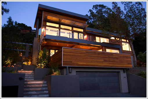
It’s been over two years in the making (for one reason or another), the finishes are mighty fine, and it honestly offers one of the best damn (modern) font doors we’ve gotten our grubby little hands on in quite a while (think scale, weight and precision). Oh, and the panoramic valley views aren’t too shabby either.

UPDATE (9/7): Closed escrow on 8/09/07 for $4,500,000 (2.4% over asking).
∙ Listing: 366 Lovell, Mill Valley (5/4.5) – $4,395,000 [PaytonsList]

It boasts use of “green technology” in the listing, but doesn’t state what exactly it is that’s supposed to be green, other than the “outdoor ethyl alcohol fireplace”. I’d be very curious to know the other “green” features are.
Simply beautiful!
Nice House! Tried to google architects name and found nothing. I am not even sure how the pronounce the last name of the designer. Anyway, a very nice job and this shows you can have a modern home that is comfortable and current without looking like a electric power transformer substation.
I don’t think I’d call this modern. It’s contemporary, but in a very bland way.
The natural setting is gorgeous, of course. But the home itself seems a bit arbitrary and slapdash. The kitchen is so overdone with marble it makes me dizzy.
In contrast to 610 Rhode Island (I think that’s the address), this looks safe and boring. I don’t see it aging particularly well.
I guess I’m more in the electric power transformer substation camp.
Gorgeous indeed, but the kitchen feels out of synch with the rest of the house.
I’m sure it’s nice, but… that kitchen is ugly beyond. And the rest of the photos seem to place more emphasis on the staging than the property. For nearly $5M I expect a little more than poorly lit photos. Even in Mill Valley.
Especially in Mill Valley.
I like the house and think it slips into the fabric of Mill Valley very well. The kitchen does seem a bit unusual, not my taste, but interesting.
This next comment is not meant for this home in particular, but for staged homes in general. Is it one company that does every staging job in the Bay Area!? Really! There is no other urban region where every home interior is looking so identical and I mean this as a challenge. Look at the interiors of properties in Manhattan and yes even Los Angeles and you will find that the homes tend to reflect the individual lives of the owners, and not the latest catalogues of DWR, Room and Board and West Elm. The same goes for color coordinated art. I sometimes wonder which came first, the couch fabric choice, or the painting selection that hangs behind it. This rant is not meant just for this listing, but for a trend throughout the region.
I like this home, and I certainly wouldn’t turn it away if it were in my budget. I do, however agree that the kitchen is more suited to a farmhouse than a modern look. Too much white and veiny marble.
This is a nice house such as the bedrooms, living rooms and outdoor. But the kitchen is too white as Lori said. I don’t like the kitchen design at all. It just looks like in the white hospital.
Steep drive way. Landscaping needs to mature…but home feels like a high end resort/spa…great views. Hard to imagine a family “hanging out” there though. What happens if toys are strewn around the floors…is it still cool? But if Mill Valley’s Sycamore Park can now command approx $3.6 million (50 Walnut), perhaps anything is possible in terms of price…
The designer is Amornrit Pukdeedamrongrit…pronounced phonetically. He is a great young designer who is always on the lookout for fun work. Send me an email if you would like to contact him….lifeinprogress@gmail.com.
Apparently this house sold for over ask. It certainly doesn’t push the envelope (especially in terms of form) – but it fits nicely with Mill Valley’s environment. It’s the materials that make it work… As for the power substation look…. while I like that as well it is sorta rude out in the hills here as it would scream “LOOK AT ME”…
Our house is of similar design (we built back in ’02).
Its on the market right now.
I have to agree with the kitchen comments – out of step with the rest of the house. Not to mention that marble is a terrible material for a kitchen – stains way to easily and in a modern style home “weathered” just looks crummy.
As for the comment about 2 years in the making – that’s a pretty good turn around from purchase to back on the market for a full blown remodel – considering you need to get through the Mill Valley design review process.
As for how the house would look like with toys scattered about – pretty much the same as any house when toys are scattered about – messy. If there is correct storage its not an issue. Traditional homes also look like crap when randomly decorated by Fisher Price… I konw we have 3 kids in our house. Looks great when we have it clean… Nice thing about modern is that you tend not to get creeping clutter – its hard to hide piles of crap that look okay when “hidden” in plain view like you might in a more traditional design.
366 Lovell Avenue closed escrow on 8/09/07 for $4,500,000 (2.4% over asking).