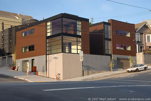

Matt Jalbert over at le blog exuberance captures 2005-2007 18th Street (at Rhode Island) in all its modern glory. And while we actually have the scoop on this one, we can’t quite share (which is killing us). Suffice it to say, it’s not headed for the market (so no open house for you), but we’ll do our best to get you a peek inside.
That being said, while this property isn’t hitting the market, there’s an equally gawk worthy modern gem hitting the market nearby. And by nearby, we mean you can actually see it in all of Matt’s photos…
∙ 2005-2007 18th Street: mega modern new architecture on Potrero Hill [exuberance.com]
∙ Map: 2005-2007 18th Street @ Rhode Island [Google]

I think it’s cool, but I wonder how proud the builders of the now very dated 60’s and 70’s buildings were of their “modern design”.
This building shares some of the same very plain, unadorned style as those 60s/70s ugly boxes, and so I wonder if it will seem ugly to people 40 years from now.
I’m with tipster. Not a fan, although inside pics could be nicer. The modern on jackson st has a lot more interesting features than does this place.
And I’m not a fan on withholding information! If you can’t share, than don’t tell! 🙂
[Editor’s Note: Point taken. No more “we know but we’re not telling.” And if we do, call us on it (not that you wouldn’t anyway). Thanks for “plugging in.”]
Not everybody is in love with Victorians. Some of us actually appreciate the simplicity of mid-century modern architecture.
This is a happening building.
While this design isn’t revelatory, it’s more or less timeless. And the view is sick. I walk by it frequently.
Designs be Johnson and van der Rohe look as good today as they did in the 20’s, 30’s and 40’s. Designs by Neutra, Schindler and their peers look perhaps better today than they did mid-century. Eichler can even be thrown in with this group.
Good modern design done in the 60’s and 70’s looks brilliant today. Poorly conceived and trendy stuff done then looks as awful as… the interior of a Victorian.
Very nice though it sure looks like a Dwell Magazine poster child. It’s hard not to like a simple modern building such as this. What is with the lower wall however? I see a narrow dirt strip at sidewalk level which I hope will be planted to help “enhance” the grey wall facing along the street.
I don’t know the neighborhood or this street corner, but looking at the picture, it’s hard to imagine a less friendly house from the perspective of a pedestrian who is outside on the corner. Generally speaking, Victorians at least attempt to engage passers-by with porches, bay windows, detailing, perhaps a small front garden or an interesting set of stairs, etc. This building, by contrast, seems aggressive and hostile to passers-by, offering nothing to pedestrians but two sets of garage doors, utility hardware and concrete walls that appear to be taller than the nearby street signs. Walking next to this building would be about as pleasant as walking next to a sound barrier on the freeway.
I was under the assumption that this property is/was owned by former Apple Computer designer and Studio Archetype founder, Clement Mok (http://en.wikipedia.org/wiki/Clement_Mok). I saw a building permit years ago posted on the site with his name and that of Regan Brice Architects. I could, however, be wrong — it’s been known to happen.
I used to live at 2027 18th St. on the top floor, and I watched the old building go down, and the new building go up. The owner of this building is the same person who owns the also uniquely designed building on Rhode Island (next door).