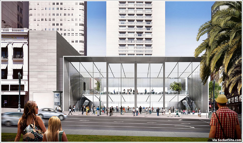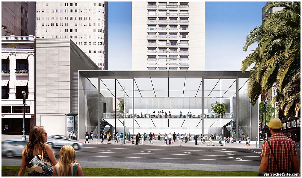
Another set of renderings of the redesigned Post Street façade for Apple’s proposed flagship store on Union Square which now features two full-height sliding glass doors, each measuring 23 feet wide and 44.5 feet tall, allowing the store to be opened to the street:

Note the regular sized all-glass doors in the non-sliding bays (click to enlarge) which would act as the primary access points for the store when the full-height doors are closed. There are two sets of doors from the redesigned plaza behind the store as well.
Looks magnitudes better than the current architectural excrement.
Is there a rendering that includes the pigeon gun emplacements?
I wonder if they’ll rethink this in light of the bill for replacing a pane of glass in their NYC shrine, reported at $450,000 (which I have trouble believing, but I’m sure it’s a lot of money, regardless).
Speaking of shrines, this is way too shrine-like for a commercial establishment that sells electronic gadgets, one of the most tumultuous and quickly changing markets extant. Ditto for their proposed donut-quarters. Save the shrines for major, predictable needs like crossing bodies of water.
They should also sell phones at a little kiosk nearby for those that are nauseated by shrines to consumption.
djt – I’m nauseated by the levis store currently there and the current “park” configuration – their obliteration is too much good news.
is the hot dog stand being displaced a shrine to consumption too?
I assume that the doors will be partially closed when it rains, but still……
Will the employees be getting sunscreen? or future skin cancer treatments?
Doors closed: microwave oven
Solution: open doors
Open doors: wine cooler (on a good day)
Obligatory “not tall enough” comment. Seriously, though, they could add housing above it.
Let’s see them try to claim THIS doesn’t integrate with the street. Cynical but appropriate.
Big glass cube. Slick, but not very creative. I can’t believe they want to erect a 50′ high blank wall along Stockton Street, though. Are they too suburb-oriented to know about basic urban sidewalk standards? (You’d think so after seeing this thing and their proposed giant doughnut on the peninsula) How brain-dead is Apple?