As we detailed in the third quarter of 2018:
Purchased by an art collector for $1.55 million in August of 2003, the 3,070-square foot Russian Hill cooperative unit #6 at 947 Green Street was gutted and completely transformed into a stunning “European-Deco inspired masterpiece” with views by LeavittWeaver.
Featuring polished teak casework, custom furnishings, and configured as a one-bedroom with an adjoining study (which would be repurposed as a second bedroom), the unit hit the market priced at $7.495 million, or roughly $2,441 per square foot, in the first quarter of [2018].
And today [September 6, 2018], 947 Green Street #6 was just re-listed anew with an official “1” day on the market and a $5.995 million price tag, a sale at which would be considered to be “at asking” according to all industry stats and reports.
Delisted from the MLS in the fourth quarter of 2018, 947 Green Street #6 was re-re-listed anew with an official “1” day on the market and a $4.995 million price tag, a sale at which would have be considered to be “at asking” according to all industry stats and reports, in February of last year.
And having been de-listed anew last June, the stunning full-floor view flat has just been re-re-re-listed anew with an official “1” day on the market and a further reduced, albeit not according to industry stats, list price of $3.595 million, which is roughly 52 percent below its original list.
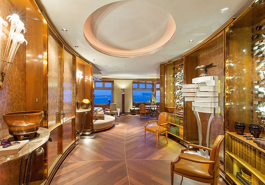














Views are stunning. Unit itself is stunningly gaudy.
Precisely. Built-in everything – looks like “Rat Pack” era or Vlad Putin’s love nest. Ick.
but you don’t have to spend any bucks on furniture! It’s a steal!
I’d call the aesthetic “West Coast Trumpian”
Stunningly weird lazy chair bed…..
I’d really have to gut and redo the interior here, but the views are stunning. Looks like a mafia yacht.
Dying over “mafia yacht”!!!!
Ozymandias’ pied de terre!
Tony Saprono would love this place – So would most Russian Mafioso –
Proof that money doesn’t buy good taste or _______ Fill in the blank.
The kitchen isn’t bad….. The rest… Icky
I don’t think the decor is that bad. Decidedly better than anything “Trumpian”, haha. Realize too that the photos themselves (which are of high quality) are overly saturated and anything but minimalist. They add to the general over-the-top-ness of the look. The architecture is too much for my taste, but I think it could be toned down. The wood and the curves and the windows are nice.
Agreed. Not my style and the gold-hued photos aren’t doing it any favors, but it’s exceptional work, an AD worthy renovation and will stand the test of time (unless white-boxed by a flipper)…
“European-Deco inspired masterpiece”
I read that initially as “European-Disco“, maybe influenced by seeing the photos first.
The whole bathroom looks like the interior of a slab of head cheese, I’d paint it all white and get rid of the mirror.
Would have to replace that god awful bed that looks like Andre the Giants first class bed on Emirates Airlines.
Oriental Rugs and oriental carpet would help, but on the whole, it truly looks like a deserted premiere class waiting room at Hamad International airport
The views and floors are amazing. Getting rid of the beige furniture and painting the ceiling white would do wonders on a budget. Is the toilet in the shower…???
No, the toilet is to the left (the the photos perspective) of the shower.
To me it looks vaguely Frank Loyd Wright. That whole neighborhood is an acquired taste. I like it. Former US Treasury Secretary and Secretary of State George Schultz was in the penthouse in the building next door.
What a deeply strange home. Reminds me of a hotel lobby more than a place to live
Saudi chic.
A fine case study for everyone who hates “whiteboxing” on the economic ourcomes of making specific individual design choices. Sells for $2.7mm in 6 months, if they are lucky. Maybe one of the Kardashian matriarchs is looking?
“Stunning?!”
If your taste is Trump Tower.
Extremely taste specific
Organized clutter. SO. MUCH. STUFF. in there. All that gold is just ugly, the bed even uglier and strange. Overall yuck!
Folks here can’t distinguish between gaudy and dense. To me it looks like a high-end museum – so many treasures packed into a small space that it’s overwhelming. I also assume that the renovation supported many fine craftspeople.
The tragedy is that some of the materials they used are irreplaceable. In this case it really should be the seller’s responsibility to find a good home for the furnishings rather than hoping the new owner won’t paint over them.