Slated to re-open later this year with Riverbed Technology and Macys.com as anchor tenants, the re-skinning and rebuilding of 680 Folsom Street which kicked off early last year and topped out this past October is nearly complete.

The project will yield 505,000 square feet of office space with a new public plaza and 15,000-square-foot retail or cultural building to be built at the corner of Folsom and Third.
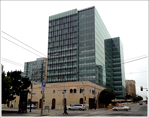
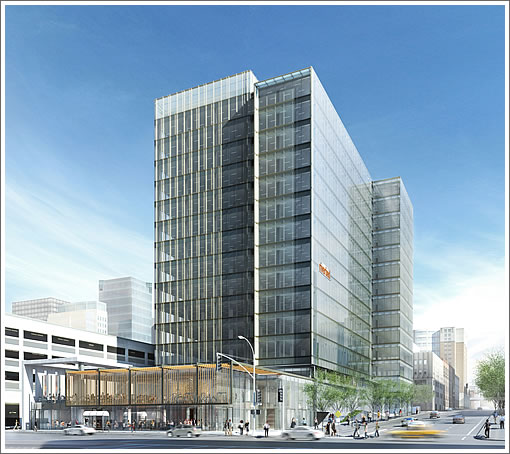
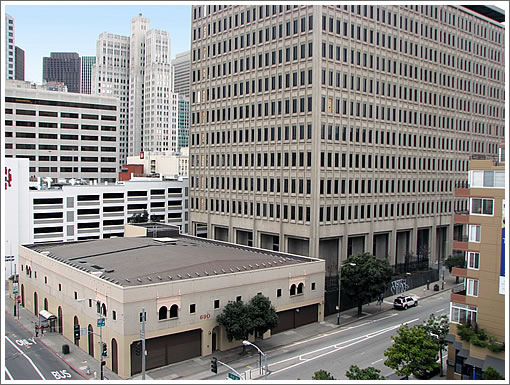
As the corner and 680 Folsom Street previously appeared:

The tower looks better in real life compared the the rendering. It will be nicer when the 2 story corner building is done too. It seems like it would be easier to demo and rebuild that low building than to reskin it.
Glad to hear that the developer has already got their anchor tenants signed up.
Yes, that is quite an improvement!
Nice.
It looked better before.
It was a nondescript 1960s/70s Brutalist mid-rise, but at least had a Utopian Modernist look to it…
Now it’s a nondescript contemporary mid-rise that looks like it belongs in Brisbane.
Total waste of money, when redesigning the ground floor and interior spaces would have accomplished essentially the same result. It’s not like anyone will ever gaze admiringly upon it… It’s like it’s designed to be forgettably invisible.
I’m just glad the 14 mos of jackhammers are done.
I can see reskinning 100 Van Ness because of the conversion from office to residential (people want big windows or glass walls where they live), but this building remains office. I like the all-glass look, but hardly seems worth the money and effort.
“a nondescript contemporary mid-rise that looks like it belongs in Brisbane”
This description would have been true when it was built the first time, too. Plus ça change…
One thing I have come to distrust are the artist’s renderings. A good example is the rendering of NEMA at 10th & Market St, a beautiful romantic view but in reality a boring monolith of black glass. It could just as well be in Dallas, Texas. Whether you like the finished look the comparisons to the drawing are not accurate.
what this side by side rendering vs reality shows is that regardless how architectural renderings try to make these glassy buildings look light and airy with pale light glass, in reality glass is dark dark dark. Even totally untinted clear glass is very dark compared to a a more solid-skinned building with light colored material.
I live a few blocks away and am thrilled with the upgrade.
Can’t wait to see what they do with the corner public area.
Quite true hmmmm, glass covered buildings are darker than the same covered with a light colored opaque skin. It is the flipside of the greenhouse effect: light passes through the glass, strikes something solid, and is converted into heat. Light goes in and doesn’t bounce back out.
Maybe the rendering is trying to be reflect what the building will look like normally, with some dust and dirt on the glass surface.
Maybe the lack of sunlight in the photo makes it look darker than the rendering. It would be helpful to see a photo on a sunny day.
I also liked it much better before. It’s now a completely forgettable dark glass cube.
I’d wait to take a look at this under bright (September?) sunlight before judging too harshly. The photo appears to have been taken under a marine layer.
Plus, I think they’re not only reskinning it, but also updating the 60s/70s brutalist HVAC and other infrastructure as well…
This building dominates the view from my home and I am beyond delighted that it has been renovated. To those who say is “wasn’t worth the money.” I’m sure the owners would beg to differ. It was an empty wasteland for years and couldn’t get a tenant. Now it has two major tenants months before opening. At the very least, the building and area will now have life where before it was completely dead.
I walk by the building every day on my way to the office. Last fall when I asked about the project, my commercial real estate agent told me that it was already fully leased. I look forward to there being something – anything – interesting in that shorter building on the corner of Folsom and Third.
The fact that it has acquired some leases in its new form may have more to do with updated systems inside than with the skin. I doubt any companies worry too much about the skin of the buildings they occupy. They worry more about floor plates, networks, security and so forth.
Certainly outfits like Macys.com need modern broadband internet access which the building probably didn’t previously offer, but which could have been added without the molting.
Its not fair to compare the two shots, because the cloudy one makes the glass look darker. Try looking at it when the sky is clear and the building brightens up and looks like the sort of wonderful modern office space we need.