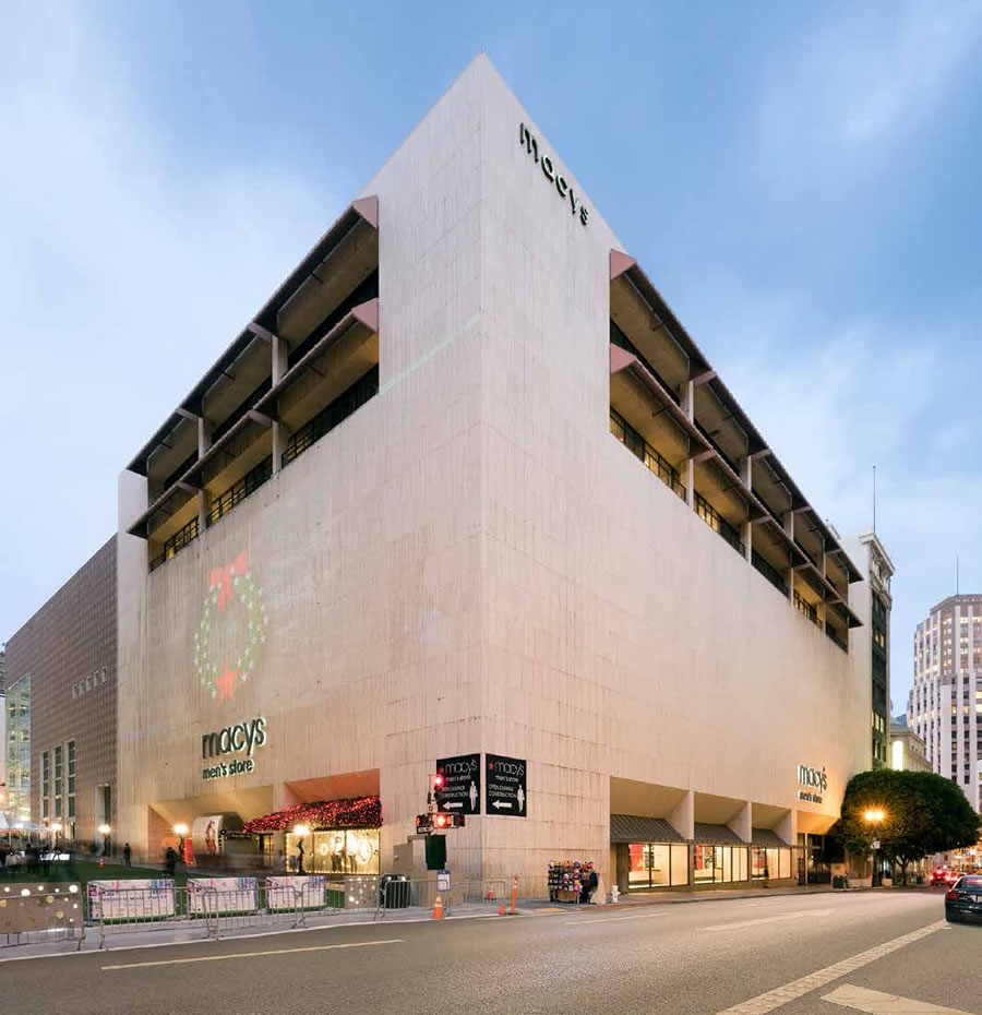
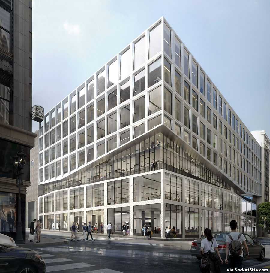
In the works since the end of 2016, as we first reported at the time, plans to strip the concrete and travertine skin from the exterior of the Macy’s Men’s Store building at 120 Stockton Street and install a glass curtain wall facade are slated to be approved at the end of this month.
The proposed $59 million redevelopment would also reconfigure and repurpose the interior of the 250,000-square-foot building, with 49,999 square feet of new office space across its top two floors and six retail spaces spread across the floors below. In addition, a new 11,000-square-foot restaurant would be built atop the building.
Macy’s is expected to consolidated its wares within its flagship store across the street and vacate 120 Stockton, which it sold to Morgan Stanley for $250 million, within the next couple of years.


What’s with the floating clock tower in the rendering? Dali-inspired re-skin!
It’s the existing clock on the Main Building (tho it seems to not have the “Open Tonight” neon sign below it anymore)
HUGE improvement. Surprised they want retail beyond the second floor – unless the City is demanding it.
It’s the Prop M cap. The over 49,999 pool for office space is tapped out. For the owner to request converting the whole building to offices would put them in competition with other developers for the 850K of space that can be allocated in a year. For them to get part of that allocation could take years and years. The under 50K M pool still has space available for allocation. Hence City regulations indeed precluded the building from being totally converted to offices above the second floor.
There is 2 msf remaining in the Prop M pool since the 875,000 that was added in October.
Retail above the ground floor and more so above the second floor will not do well. and that is not going to change. The “mall” built at 5th and Market couldn’t find any tenants at all. This site should fare better but the retail on the second floor and above likely won’t survive. The 49,999 feet of office space across the top two floors is what will eventually happen to all but the ground floor of this building. The only question is the timing. How many years must the owner wait before they can return to Planning with a request to convert another 49,999 feet of the building to office use? It’s a safe bet the same “game” will be played by the owners of the 5th and Market mall.
The Clock is on the Stockton/O’Farrell Street building across the street.
It is really crazy that they can’t convert all the empty retail spaces into office space. The limit does not make sense.
The office space in SF is crazy expensive, much more expensive than living space (by per sqft per year).
All those retail spaces in Castro and along Market street sit empty. If they turn those into office space, those workers will bring more foot traffic to the restaurants and business around that area.
Going, going…gone? They’re also now putting up the I Magnin building for sale, a ~40% reduction in floor area in just a few years (tho the remaining ~700K gsf will still be a very large store)
The I Magnin building was Timothy L. Pfleuger’s final design, unfinished at the time of his death in 1946. I wonder if the new owners will keep it retail or convert it to offices or a hotel.
It’s hard to imagine it being converted to retail beyond the ground floor/basement – which would be hard to imagine NOT remaining so – since there would not be a lot of access (who would want a store reached only by elevator that couldn’t be seen from the street?)
The bigger issue, I think , will be whether not the (carrara?) marble facade is retained or some genius wants to strip it off instead. IIRC the Seattle store – which was vaguely similar – ended up reskinned…but I don’t think that was ever the landmark this is.
As we previously outlined (and linked above), each of the six retail spaces would have a storefront fronting either Stockton or O’Farrell, with stacked square footage versus individual stores on each floor.
Thanks, but Pioneer and I were talking about the old I Magnin buildling…the OTHER building macy*s is “monetizing.”
I want the travertine pieces!
I will fight you for them. Actually need only 200 sq. feet.
I want the zigzag slash to relate to the retail/office segments, or somehow be more than a stylistic gimmick.
Agreed. A strong effort if it weren’t hooey.
Quite handsome, maybe they could use some travertine on the floors….
I kinda like the existing exterior actually. Seems like it would make some sense to keep that and build a tower on top.
It’s a windowless box. Central cities should not be dominated by windowless boxes, even elegantly skinned ones.
Can you please explain why? I find it horrendous because it is like a huge blank stone wall, univiting to the street and then you scurry through one of the few rat like entrances into this mystery box.
With open windows with a nice view into the inside the big box (what it his is, literally and figuratively in this case), it will fell more inviting and blended into the area.
Currently this thing feels like a huge blank concrete wall electric/utility box, like that crazy building in TriBeCa in NYC or the PGe substation over on Folsom and main.
So I’d love to hear your why in this.
Amen. Put a set-back tower on it. Residential.
Massive improvement over the 50s Brutalist crap-box. Who in their right mind would basically pop a concrete abominiation in the center of Union Square?
Also, does anyone know what was there before the existing building went in?
The building was built in 1974, by Amfac, the then – and final – owner of the City of Paris…whose annex occupied the site.
previous building: 1918-1972 City of Paris extension (not to be confused with the 1907 building on Geary and Stockton with the rotunda was bought by Neiman-Marcus in 1974 and the current building opened in 1982.)
current building: 1974-1984 Liberty House, 1984-present Macy’s Men’s Store
Now if they would only re-skin Neiman Marcus…. I think Philip Johnson hated SF. ALL of his buildings here are awful.
not just here…!
I remember when it was Liberty House.
I do too: they had great restaurants, a table-service side called “The Plum” and a cafeteria-styled side called “The Anxious Grape.”
I don’t think I ever ate at the former but tried the latter a number of times (there was a similarly named room in the Oakland store). Macy*s kept it for a few years but then leased it out to Fresh Choice…which pretty much ruined it.
Is there any reason the floorspace freed from retail could not be converted to residential? Adding more residential to Union Square could be a nice synergy.
I really love the travertine – wish they would keep it and just clean it up. I think it has real presence.
The proposed rehab is a great deal better than the existing travertine marble prison box.
Holy missing I-beams Batman !! Has anyone (else) been by this recently ?? People were worried about the travertine ending up in the dumpster, but it looks like most of the building has….it’s reduced to just a part of the frame in the center of the lot.
Methinks SS should investigate to see if the trend of unpermitted “remodeling” has made its way downtown.