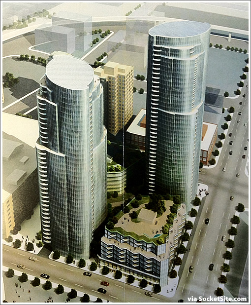
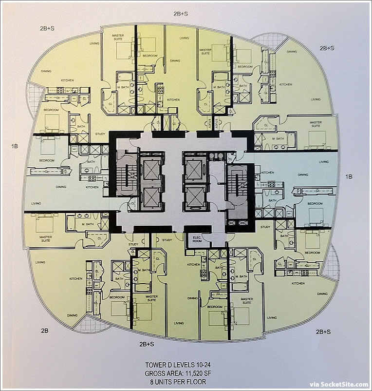
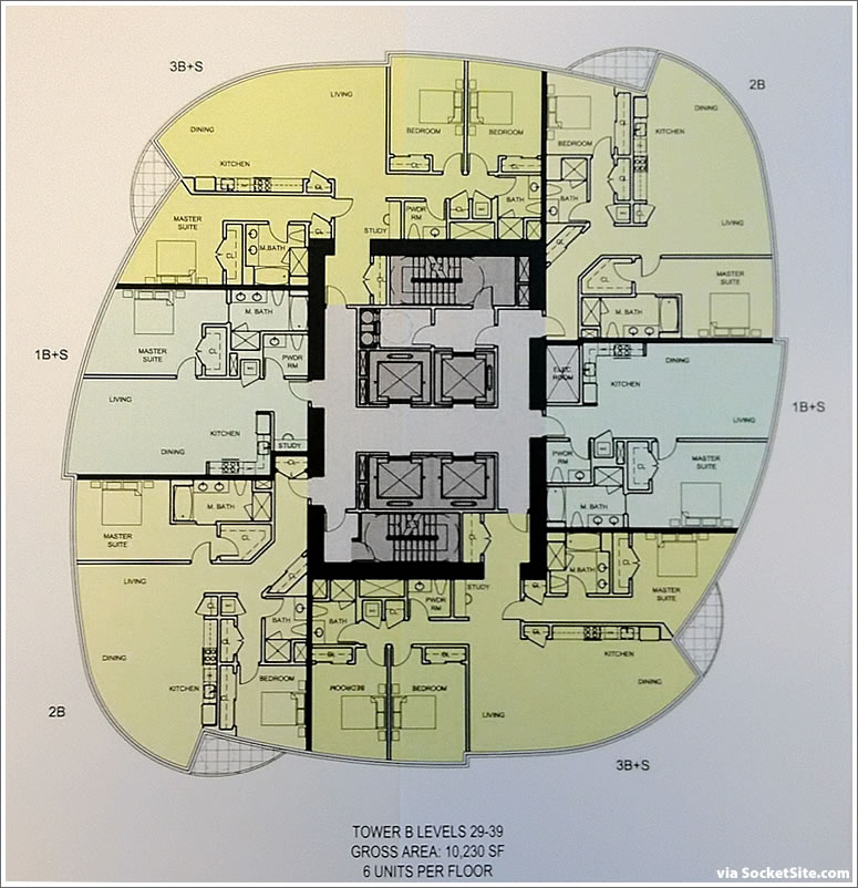
With signature Infinity floor plans which are fabulous for taking in the views but many find frustrating to actually furnish, the discussion surrounding the re-designed towers of 201 Folsom, Tishman Speyer’s sister project to the Infinity, quickly turns to the floor plans, the most common plans for which a plugged-in tipster delivers a sneak peek
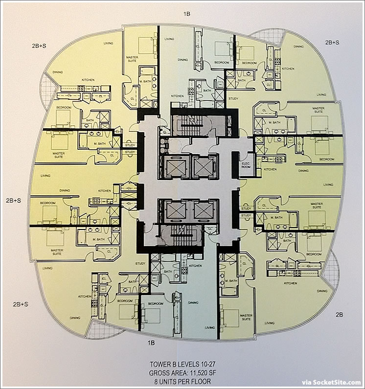
Click the images to enlarge, and continue reading for more plans and floors.
∙ The Arquitectonica Redesigned 201 Folsom Street Rendering Scoop [SocketSite]
∙ 201 Folsom: The Revised Plans For The Two New Towers To Rise [SocketSite]
∙ 201 Folsom: Three More Years To Contemplate And Start Construction [SocketSite]
I like the idea of the exterior, but there’s no way those decks are large enough for the open space requirement. 6′ minimum in each direction. I also don’t like that many units have bedrooms on opposite sides of the ‘public’ living area, but perhaps the best you can do with the envelope. Oh yes, and a desk beside the entrance doesn’t count as a ‘study’.
Similar to infinity floorplans. what are the amenities like?
Heard they were gonna do valet parking. Can anyone confirm it’s true?
This sort of thing depresses me. You’d think there would be more consideration for functionality here… Yet, another example of a development that celebrates tall and shiny instead of smart and simple.
@ Andy: I think they have to per city ordinance, right? Can’t do 1:1 so either valet, stackers, or certain units go without parking altogether.
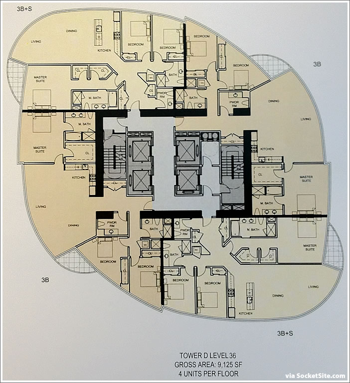
@ Andreas: was thinking the same thing ….at first blush I REALLY dislike the oval approach. Like the editor mentions, Infinity corner units are notoriously awkward to furnish because of this. In this case, they’ve taken it a step further – 3B above would be borderline unlivable in my personal opinion, with 2 wasted rooms. Looks like architects putting form over function yet again. Did they design this to sell to humans, or a chambered nautilus?
“…3B above would be borderline unlivable…”
There are only two floors that would include the 3B floorplan. Most of this building’s floorplate is more square-like.
Unlivable? Really? like how Guldens mustard is barely edible compared to grey poupon?
Ok, so help us out. How would 3b above be “borderline unlivable”?
Yes, two of the bedrooms are not more traditional rectangles, but the floor plans show furniture to scale and acceptable clearances around beds. The two bedrooms may not be large,but they are within the normal range of bedroom sizes. In fact, the master bedrooms seem pretty generous in many units.
I like the floor plans, with the exception of some of the kitchens: All so open to the living space and some could use an island to add functionality and help define the space.
the 3B floorplans have three bedrooms, and the master is quite normal and rectangular. The other two are bound to be either kids’ rooms, guest rooms, or studies, any of which seems fine in an odder shape, to me.
“I also don’t like that many units have bedrooms on opposite sides of the ‘public’ living area…”
I live in a two-story house with master bed/bath on one level and two guest bedrooms/bath on the other level. When family or overnight guests are in town, I really appreciate the privacy afforded by the separation. In a smaller one-story condo, I imagine the separation would be even more desirable.
However, I don’t understand for the need for a half-bath adjacent to a full bath. I would rather have the space used for living or a larger kitchen.
Unlivable may have been poor word choice on my part. Let’s say ergonomically apathetic instead.
A kids’ room or study shaped like a giant trapezoid or triangle? Nothing like waking up every morning to the sight of a 60 degree angle staring right at you. Where do you put the furniture in those bedrooms, right against the windows? The architects here should be forced to spend a year living in one of these layouts, and not just as a pied-a-tiere.
Why does contemporary haute design usually equal poor ergonomics? I am a San Franciscan and a Soma condo dweller, and I demand boring, boxy, and banal!
“However, I don’t understand for the need for a half-bath adjacent to a full bath. I would rather have the space used for living or a larger kitchen”
Completely agree. It’s just wasted space. A large closet would be fine as well.
@Legacy Dude: “I think they have to per city ordinance, right? Can’t do 1:1 so either valet, stackers, or certain units go without parking altogether.”
Are you sure about this? How did Infinity get 1:1 parking?
Bedrooms are all good shapes and functional. Actually, more interesting than many boxy, square small bedrooms in some condos and a lot of Victorians.
The 1/2 bath makes a lot of sense. Most buyers expect it these days and at this price point. The 1/2 bath is really a “powder room”: none of your guests at a party or dinner have to use either of you more private baths. Makes total sense.
Also, I agree with Mike about the separation of master and other bedrooms. My house is 3 levels with the master bed and bath on the lower level, opening to the garden, and the other two bedrooms and full bath are on the 3rd floor. Main living level has a 1/2 bath.
“I also don’t like that many units have bedrooms on opposite sides of the ‘public’ living area..”
One of the main reasons I bought my current home is that there is a living room separating the bedrooms. It is much quiter with guests (of if the other bedroom is used as an office) than having two bedrooms right next to one another.
Anyway, those curvy floorplans give me a headache. I can’t imaging trying to furnish them…it’s just an inefficient use of square feet for the sake of stylish exterior design.
When are we going to start calling a 3 room one bedroom apartment a two room condo when the kitchen is in the living room? A 2 bedroom 5 room apartment becomes a 4 room condo. Kitchen walls have replaced book shelves and spaces for art. But they do save space.
“The 1/2 bath makes a lot of sense. Most buyers expect it these days and at this price point. The 1/2 bath is really a “powder room”: none of your guests at a party or dinner have to use either of you more private baths. Makes total sense.”
Exactly! This market has such a warped view of the functionality of a powder room – very common in new in 2 and 3 bedroom construction throughout most North American markets but highly undervalued and seldom built here.
“I would rather have the space used for living or a larger kitchen”
Would point out that the powder rooms in the 3B plans are needlessly over-sized. Can see how the load bearing column presents a challenge to efficient space utilization. One solution would be to include a small closet or space for built-ins fronting on the dining room, moving the plumbing fixtures closer to the door of the powder room and shrinking its space requirement while adding much needed storage.
While these curves do make furniture arrangement more challenging the problems here aren’t anywhere near like those in the Infinity with those convex walls. And I think most complaints are addressed to the last floorplan shown here which apply only to the top two or four floors. The remaining 95% of the building is significantly more boxy.
I like how the building structure seems to be supported by the center core. No pillars adjacent to the windows which would kill several square feet of usable space.
I wonder if the tops of the setbacks are used as large decks for those floors.
Hopefully this building is better managed than the ghetto fabulous Infinity. The massive number of careless renters and the HOA’s unwillingness to enfore fines for rule violations, has made the Infinity a complete failure of a luxury building.
wasteland area, not local non-tourist place to walk. Wasteland at night also. I will enjoy the rounded corners as I view the building and laugh a bit at anyone living in this boring neighborhood and terrible floor plans.
For reference my closest friend bought into the orange lofts on Beale in 97 and I work a block away. Place has not changed, even with the Infinity. Still a homeless wasteland. Used to call in Steel Town.
Clark,
This project will slowly improve the neighborhood and increase nearby values (infinity, met)
Let’s just call it Infinity III and IV, shall we?
This just looks like another Infinity with another 600 or so additional units of inventory in the market. Am I the only one who thinks this area is being oversaturated with these cookie cutter condos?
Looks like none of those kitchens have islands.
Most of the residents at the Infinity are young professionals who like to roll out of bed and be at work in a few minutes. They don’t care about ‘inefficiency’ and ‘functionality’ because they don’t have that much stuff I think 201 will have the same mix with FB type young millionaires buying the 2s and 3s just because they can. Obviously 201 investors see a future here.
Personally, 3B would be my choice of floor plan out of those. Our current place at the Brannan has similarly separated bedrooms (though not similarly round), and it’s one of the better features for us.
Whether you’re using the spares as a kids/guest room, a media room, or an office, that distance from the master bedroom is a blessing.
The kitchen would need a nice bar island, though.
That said, Milkshake’s comment about renter issues at the Infinity give me pause.
My favorite floor plan (for the money) at the Infinity is absolutely the Duplex homes. 1600+ sq ft., 2 floor with giant balconies looking over the bay, and an extremely functional layout that accomodates a large dining table. These units sold for a small premium over the signature corner units. Too bad this layout seems missing from 201 Folsom.
Urg. Galley kitchens? Horrible at this price-point!
@RJ, when a unit is limited to 1300+- sq feet, how else would one design in a kitchen?
Can anyone tell if access to the balconies is from the living room, bedroom or both? I can’t tell from these, but maybe I’m just missing it. I assume it’s from the living room, but maybe it’s also from the bedroom?
It is conservative attitudes like the above (“This is totally unlivable!!!) that is the reason we have nothing but boring shoeboxes going up in this city.
Move to Seattle.
^^^
…and I take it you live in a glass trapezoid in the sky, in rooms without corners? Is that right, all you haute design gurus? I’m sure you all put your money where your mouths are and live at the bleeding edge of these ridiculous trends you espouse so much, right?
Because nothing spells cutting-edge design like kitchens you can’t cook in, bedrooms you can’t sleep in, and living rooms you can’t furnish. For $1,000 psf. Telltale signs of a world-class city.
Don’t know if it will be a fair comparison and/or indicator for the future, but Unit 17G in Tower II of the Infinity is currently on the market. One bedroom, one bathroom and asking $669K for $831 per ft.² with HOA Dues of $723.
juliagulia, if you have a strong preference for being able to keep out undesirable (“ghetto fabulous”) renting elements, the way to go would have been to buy into a co-op. There are at least a few available in San Francisco.
We already have Infinity I and II for the “cutting edge”. III and IV next to them only make it overly repetitive. If you have to have another cutting edge, give me something different, like this:
http://cfile235.uf.daum.net/image/1176AE334DC56325382FA6
Or, just something more traditional for the contrast. The proposed variation doesn’t even rhyme well, that it’s boring imo.
@Legacy Dude,
it’s not my fault you’re square.
I would love to hear more details from juliagulia on her ghetto fabulous comment because we’re definitely not living at the same Infinity (perhaps just a troll comment). This could also be attributed to: 1) I keep to myself too much, 2) I live in one of the boring mid-rise buildings, or, 3) most of the people I talk too always talk about too many rules (which is true in general with any HOA).
sfjhawk – Perhaps you can stop by my floor and watch the tenant down the hall who lets their dog walk without a leash on our floor and in the elevators. Or maybe check out the garage floors where people seem to regularly leave trash like boxes on the floors because they can’t make it to the recycle area. Dogs without leashes, trash laying around because someone can’t go to the recycle bin… just a couple of examples but I can go on. Isolated these may not seem like much, but coupled with all of the other issues – it’s ghetto fabulous. This is no high end living situation. I don’t mind the rules. I just wish infractions were enforced with fines or the like.
Apparently the cost to build this project is MORE than the prices they can get. Constructions costs have exceeded potential value in SF.
Now, what?