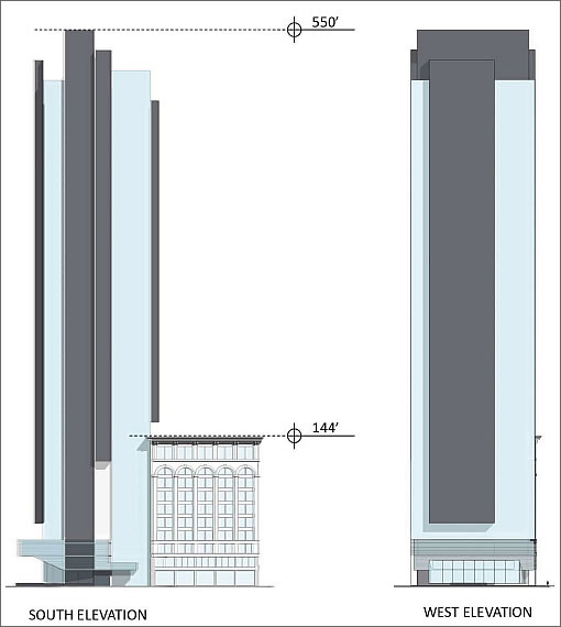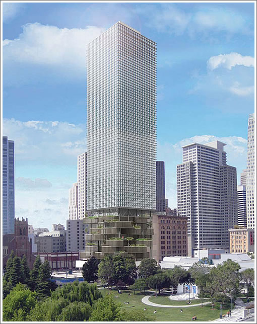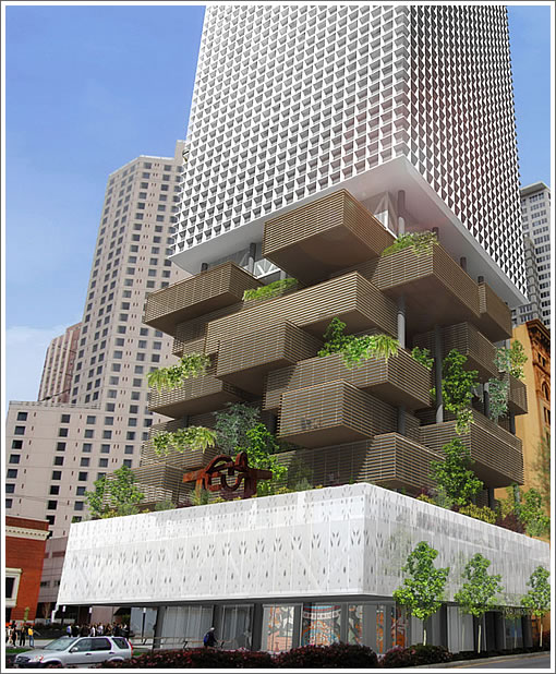
You know, considering we were the first to publish a sneak peek at the circa 2011 conceptual designs for the new tower and Mexican Museum to rise at 706 Mission, you think we would have recognized those that were circa 2006. But we didn’t.
As we were quickly corrected, the design below is DOA. So if you didn’t like it, good.


∙ Sneak Peek: 706 Mission Tower Design And Aronson Building Rehab [SocketSite]
∙ 706 Mission Tower (And Mexican Museum) Back In Play [SocketSite]

OMG that is incredible. Love it.
Sick.
Wow!
it looks like an urban medical marijuana grow facility
Never going to happen, although i wish it would
This design is from 2006 and is dead in the water.
I sure hope it’ll never happen. That just looks like godzilla crapped a 1980s office building on top of a gigante partido de jenga. The architects are apparently unfamiliar with the term soft story.
I like the bottom part; it’s interesting. Looks like they ran out of imagination on top. 🙁
Fugly.
Interesting… but fugly.
Maybe it would work in person?
Hmm… now, its “Hanging Gardens” element is sort of growing on me.
Brilliant.
It must be reconsidered.
It must be built.
Why can’t the whole tower look cool?
Oh yeah. 70 year old North Beach NIMBYS might be offended.
Too bad it’s passe’ because I love it but it’s much too exciting for SF, of course. Not even a bay window in sight.
Okay…so, if you kind of blur your eyes….does it look like a giant cigarette is stubbed out into the park?
Funny, it doesn’t resemble a middle Sunset district SFR to me at all.
It doesn’t look good at all… my Islamic Cultural Center at this location fits much much better in there… check my Homepage out and I m almost done with the Project…
Anyone missing their kids building blocks and the ol ice trays??
That’s awesome. But they would have to re-style it like a Victorian to get it approved.
That old design is an architectural mullet: Business on top, party down below.
My eyes hurt.
It looks like a cigarette butt.