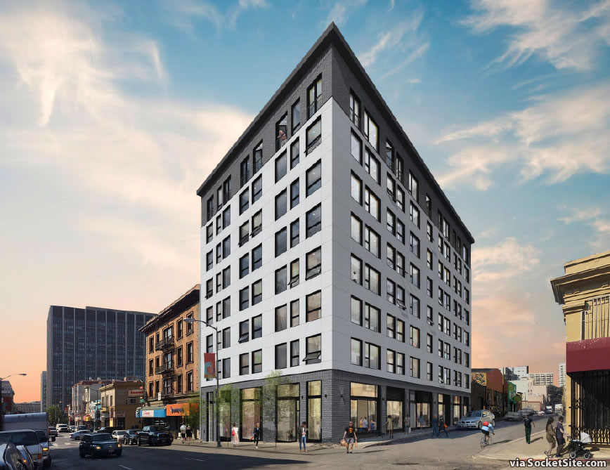
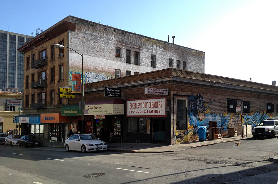
With the Planning Commission hearing for a proposed eight-story development to replace the single-story Susan’s Massage, Four Seasons restaurant and Excellent Dry Cleaners building at the corner of Larkin and Olive slated to be held in three weeks time, the project has been completely redesigned.
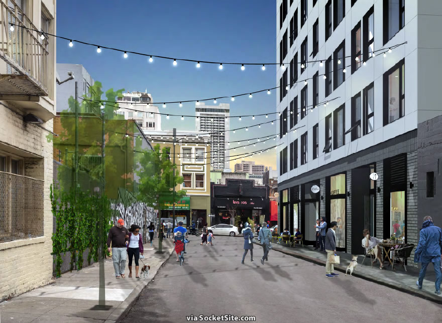
Gone are the precast concrete panels and throw-back modern design, which have been abandoned in favor of a contemporary cement plaster finish with contrasting dark brick at the ground and eighth floors.
Inside, the 719 Larkin Street project still totals 42 units, all one-bedrooms ranging from 556 to 683 square feet. But instead of a single-restaurant space on the corner, the ground floor has been reconfigured with four commercial storefronts ranging from 544 to 921 square feet in size and fronting both Larkin and Olive Streets.
Once again, keep in mind that Larkin Street from McAllister to Geary is one of the nine “Action Zones” at the heart of the City’s “game changing” strategy for revitalizing the Tenderloin, Central Market and Sixth Street, with a specific strategy of “[enhancing] the visibility of Little Saigon as a Vietnamese-oriented cultural district, which includes providing ‘focused business retention services’ to Larkin Street businesses backed by the Little Saigon merchants association.”


Well, it’s still dull and uninspired IMHO but it’s less jaringly so and fits with the neighborhood better. Clearly they are going for low end construction costs but they probably have to in order to keep rents as low as possible which is necessary in this area. After all, it’s not Noe Valley.
No rents here, these will be condos.
I liked the previous design but due to it’s office building aesthetic felt it was out of place in this instance. While not as daring, the new design plays well with the surrounding buildings.
This looks contextural with trendy color, but the original version had more personality: both are rather barren. While this might fly-through the planning process filters, perhaps the ground-level cladding could be more enticing: like an accent, possibly a showy-yet-durable surface that reflects Vietnamese construction, whatever those material(s) might be.
I took the ground level cladding to be graffiti-proofing and probably nothing as graffiti resistant would be more enticing.
The original version? You mean the communist-era brutalist housing bloc?
I think it blends well and like that they are preserving small retail. Maybe they can consider adding some small balconies to make it less dull? People can put plants out, etc
More likely to hang laundry but that’s OK too if it’s what they want. I’d like to BBQ on mine but it’s against my building rules.
Balconies just turn into exterior storage space.
I’m disappointed that they threw out the first facade. But I’m excited that they’re dividing the one large ground floor retail unit into four retail units.
At night it turns into Little Khe Sanh.
Hopefully, the Susan’s Massage protesters will be out in force to stop this wanton, over the top building that is destroying their sanctuary within a sanctuary that is the ‘Loin…..
This is a n*-sh*tter: On the Nextdoor site an anti-gentrification Tenderloin resident stated the ‘loin has been declared a drug-permissive zone by the city and you can do what you want there (drug-wise), truly making it a sanctuary within a sanctuary (the entire city). That’s almost enough reason to rent a pied-a-terre in this building and open an opium den or crack house if true.
Looks much better. I hope the action zones jargon translates into Four Seasons successfully relocating in the neighborhood.
Windows are far too large. But it does look boring and sterile. Pass. – SF Planning
Well, this design appears to have windows you can open for ventilation. I couldn’t tell if the previous one did. Both designs seem fairly superficially different. At the end of the day, you have a big box for people to live in, and whether you sheath it in simplified traditionalism or Brutalism, both are not new and in the end, will probably not stand out. In an architecturally heterogenous neighborhood, which is any city over 100 years of age, it’s just another outfit in the crowd.
I think this design is handsome. The other, while nice looking as an illustration would look dull and Brutalist and wouldn’t weather well. Not everything has to be fussy, especially when surrounded by older, ornamented buildings.
I wonder if the Susan’s Massage madam and her people are going to file as an SF Legacy business to get the cash that comes from the city to help offset some of their displacement costs?
I mean why not if our esteemed elected officials want to give the $$$ away.
For sure that would be a happy ending for everyone involved….
Much better! Definitely beats the drab Brutalist slab that they had originally planned for. I can’t believe Brutalism is still en vogue.
Agree on both counts, the smaller spaces are more likely to find local tenants.