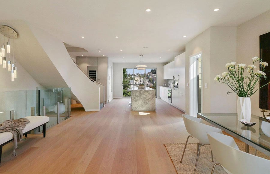
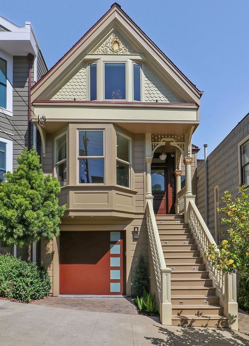
Purchased mid-renovation for $3.8 million in February 2015, the four-bedroom Noe Valley home at 4316 25th Street returned to the market as a finished flip this past September, priced at $4.9 million or roughly $1,284 per square foot for the “fully renovated Victorian gem” on a prime Noe Valley block, with an open living area, “state of the art” appliances, and “an abundance of natural light.”
Reduced to $4.6 million after two weeks on the market, the asking price for 4316 25th Street was further reduced to $4.25 million last November, to $4.2 million in February and to $4.1 million (“Priced to Sell!”) this past March.
On Friday, the sale of 4316 25th Street closed escrow for $4.0 million or roughly $1,048 per square foot for what is now a finished 3,816-square-foot home (and within 2.4 percent of asking according to all industry stats).
As the interior of the then 2,640-square-foot home, which had included a legal one-bedroom apartment below, when it was purchased for $1.575 million back in 2013 with the approved plans and permits for the renovation and expansion above:


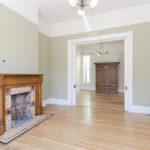
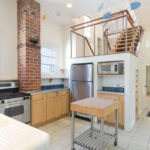
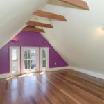
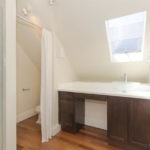
It was decent as-is in 2013, a fairly nice place with a legal 1BR in-law. I think they would have come out ahead financially if they would have just lived in it for 4 years then sold it today with no major changes, probably for about $2.5 million.
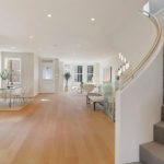
Classic, but terrible full gut remodel. You walk in to one big room, no sense of entry, no sense of defining spaces.
And the “modern” garage door is just so wrong: for this house.
Agreed. Has a loft look minus the loft feel. Designer could have used an interesting mix of materials, including glass, to divide up the one huge space. Lacks intimacy. While you have to deal with many small rooms in a typical Victorian, in this case they went to the extreme. From the looks of it no half bath or even closet on the main living floor. I do like the sweeping staircase, however, at least in concept.
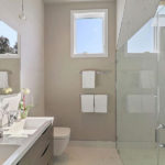
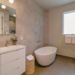
I’ve been a shower man all my life so every time I see one of those huge ovoid free-standing tubs I instantly think what a waste of space. They look like a modern version of the last century jacuzzi tubs no one wants anymore. Anyone have a different take? Does anyone actually use them enough to justify their space requirements or are they just abstract art in the bathing temple?
It’s for show. Actually, it looks like a large urinal. So uninviting. Where do you put your soap, products, etc.? Not even a small table next to it to house all the crap you need to enjoy your soak (including resting spot for your glass of wine).
I take a hot bath every night. They’re very good for you.
A bath? To quote Kramer, “You’re sitting in a tepid pool of your own filth”. I get it as a means of relaxation, but that’s about it.
Second floor windows facing the front…I would have done a series of interesting double hungs in keeping with the Victorian façade which they seem to embrace, yet insult, at the same time (good God, what were they thinking with that garage door!).
The garage door at least provides a warning of what’s to come when you climb the stairs and go inside.
What a disaster for the flipper. Yikes.
I’m surprised it went so low. In my hood (Panhandle/Nopa) I’m consistently seeing non-modernized *condos* going for $900/sf. It’s huge square footage, sure, but $1050 psf for a remodeled Noe SFH is super low. A great example of the state of the top tier of the market right now, as SS has documented well.
The quest for more and more square footage sometimes leads to sterile, poorly defined interior spaces. The front door opening directly into one large living/dining/kitchen space cheapens the feel of what could have been a nicer space with less bells and whistles.
That bed needs more pillows