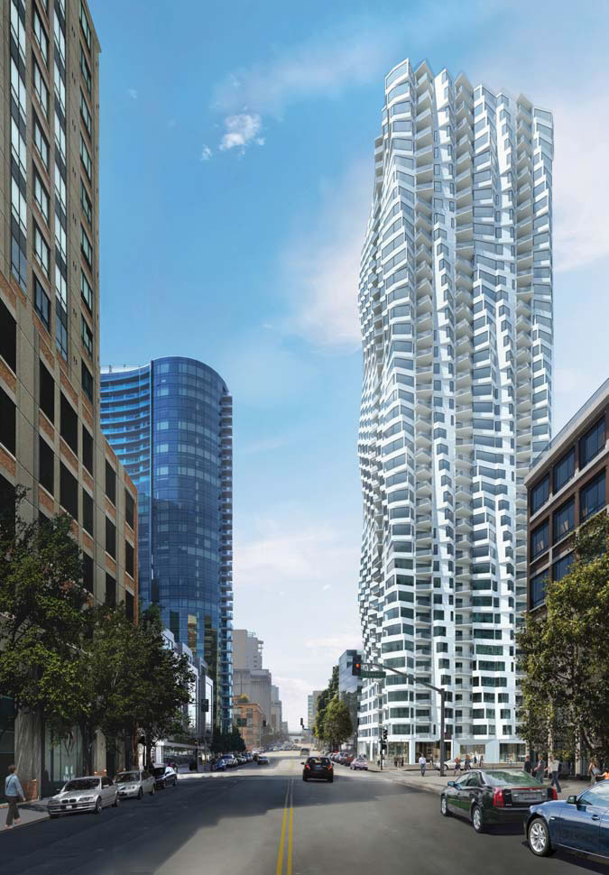
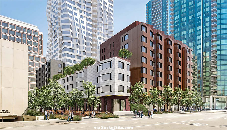
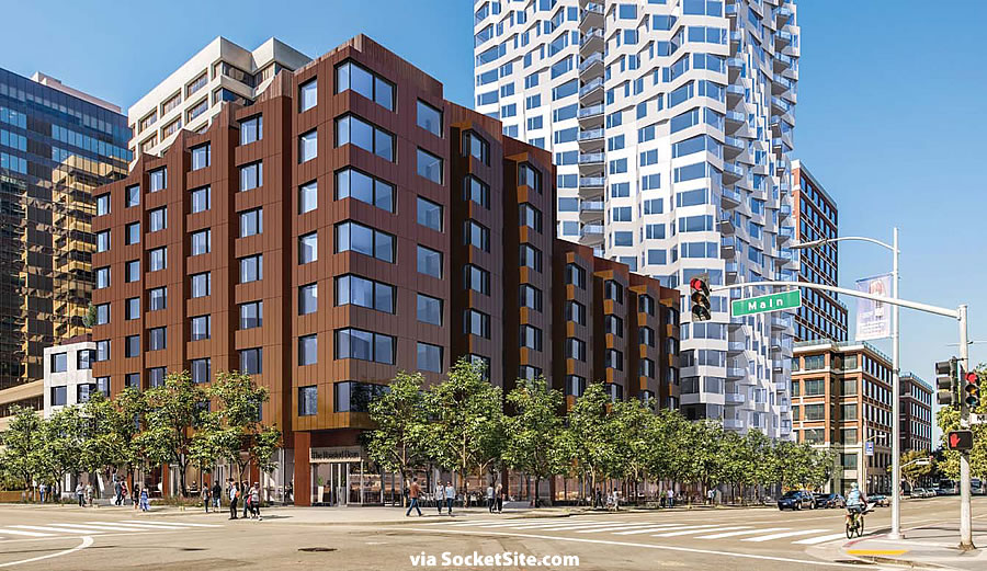
While the Transbay District site for the twisty 400-foot-tall “Bay Tower” designed by Jeanne Gang to rise at 160 Folsom Street, on the northwest corner of Folsom and Spear, has been cleared and building permits issued, permits to start preparing the site for construction (excavation, shoring and pile driving) are on hold by the Bureau of Street Use and Mapping (think/thank the new Clementina Alley) but should soon be approved.
If all goes as currently expected, work should begin in earnest on the development of 160 Folsom within the next month. And if so, the Transbay Block 1 project, which will yield a total of 392 condos, 156 of which will be below market rate (BMR), over 10,200 square feet of retail space and underground parking for 340 cars should be ready for occupancy in the first quarter of 2020 (not 2019).


beautiful! excited to watch this one rise.
wouldnt mind another 200′ on this one.
Would be lovely. There was a fight just to get the additional 100′. This tower at 400′ is a waste of its beauty and potential, this building at 300′ would be absurd. I’m not an advocate of building everything taller but in reference to the current cycle this is the second best designed building behind 181 Fremont. IMO.
Agreed. See Gehry’s 8 Spruce — blocks from the East River — for a twisty tall and soaring residential building. San Francisco’s fear of height combined with Planning’s notion to’shape’ the skyline mutes what should be.
It’s nicely proportioned as it is, with 3.5 rotations as it goes up. More height would make it more visible, but wouldn’t necessarily make it more interesting or better architecturally.
If each rotation is only 90 degrees, then yes. Otherwise it’s 315 degrees… not even one revolution, but then again, quite fitting for the penthouse to face the corner.
We can dream.
SO GLAD to see that the 2 smaller buildings are each holistically one material! Please put an end to the chopped up multi-colored panel TREND. Buildings should look solid and changing colors does not truly “articulate” the facade.
And of course, love the tower!
I totally agree. However, it looks like there is variation in the podium buildings (maybe masonry and hardie-type panels around the windows), but the color is so similar that it generally reads as one material. Just some subtle texture difference.
And no orange panels!
But how else do we show support for the Giants!!
I do with there were better ornamentation for the townhouses fronting Clementina. Same for those on Blocks 6/7 across Transbay Park.
Modern architecture does not support nor advocate ornamentation.
Anyone notice that in the top photo, the artist painted Infinity using colors from Lumina? He corrected that mistake in the second photo.
Infinity looks way too stumpy in this renderings.
I am all for creativity and Gaudi architecture. But my first impression from the rendering is a badly mangled building. This doesn’t work for me.
Where did you get the information about completion date being pushed back Q1 of 2020? I was at a presentation by Lend-Lease in February where the schedule they provided had them dismantling the crane Sept 2018 with initial move-ins in Q1 of 2019. Based on your information, it sounds like the project suffered a 12-month delay.
I was wondering how they will wash the windows on this one…
Gang’s Aqua building in Chicago is fantastic. I hope this doesn’t get watered down.
http://s3.amazonaws.com/architecture-org/files/buildings/aqua-tower-04.jpg
Yuck. Looks like a typical rectangle with slimy goo on it. Blehhhh.
Are the podium buildings BMR?
Hmm. I do not get it. Good to see housing going up – but the ‘architecture’? Seems like bell bottoms and Birkenstocks. A phase that people will people will laugh about in the future.
Mark my words –I know practically no one does; really more ought to — this building is destined to become an SF classic. Like the TransAm pyramid some will revile it but all will know of it and I think it’ll always have a sizable, durable crowd of adorers.
(That is, unless it’s a duplicate or near copy of a design already well-used in other cities? I don’t get out much..)
Those are the obvious references, but I think this one is sufficiently different from them (and, unfortunately, less than half the height of either).
Agreed, Spruce & Aqua are rippling, take their inspiration from nature, whereas this is a pure geometric expression and quite distinct from the others.
It looks unfinished at 400 feet. As if in motion and then abruptly halted. The white is a bit stark. Love the concept.
so cool. full earthquake simulation…..
I was envisioning a spiraling upward motion and then abruptly halted by SF height limits. 😉
Too short for such an unique design. Looks like a twisty BofA Tower (555 California).
would love to see something like this at 800-900 ft
Oh yeah – that would have been incredible. Another missed opportunity for SF.
I agree this beautiful towershould become a SF landmark unless the BMR extortions will cause it to be value engineered into cheap materials.
The only really architecturally interesting new tower in San Francisco!
UPDATE: The Latest Timing for the Twisty Bay Tower Now Rising on Folsom